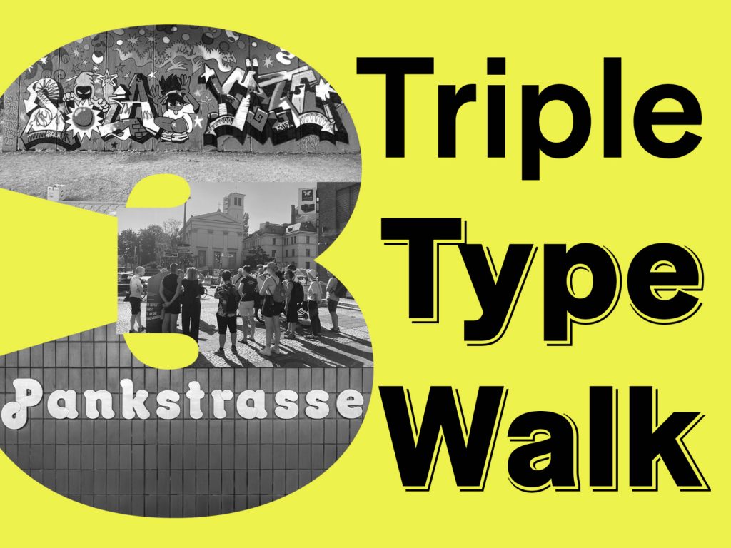
Mit Jesse Simon entlang der U8
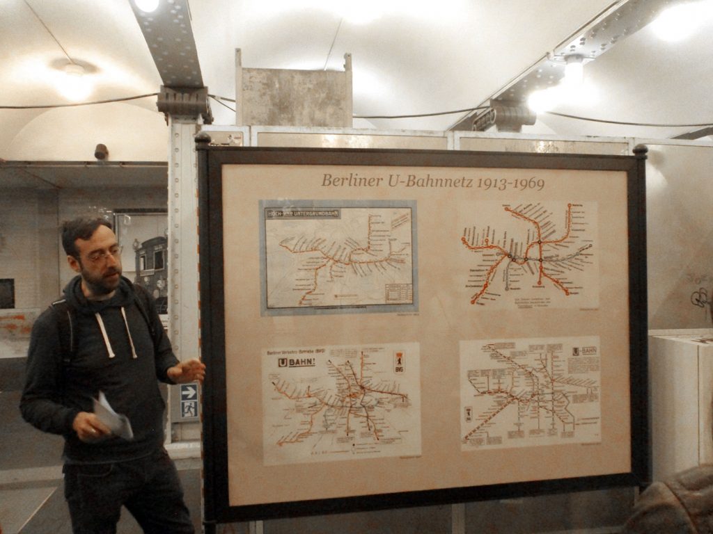
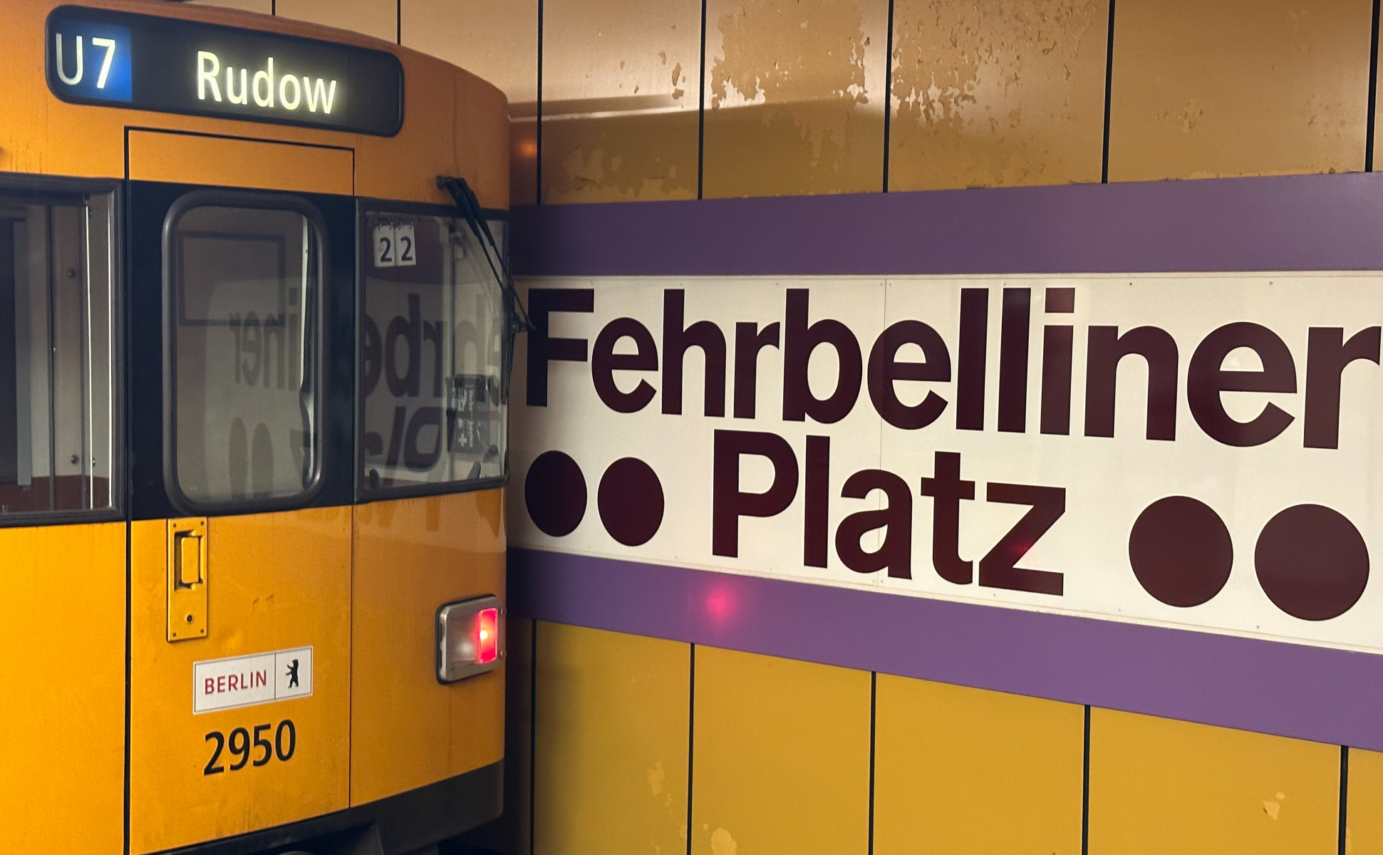
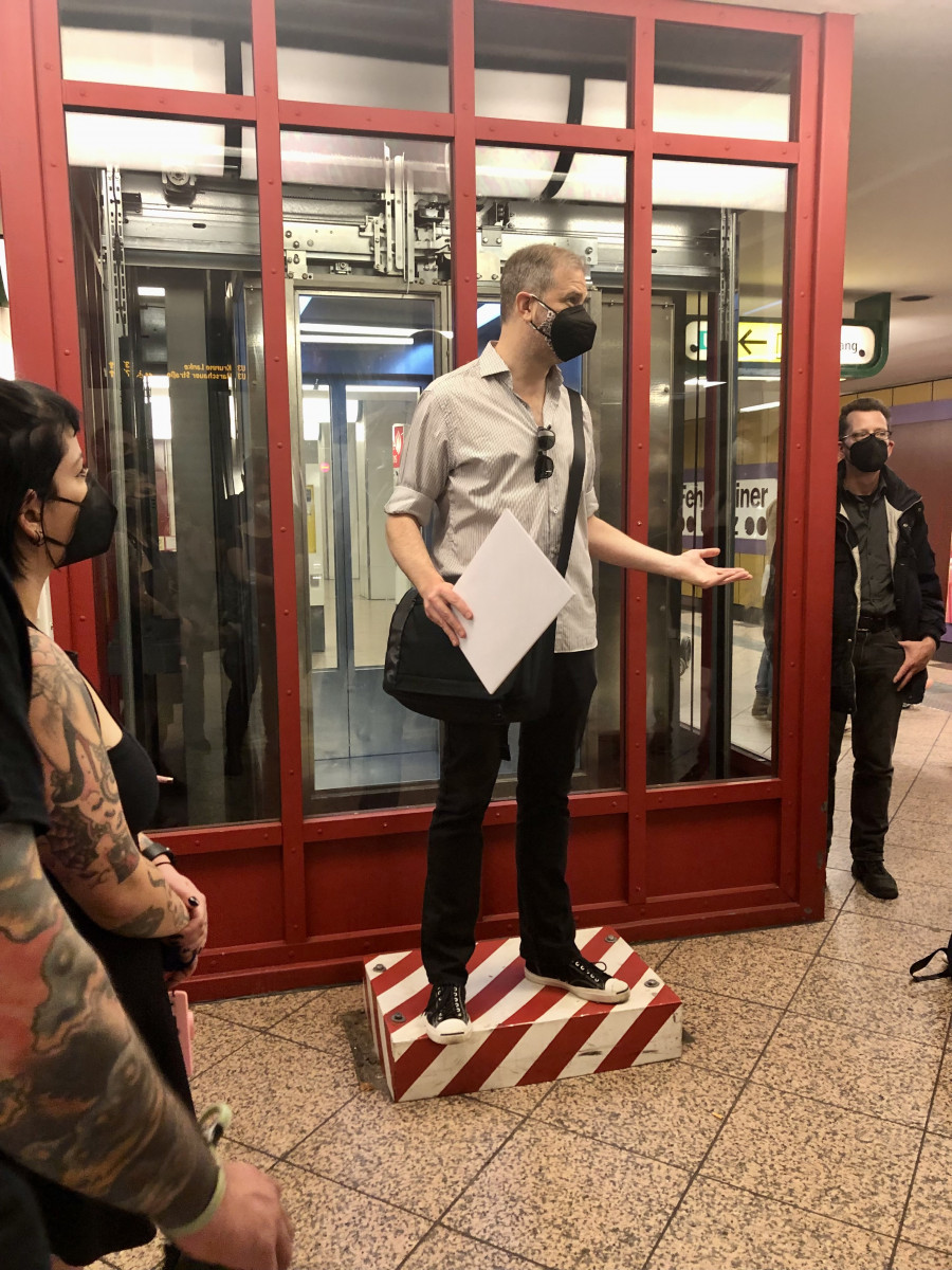
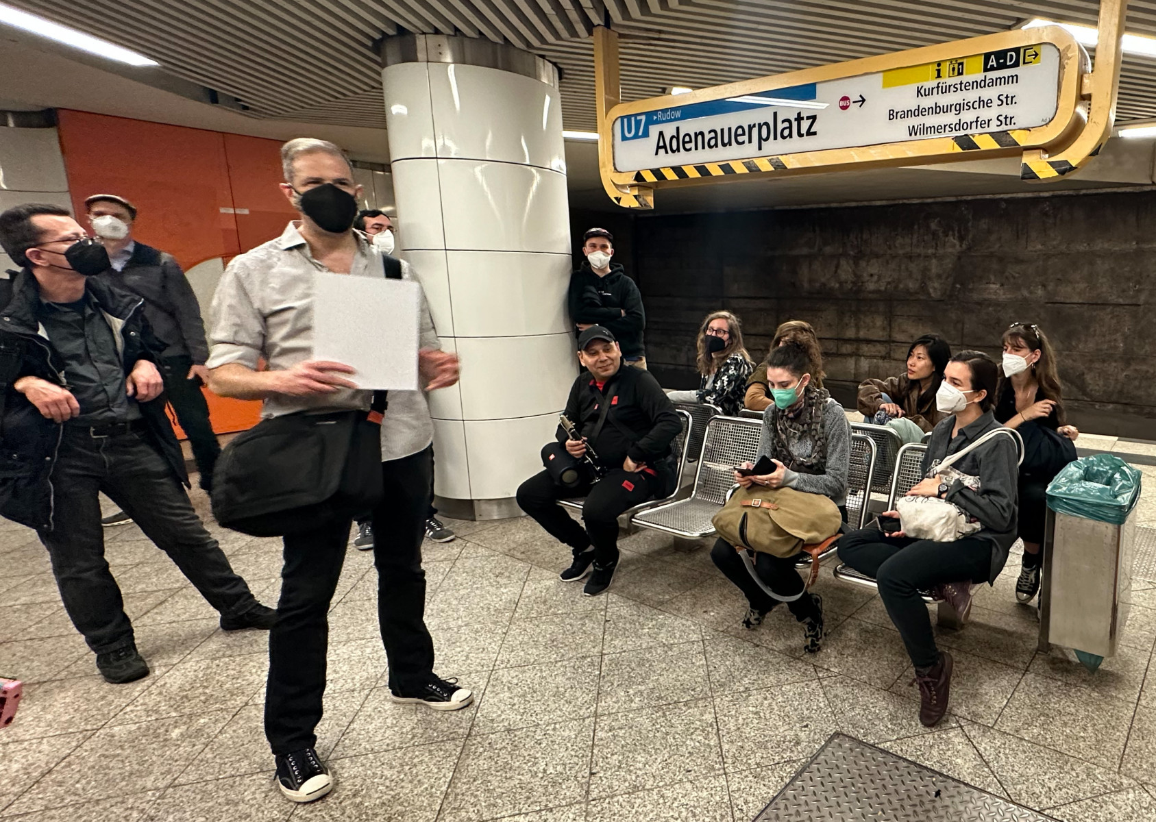
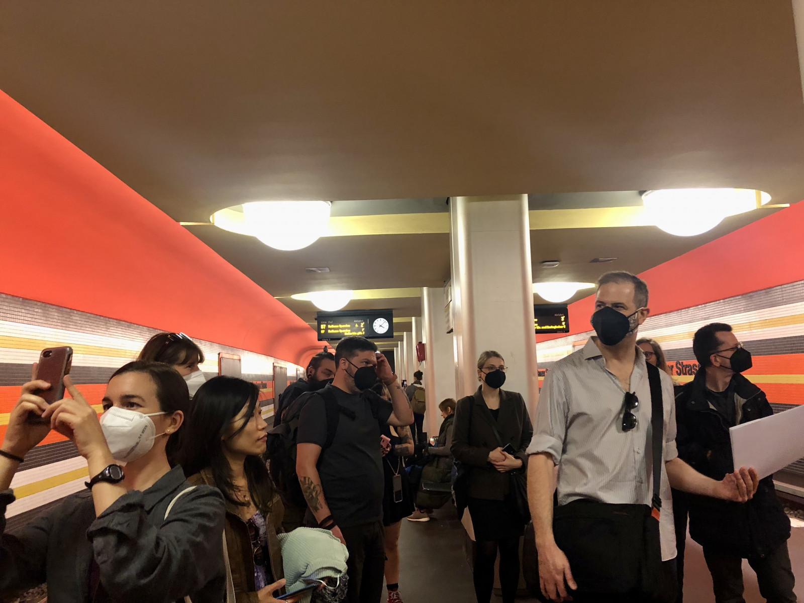
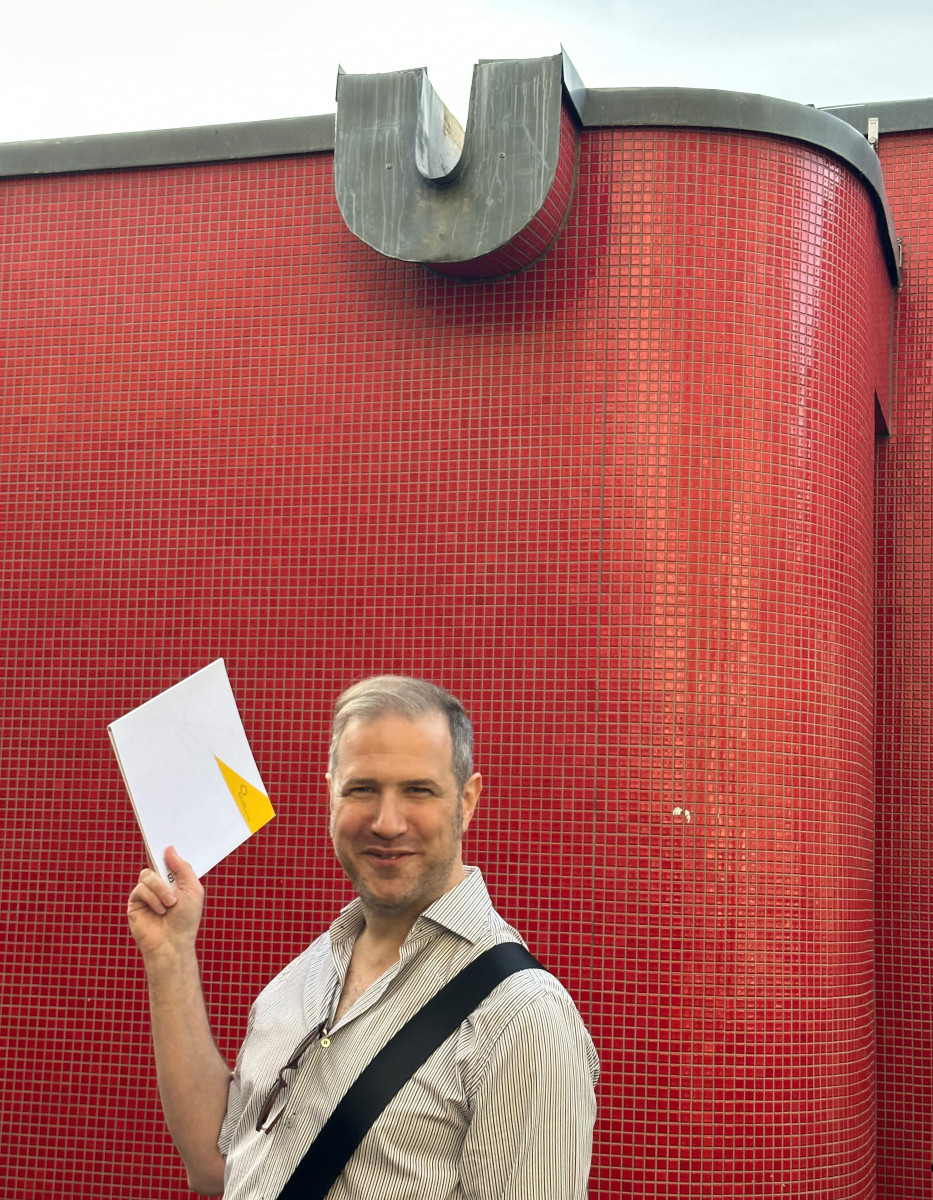
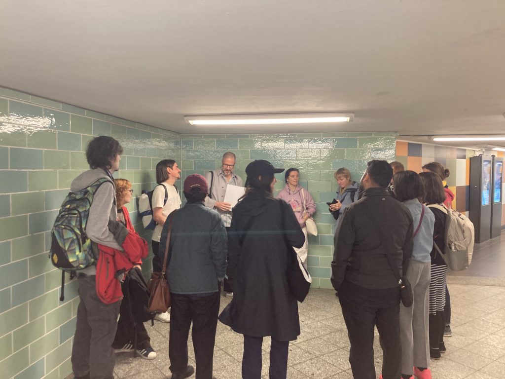
Für den U-Bahn-Typewalk trafen wir uns auf dem Bahnsteig Gesundbrunnen, ehemalige Endstation der Linie U8 bis in die 1970er Jahre. Jesse Simon, Autor von Berlin Typography, leidenschaftlicher Schriftenjäger (und -sammler) im ober- und unterirdischen Stadtbild, leitete uns erst einmal eine Ebene höher. Hier stellten wir uns gegenseitig vor und Jesse führte uns in die Geschichte des Berliner U-Bahnnetzes ein. Bessere Luft und weniger Lärm hier als auf dem Bahnsteig! Ein- und ausfahrende Züge sollten uns an diesem Nachmittag noch so manches Mal eine kurze Vortragspause einlegen lassen …
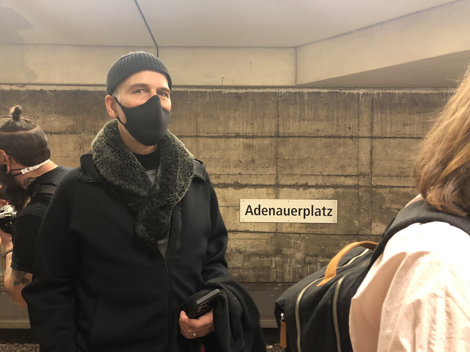
Zur Geschichte: Anfang des 20. Jahrhunderts gab es Pläne für eine Berliner Schwebebahn, ähnlich wie in Wuppertal. Daraus wurde aber nichts. Folglich wurde uns das S- und U-Bahnnetz beschert, mit turbulent-wechselhafter Historie – wir sind schließlich in Berlin. Wir erfuhren von lang geplanten, nie gebauten Verbindungen und Verlängerungen, von Geisterbahnhöfen, Ost-West-teilungsbedingtem Wirrwarr und einem sehr trägen Baugeschehen nach der Wiedervereinigung: Warum geht die U8 nicht bis zum Märkischen Viertel? Warum endet die U1 nicht am Adenauer Platz und trifft dort auf die U7, obwohl es sogar bereits einen entsprechenden Bahnsteig gibt – verwaist? Diese und andere Kuriositäten waren spannend mitzudenken, als wir uns im Anschluss auf den Bahnsteigen Schriften und Gestaltung im Allgemeinen anschauten.
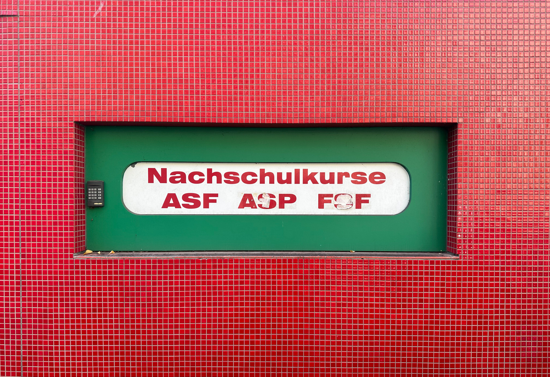
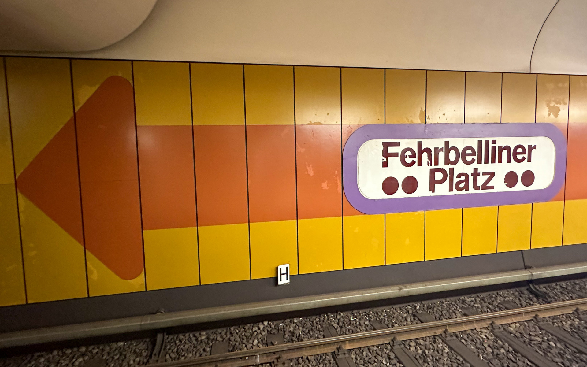
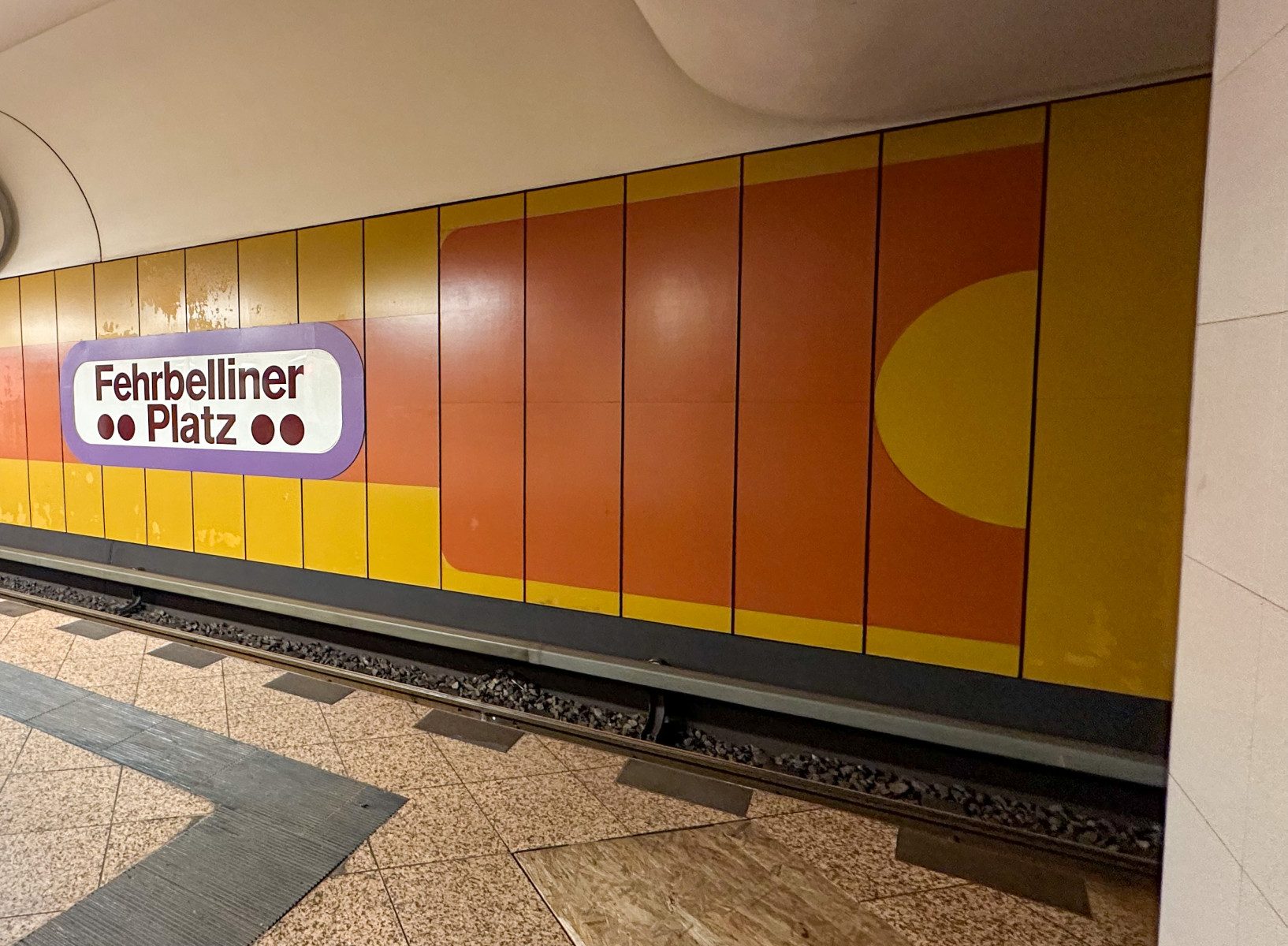
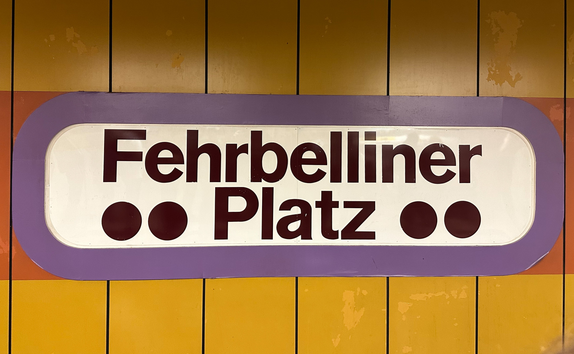
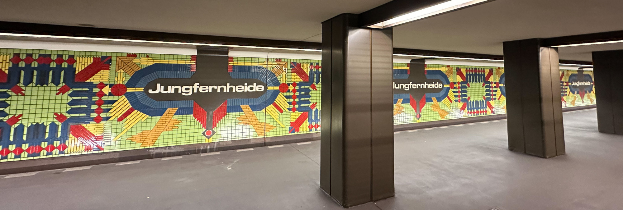
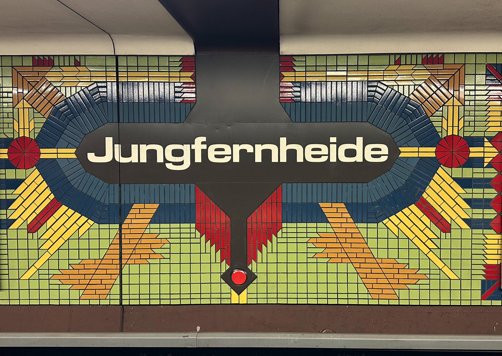
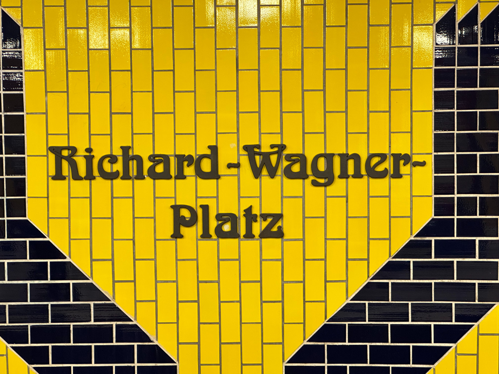
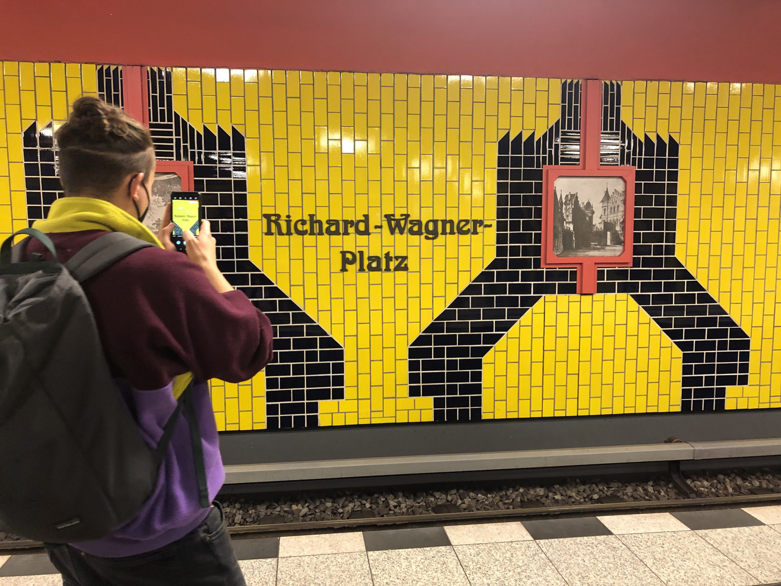
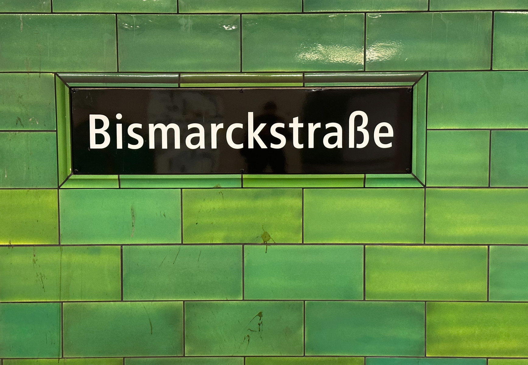
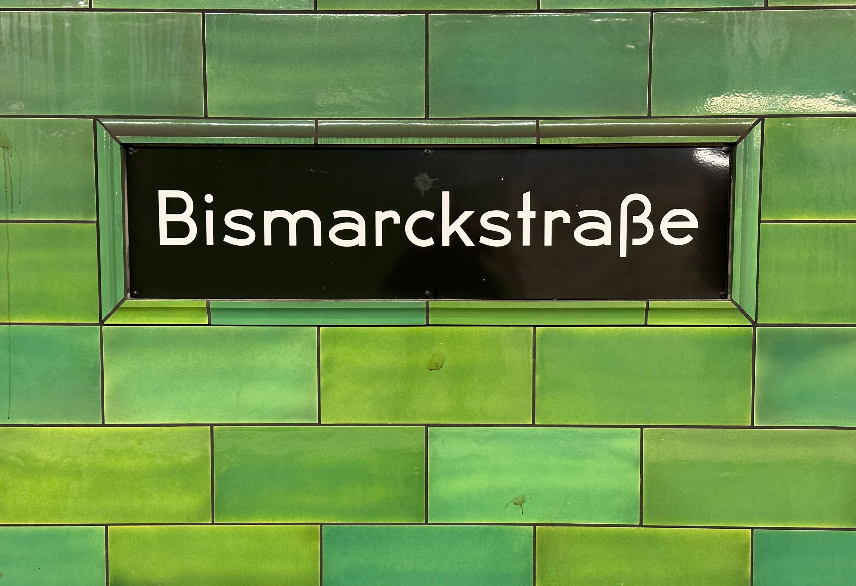
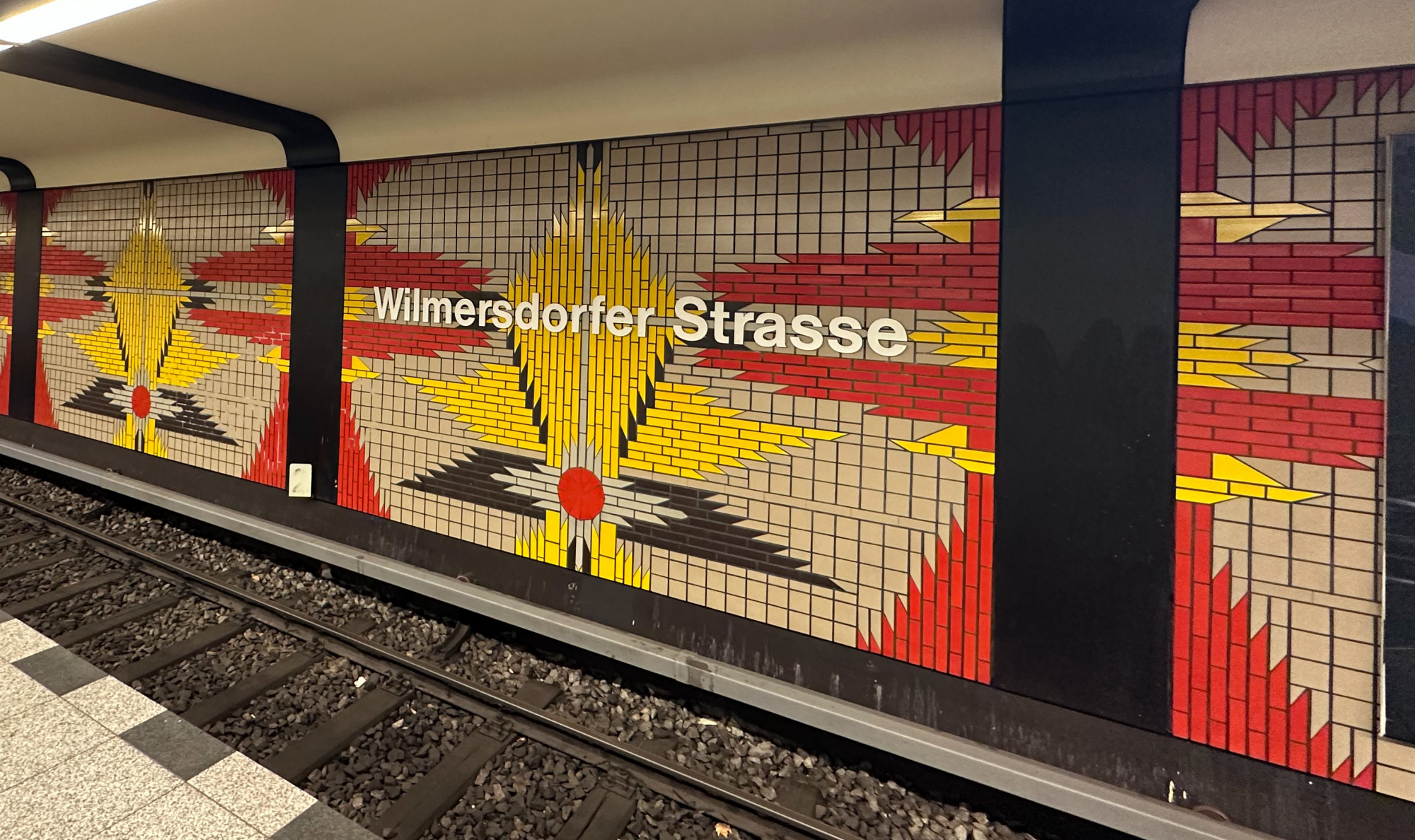
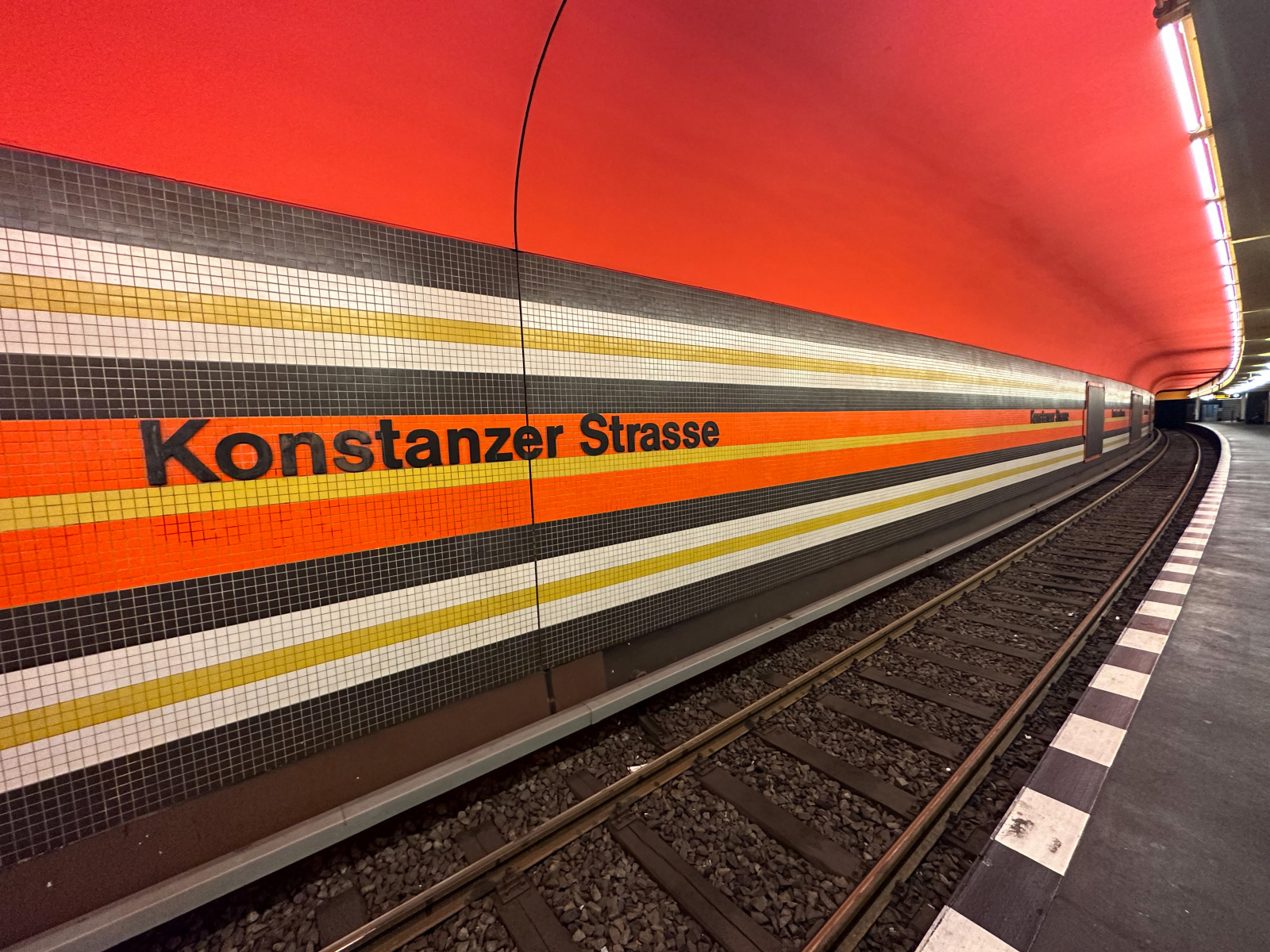
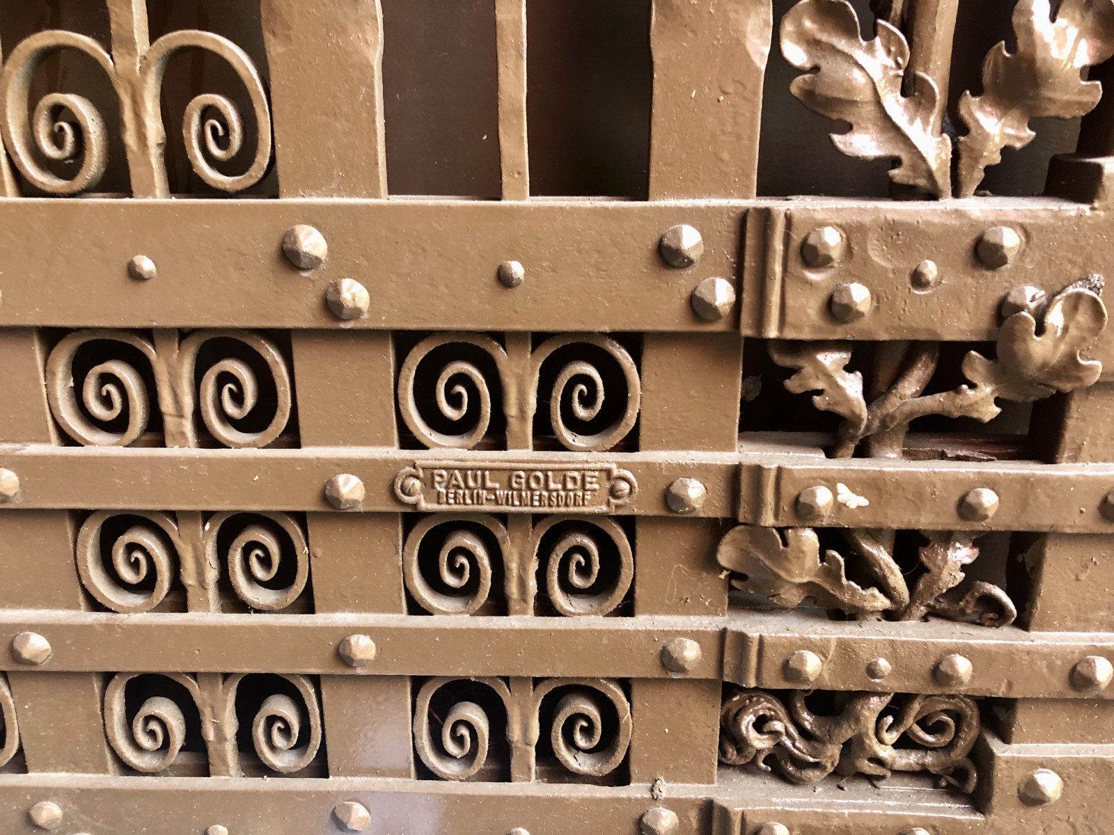
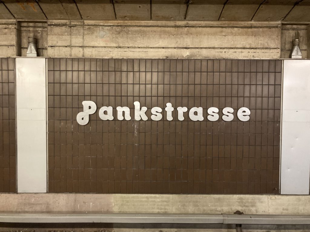
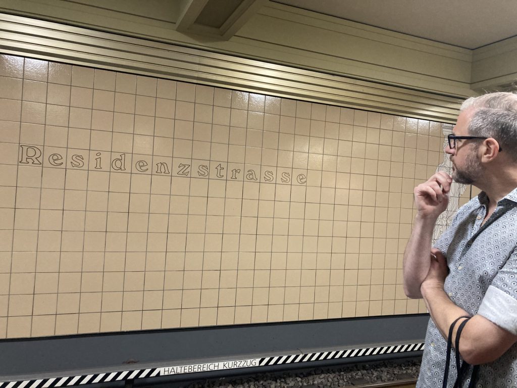
Neben Schriften ging an diesem Nachmittag auch um Farben, Fliesen und Säulen. Es ging um lieb- und kraftlosen Denkmalschutz (siehe Bild von der Pankstraße), um gedankenlos ersetzte Schriftschätze und um gute Zurichtung trotz starrer Kachelstruktur (siehe Residenzstraße). Natürlich ging es auch um Menschen, vor allem um den visionären Rainer Gerhard Rümmler, Gestalter annähernd aller neu erbauten Berliner U-Bahnhöfe von Mitte der 1960er bis Mitte der 1990er Jahre – auch entlang der U8. Rümmler war übrigens so visionär und zukunftsgerichtet, dass er vorsichtshalber das Eszett in den U-Bahnhöfen vermied („…strasse“) – denn wer weiß schon, was bleibt?
Unsere Route verlief nordwärts, mit Einzelstopps zwischen Gesundbrunnen und Lindauer Allee, dann im langen Rutsch zurück zum Alexanderplatz (herrlicher Stilmix ionisch-imitierter Säulen) und von da aus zum gemeinsamen Feierabendbier in den Pratergarten. Dort hatten wir – nebst Getränken – spannenden Austausch mit den anderen Spaziergangsgruppen und Gästen, die „einfach so“ vorbeikamen. Vielen Dank allen interessierten Teilnehmer·innen und Jesse, für deine Begeisterung, deine unterhaltsamen Schilderungen und das viele Wissen, das wir nun freudig auf jeder U-Bahnfahrt Revue passieren lassen!
Einen Appell von Jesse möchten wir hier noch für die Öffentlichkeit festhalten: Berlin, kümmere dich um dein einmaliges visuell diverses U-Bahnnetz! Dieser typografische und gestalterische Schatz der Unterschiedlichkeit der Bahnhöfe sollte unbedingt geschätzt und gepflegt werden. Er gehört zu Berlin – und das soll auch noch lange so bleiben.
Themenverwandt: Der U7-Typewalk mit Jesse Simon im Herbst 2022.
Mit Fritz und Flo durch den wilden Wedding
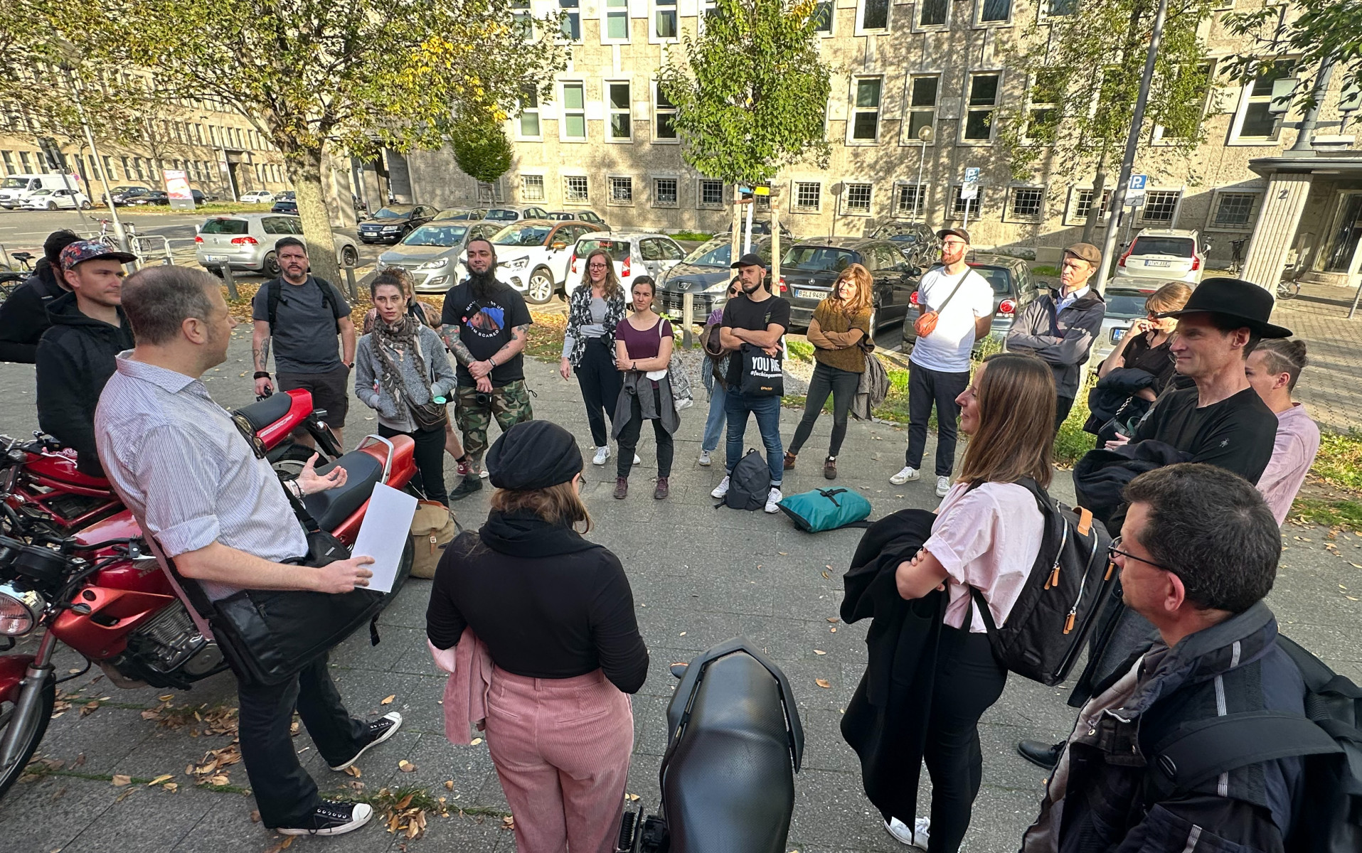
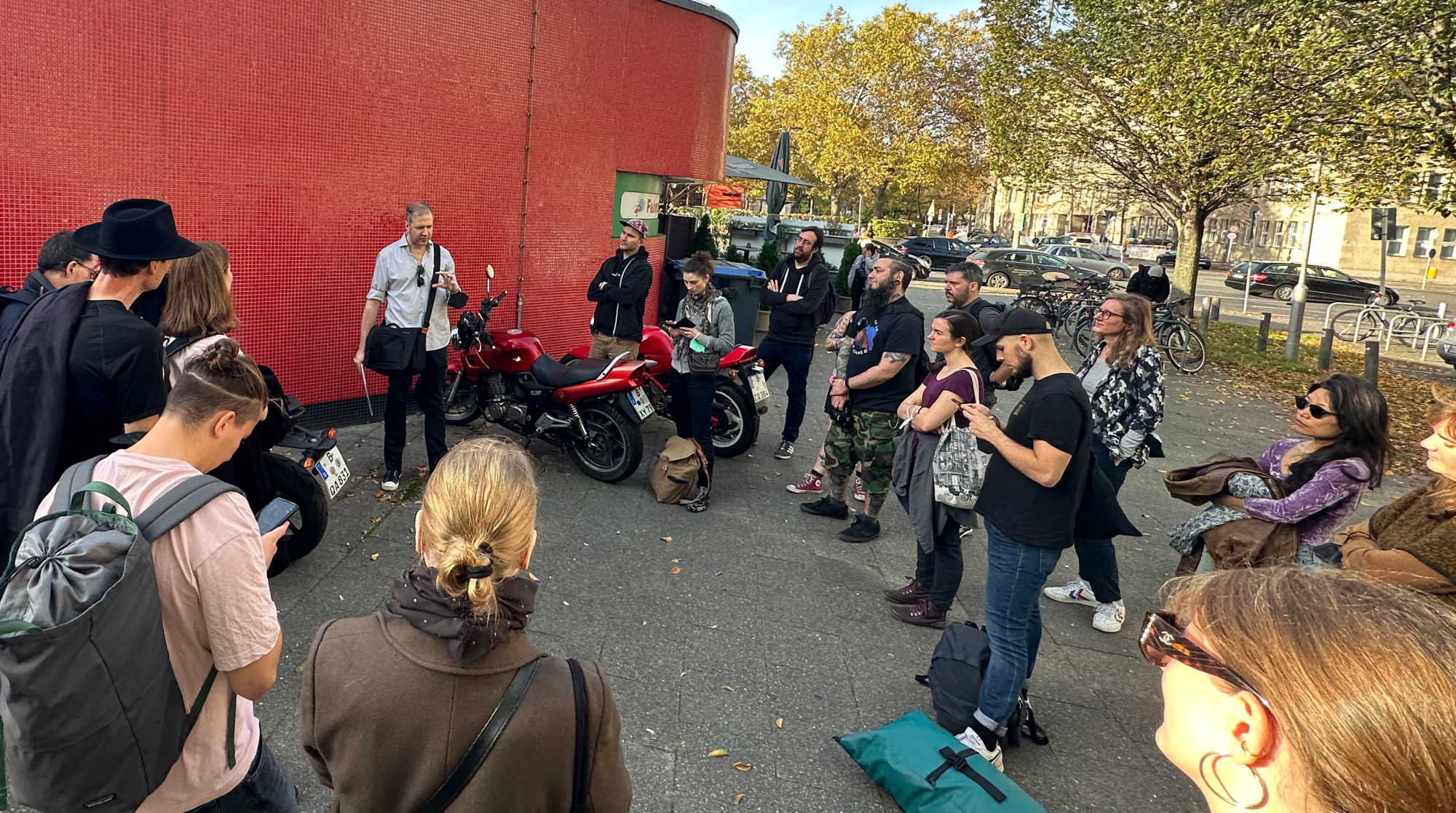
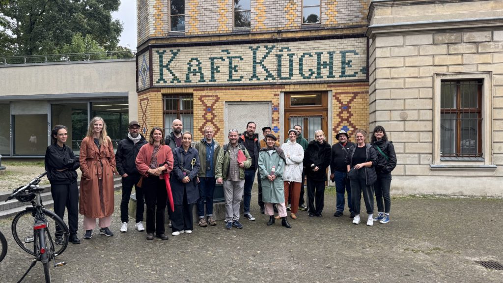
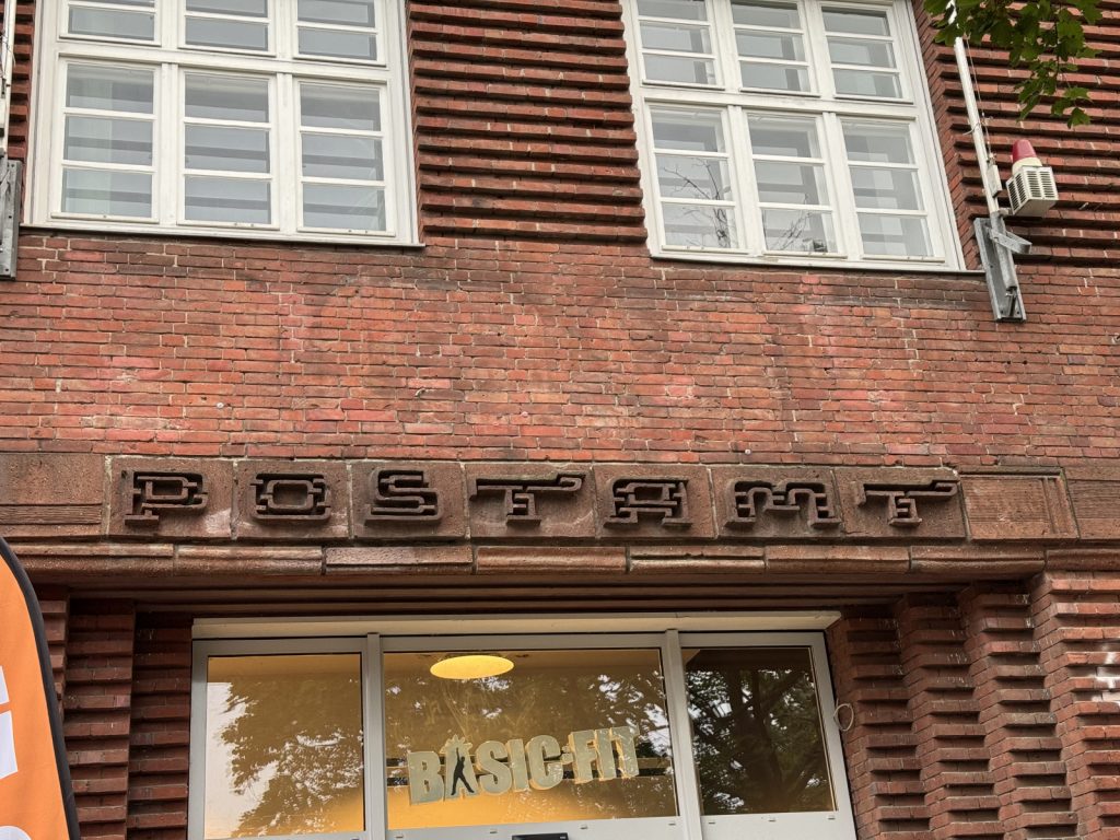
Der Wedding Walk überzeugte durch Wildheit, optisch und akustisch, durchsetzt von erholsamen Zwischenetappen: bei den Spaziergängen durchs ruhige Grüne entlang der Panke konnten sich Augen und Ohren erholen und die Partizipierenden plaudern. Apropos Partizipierende, wer war dabei? Wir bauten spontan eine Vorstellungsrunde ein und prompt fanden sich Querverbindungen, gemeinsame Bezugspunkte, etwa zu den Studienorten Potsdam und Weimar. Zurück in den Wedding: In Ermangelung dichtgesäter historischer Schriftbeispiele bezogen unsere Spaziergangsleiter Architektonisches in den Rundgang ein, das war lobens- und lohnenswert.
Fritz Grögel und Florian Hardwig waren bestens vorbereitet. Sie brillierten mit historischem Wissen – und mit ihren Laminaten: in Laminatfolie eingeschweißte, ergo regensichere Schrift- und Schautafeln in DIN A4, die sie auch im kurzzeitig einsetzenden Nieselregen schadlos herumreichen konnten.
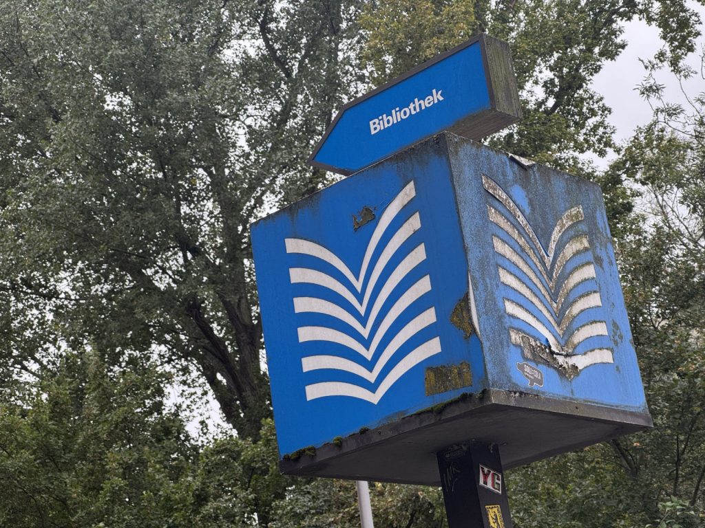
Gleich zu Beginn eine traurige Anekdote. Das schöne Logo für öffentliche Bibliotheken, stilisierte Seiten eines aufgeschlagenen Buches, dazu der Schriftzug Bibliothek im gleichen Leuchtblau, ist nur noch in Form von Restbeständen in Gebrauch (wir fanden es mehrmals auf unserem Weg). Die Marke entstand 1977 für das Deutsche Bibliotheksinstitut; dieses wurde 1999 aufgelöst und die Marke 2009 gelöscht. Wie schade. Memo: Die Bildmarke dient(e) als Wegweiser und Kennzeichen für ein kulturelles Angebot, das kaum Geld kostet und für jeden Menschen frei zugänglich war – und ist. Wir statteten einer Bibliothek am Wegesrand einen kurzen Besuch ab, ehrenhalber und weil manche zum WC mussten.
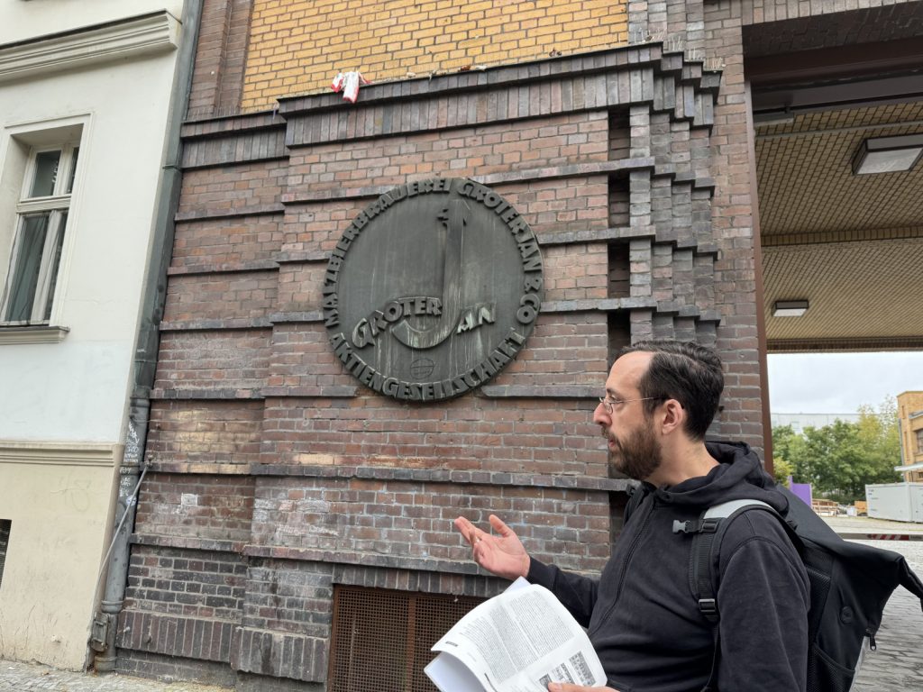
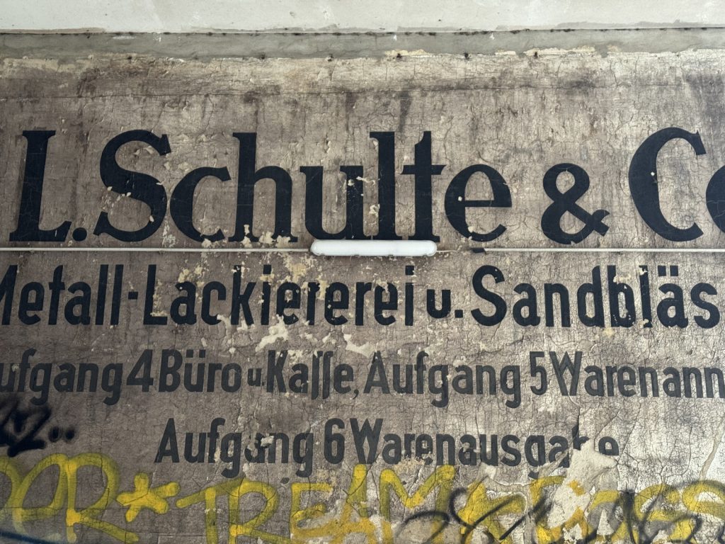
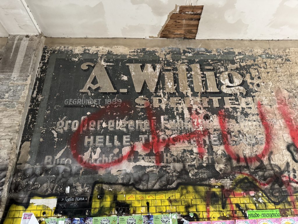
In Erinnerung bleibt aber auch das großartige Logo der Malzbierbrauerei Groterjan, das in Metall von fast einem Meter Durchmesser am ehemaligen Firmengebäude prangt. Dazu passend zeigten Fritz und Flo Plakatschriften der Zeit, als bekannteste wohl Louis Oppenheims markante Fanfare, die in den 1920er Jahren populär wurde. An der Seite des Firmengebäudes , leider schon recht abgeblättert, noch ein ein Groterjan-Schriftzug. Wir waren beeindruckt von den zum Teil auch kalkulatorisch kühnen Experimenten früherer Entrepreneure, etwa dem Architekten mit den bunt glasierten Fassadenfliesen und den Heilwasserproduzenten auf der Badstraße, die selbiges Heilwasser auch dann noch berlinweit vertrieben, als die Heilquelle, vielmehr der Gesundbrunnen, längst geschlossen war. Nun wissen wir, woher die Straße und der Stadtteil ihre Namen haben. Warum allerdings hieß das Kino an gleicher Stelle Marienburg? Egal. Wir haben gelernt, dass es an so manch öffentlichem Ort, Kaffee- oder Biergarten statt Ausschank (mangels Schanklizenz) Kaffeeküchen gab, an denen sich die Besuchenden ihren mitgebrachten Kaffee selbst zubereiten konnten.
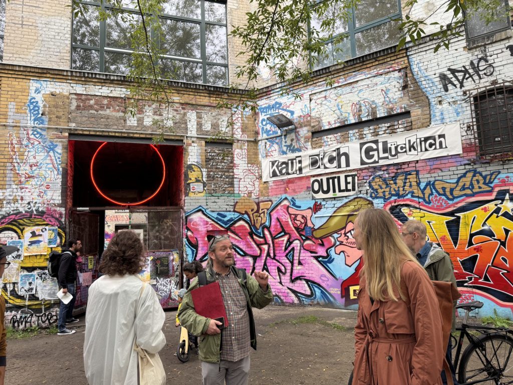
Zum krönenden Abschluss besuchten wir ein sensationelles Ensemble von ineinander übergehenden Handwerkerhöfen, die, noch nicht saniert, kreativ und subkulturell genutzt werden. Innerhalb des Ensembles fanden wir uns in einer noch ursprünglich erhaltenen Hofdurchfahrt wieder, für viele das Glanzlicht unserer Tour: gleich vier Wandbereiche voll hundert Jahre alten Inschriften, von kundigen Schildermalern direkt aufs Gemäuer angebracht, Schriftzüge, die mit Dauer der Betrachtung und dank der kundigen Erläuterungen unserer Schriftspaziergangsleitenden immer interessanter wurden. Dies gilt für den gesamten Wedding Walk (Nachbericht und Bilder vom letzten Mal) – wie auch für unsere anderen Spaziergänge durch die Schriftlandschaft Berlins.
Ein Format, das wir mit Sicherheit wiederholen werden!

Vielen Dank allen Type Walk Guides und allen, die mitgegangen sind! Das Format werden wir bestimmt mal wiederholen. Im Prater-Biergarten an der Kastanienallee gab es zum Finale ein großes Hallo, angeregten Austausch und einen gemütlichen gemeinsamen Ausklang in großer Runde.