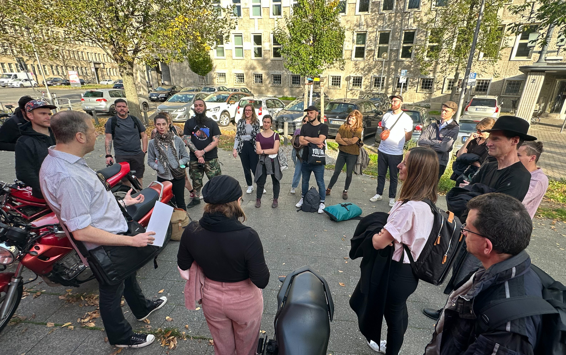
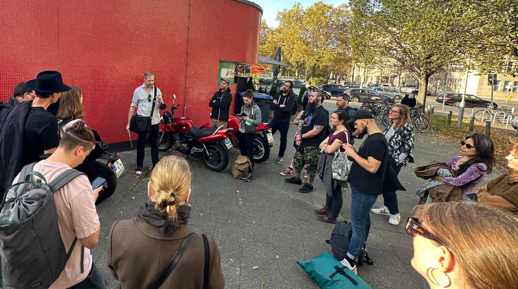
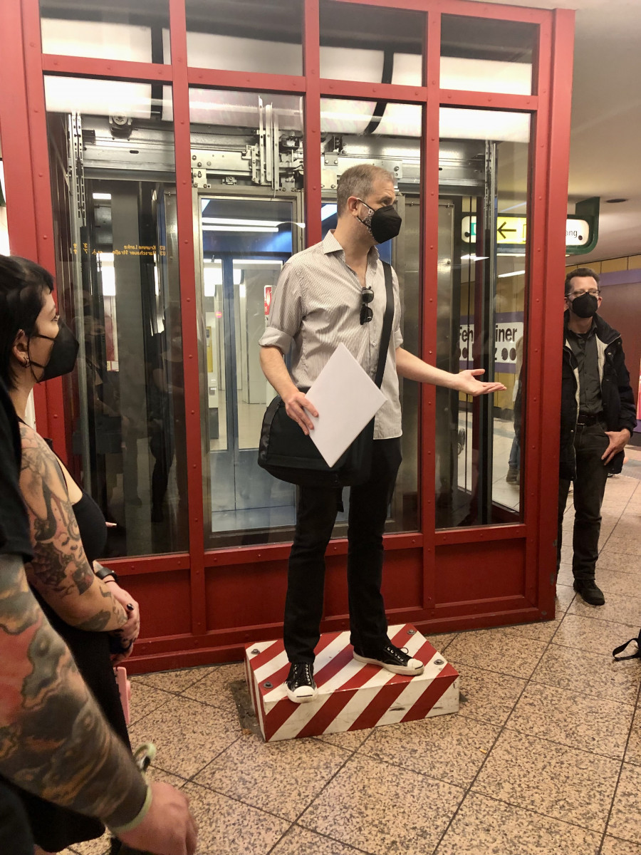
Nur so viel auf Deutsch: Das war ein Hammer. Auf dem Type Walk mit Jesse Simon – es wird nicht der letzte sein! – haben wir so viel über unsere Stadt gelernt wie selten. Und das kondensiert auf einen kurzen Abschnitt der U-Bahnstrecke U7. // The rest of our Nachbericht will be in English so that we can quote easier from what we learned with Jesse Simon at his first Schriftspaziergang with us. Disclaimer: it will not be the last, he promised.
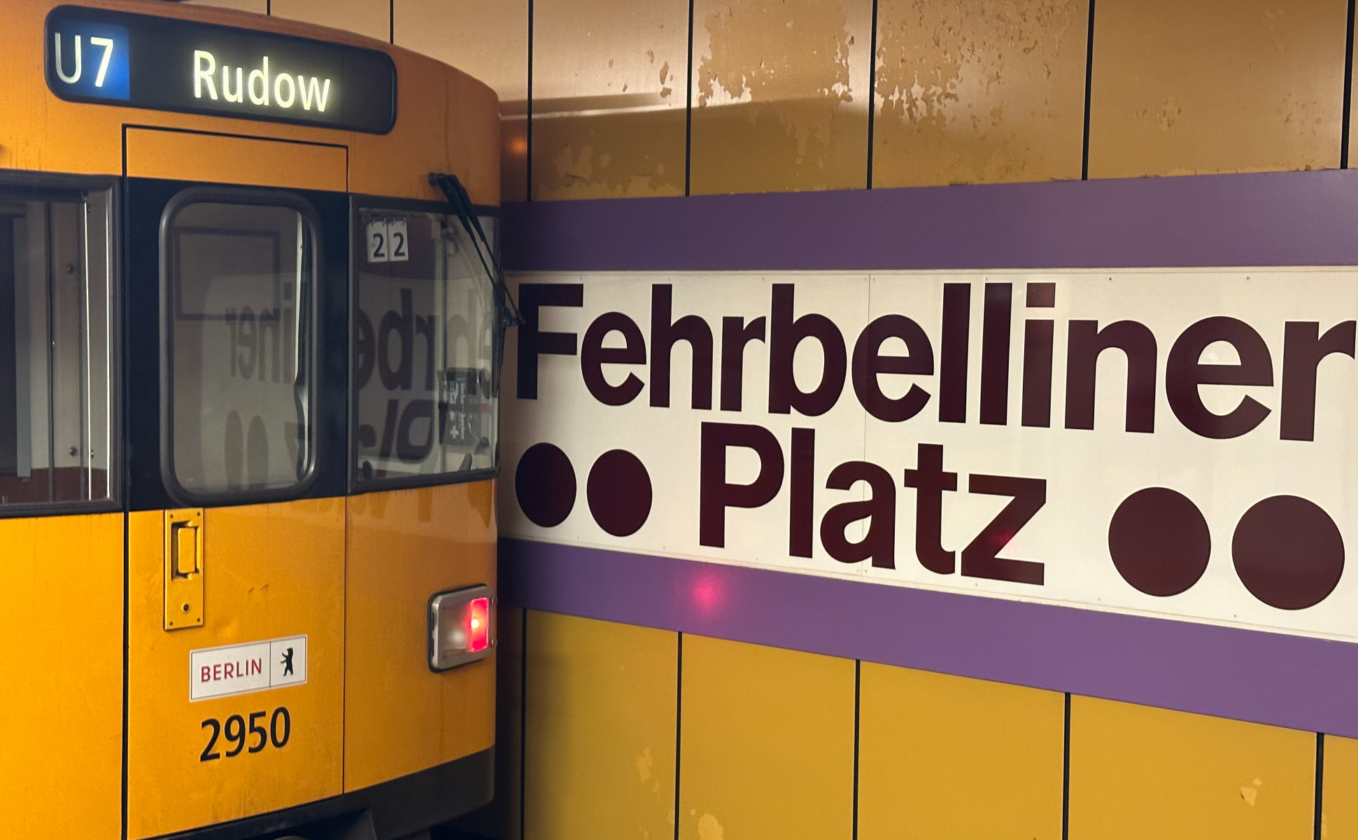
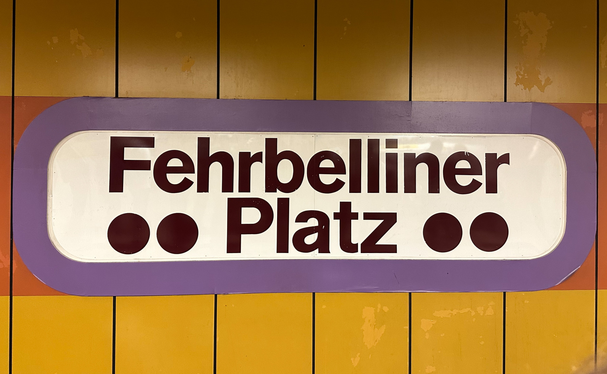
We started our tour underground at Fehrbelliner Platz. With public transport in Berlin, like elsewhere, “it is all about standardisation versus random organic growth” and these two concepts surpass each other again and again. This is how Jesse introduced us to the topic, and into that glorious period in the Sixties and Seventies, when 60 (!!!) new U-Bahn stations were built in Berlin. Almost all of U7 was constructed then, Fehrbelliner Platz in the year 1971. In comparison: only 11 new stations have been built from 1989 until now, in 28 years. “Berlin’s U-Bahn was formed by the forces of history more than a grand plan“. So one specific thing about the Berlin U-Bahn is, that “it is full of gaps, it’s incomplete” — even districts have been built with U-Bahn stations being promised which were never built (referring to Märkisches Viertel and large sections of Spandau).
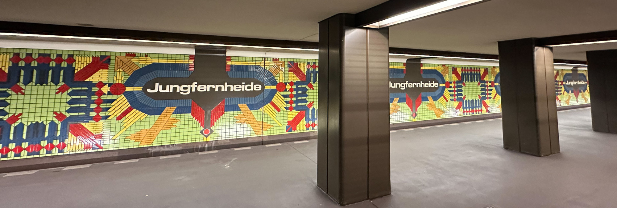
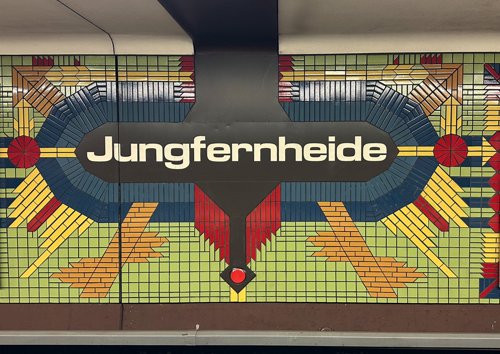
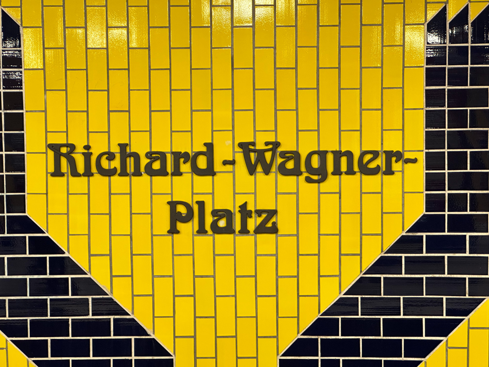
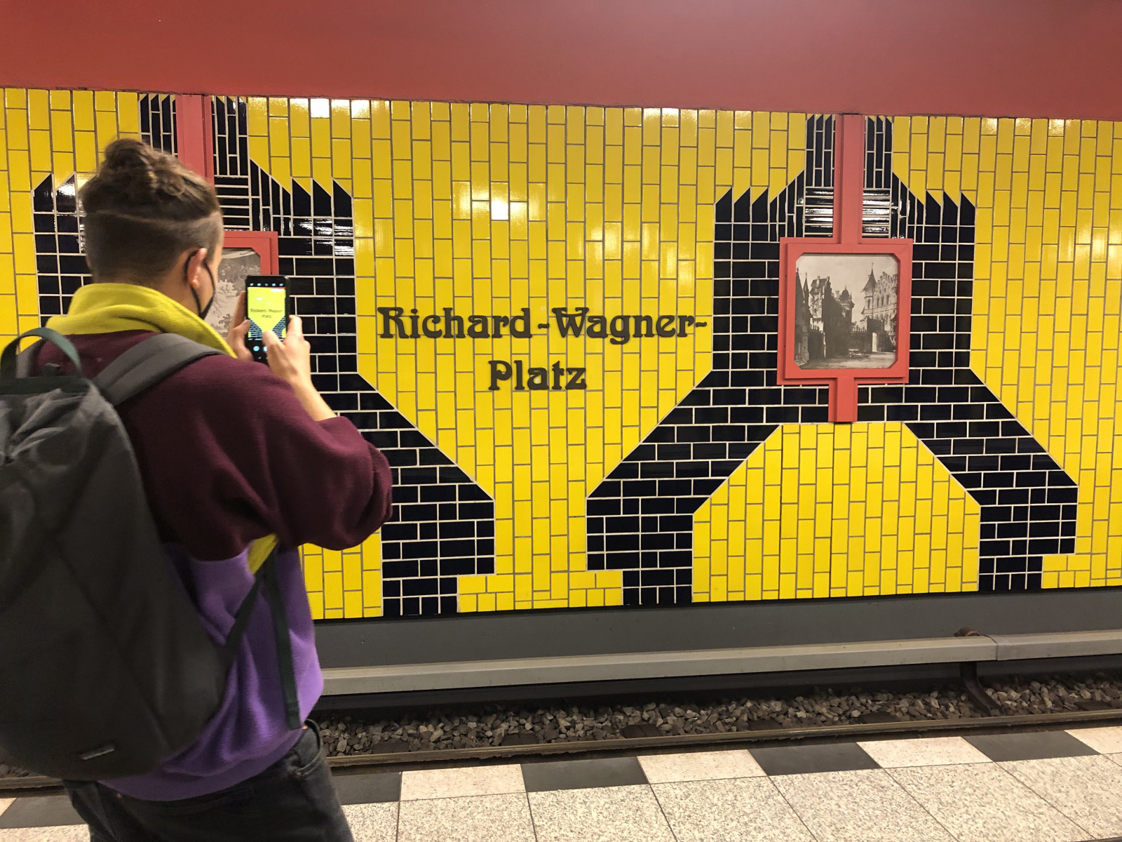
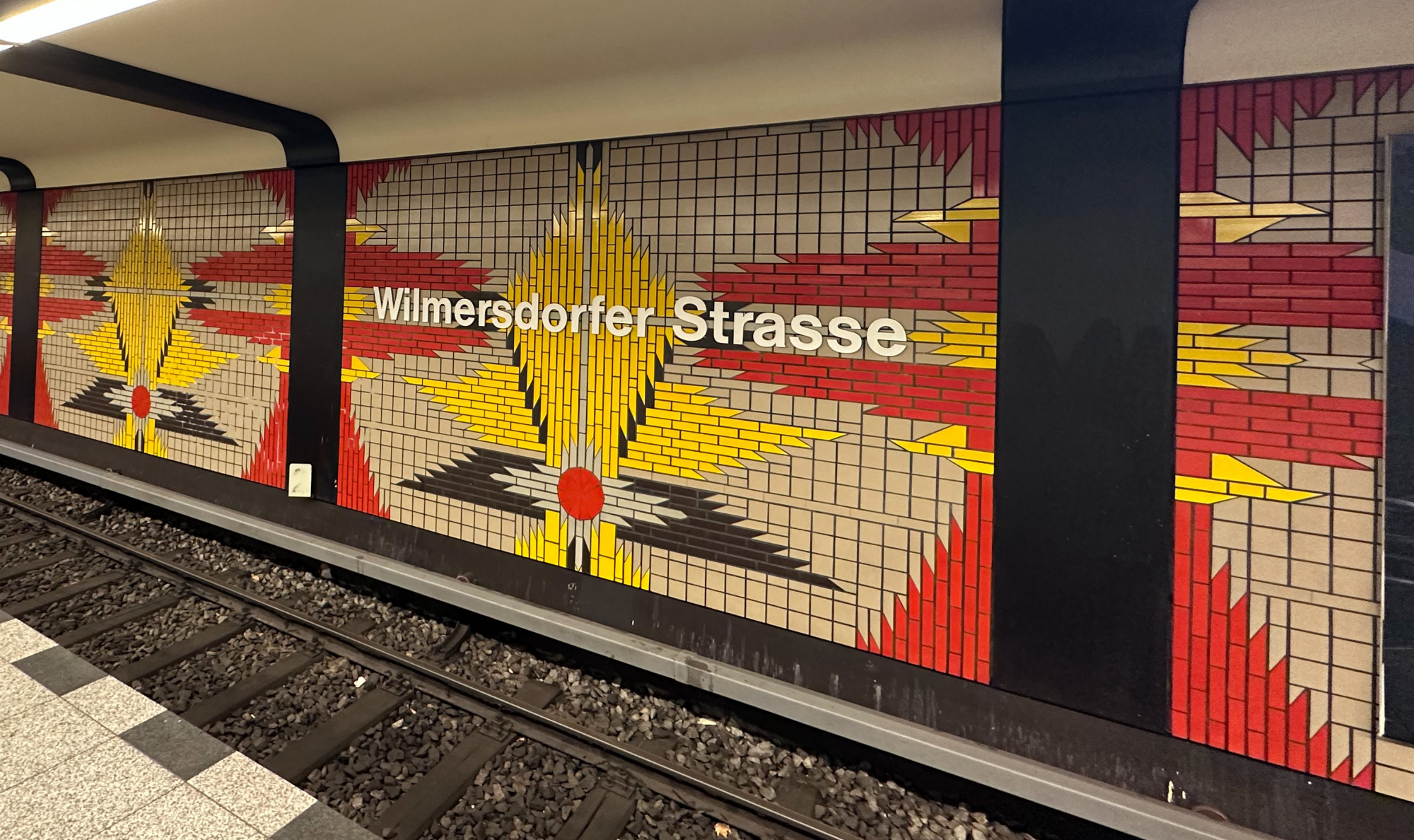
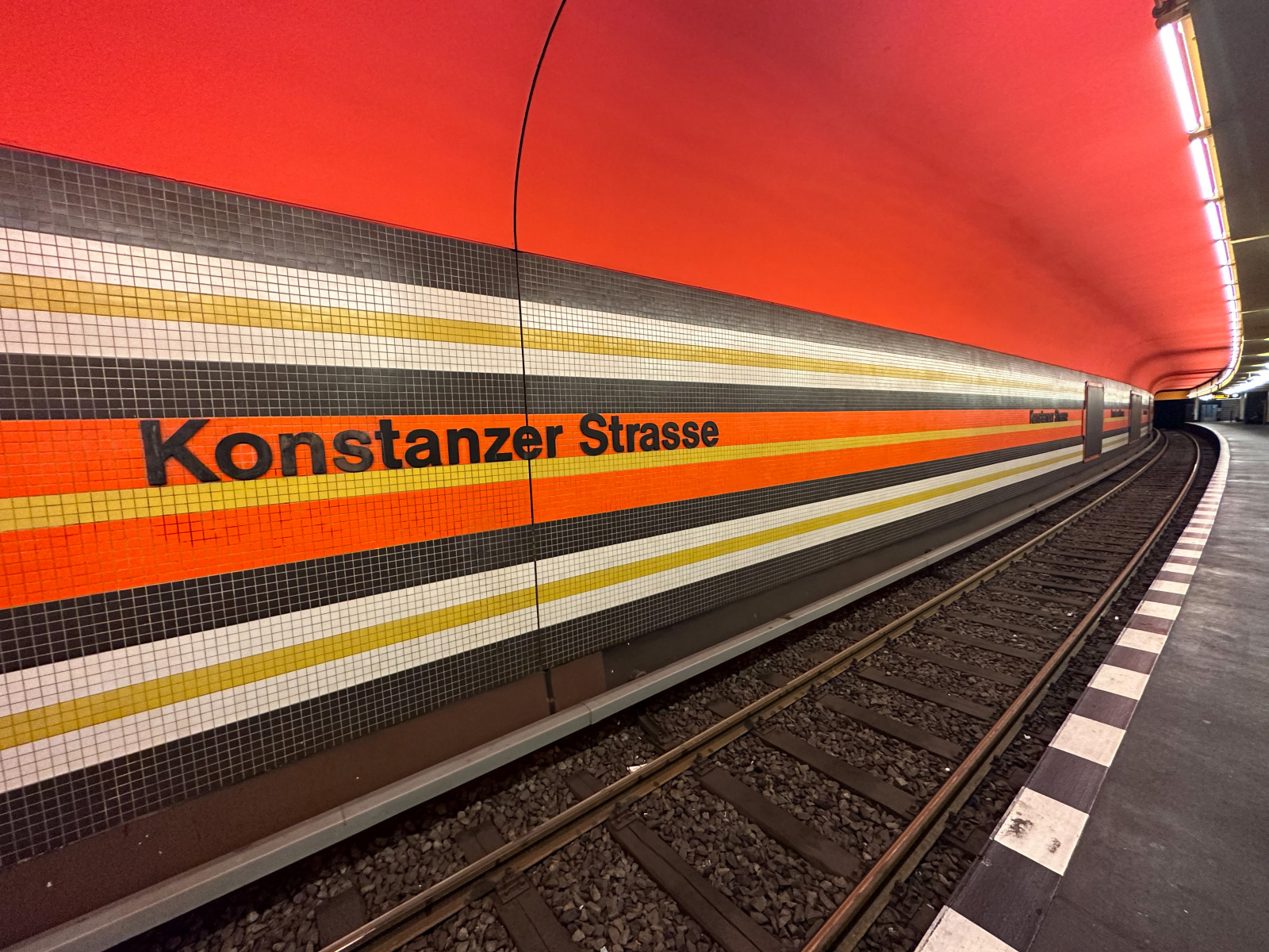
The U7 stations we know and those we visit today were designed by Rainer Gerhard Rümmler (Wiki article with all his stations listed). Rümmler was the Oberbaurat (Chief City Planer) of Berlin, working for the senate’s building and housing department. Another important name here is Werner Düttmann who constructed the Hansa-U-Bahn station, but mostly other buildings (not stations) in the post-war era.
What we see today, is that each station we encounter at the U7 was designed with concern and a concept of having them integrated into their surroundings — still standing out in function and aesthetics. And the aesthetics of those days was astounding. It was functional and practical and deeply humanistic at the same time.
The times demanded to develop truly unique stations after those from earlier days had been criticised as “too samey”. So, from that on, “Rümmler started to develop his Berlin vernacular style where everything was about difference”, Jesse summarises. “The pop architecture of the late Sixties was about breaking away from the rigid forms of pose-war modernism and moving into a brighter future where everything is curved, soft and gentle”.
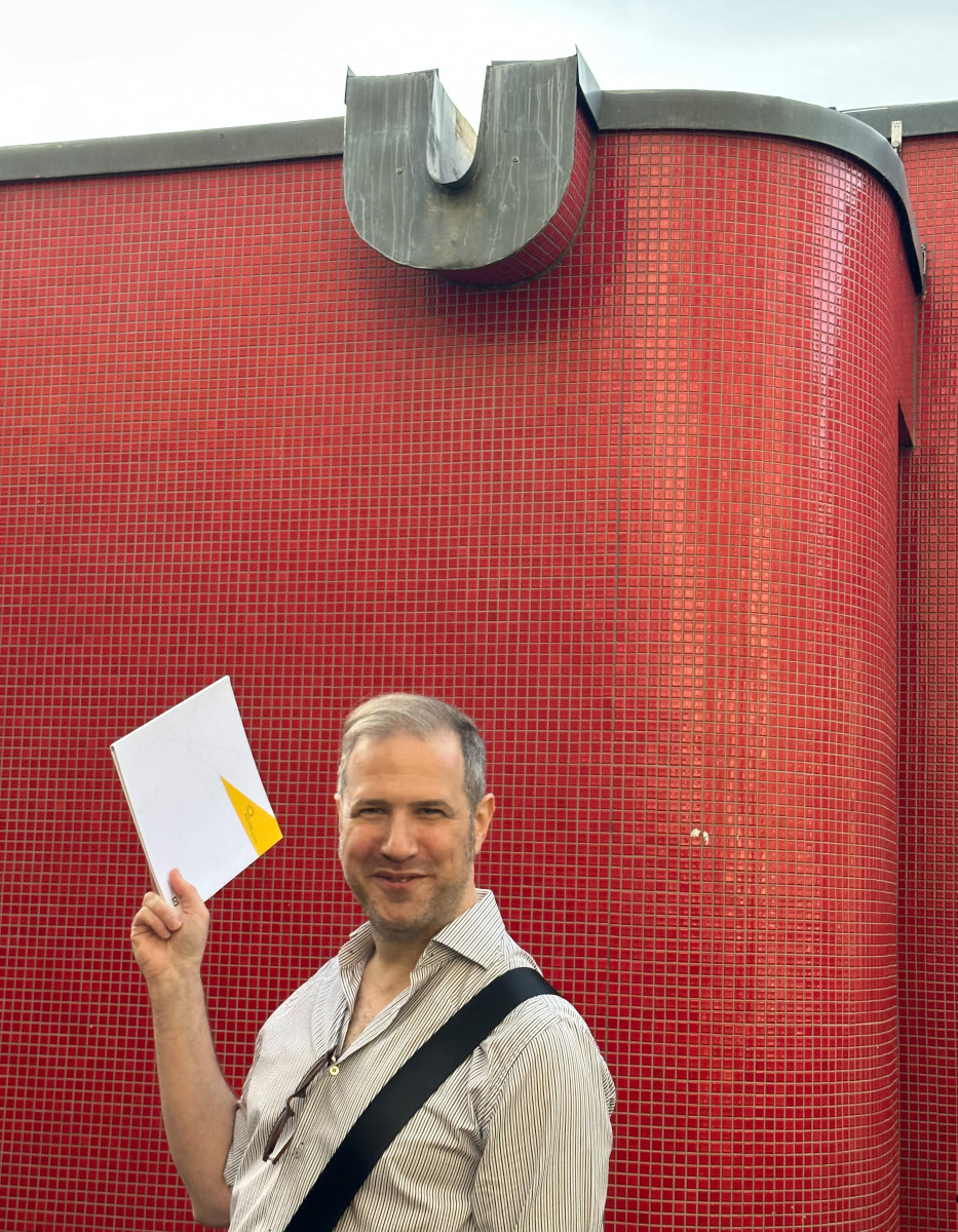
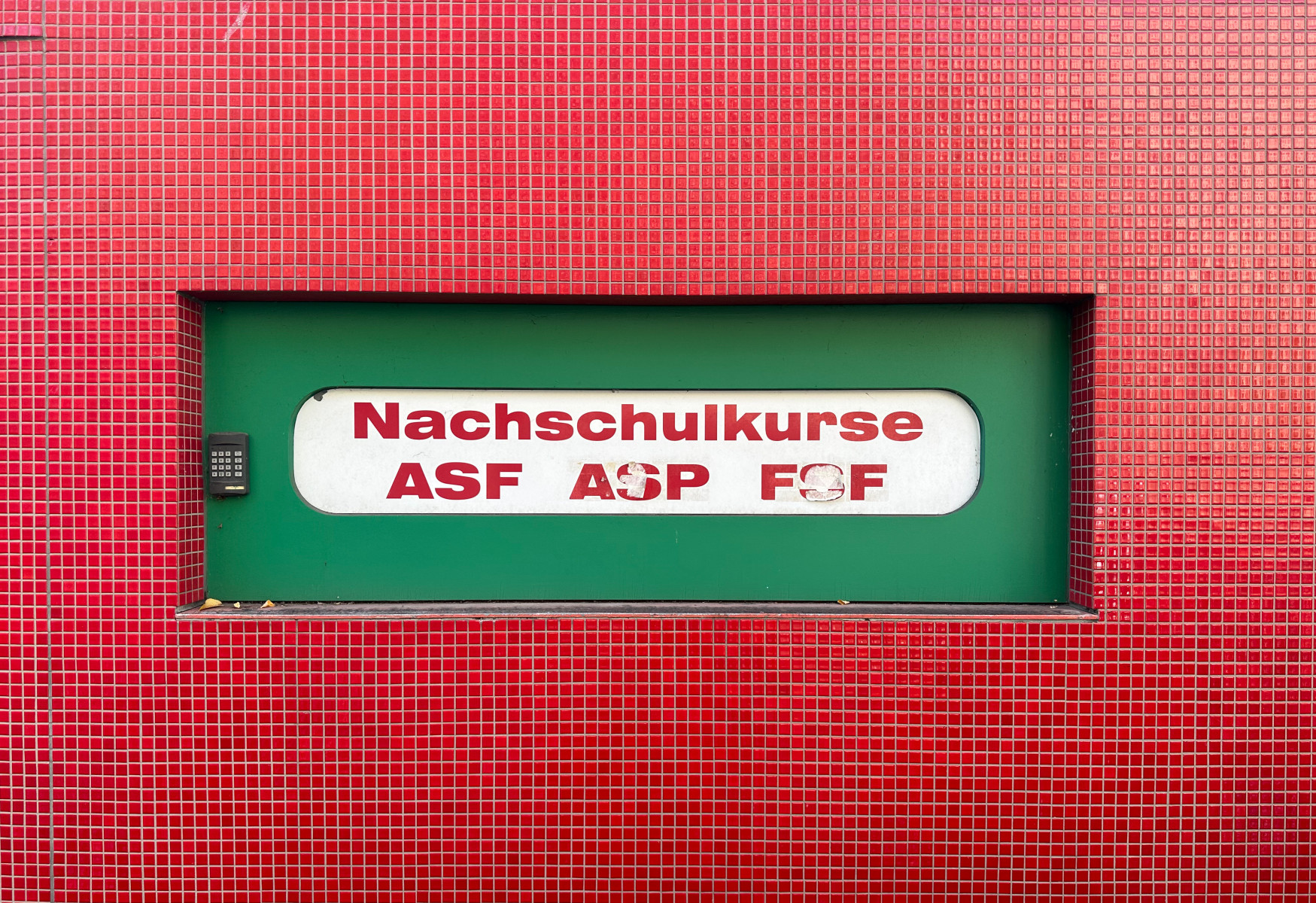
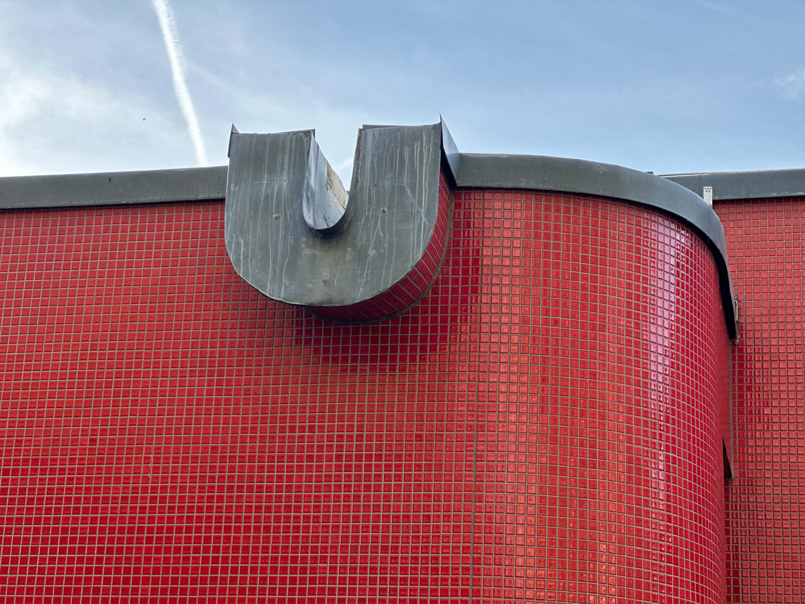
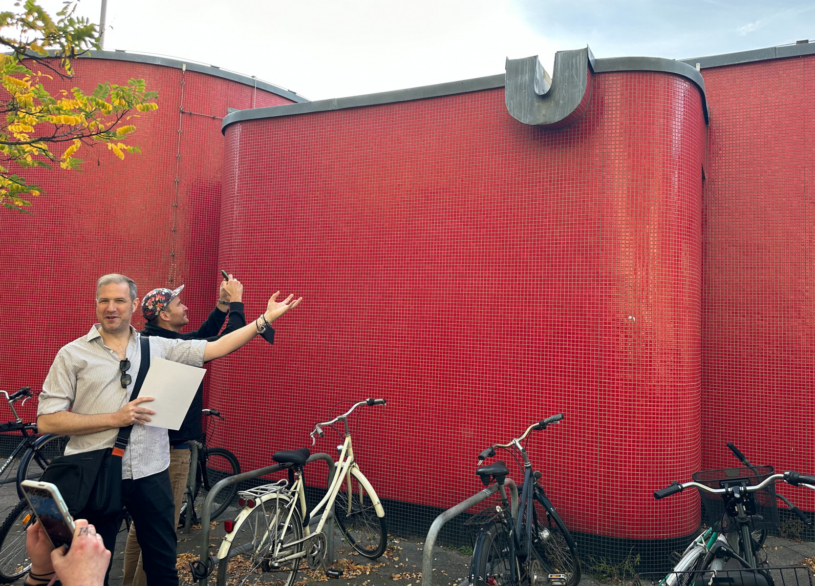
Curved, soft and gentle indeed: outdoors at Fehrbelliner Platz, we find ourselves standing at a red organic-shaped happiness of a building from the Seventies like on a sunny island — even more so because we are surrounded by, frankly speaking, fascist architecture. Buildings from the early Thirties which yes, “spread some elegance”, but most of all an air of correctness, control and overwhelming dominance.
For those who know or who travelled through: the Bierpinsel in Steglitz at the U9 extension would be another great example of those days, almost like a monument; and also Dreilinden is part of Rümmler’s famous legacy. Like Tegel airport and all the stations on the way to Tegel, those buildings were designed in the times when the city was divided. Which also were the times when architects used Letraset. Letra-, wait, what?
At some point during our tour, Jesse leaves “the path of non-commentary objectivity”, as he warns us. The Sixties and Seventies are “the most endangered era of architecture being destroyed. It seems to be a problem to still accept that Berlin was being capable of taking care of itself”. To him (not only to him), this is “really problematic”. Because what makes Berlin so great is that you can (still) see all the layers formed by history – buildings as the truest proof, like eyewitnesses of the times the city has gone through.
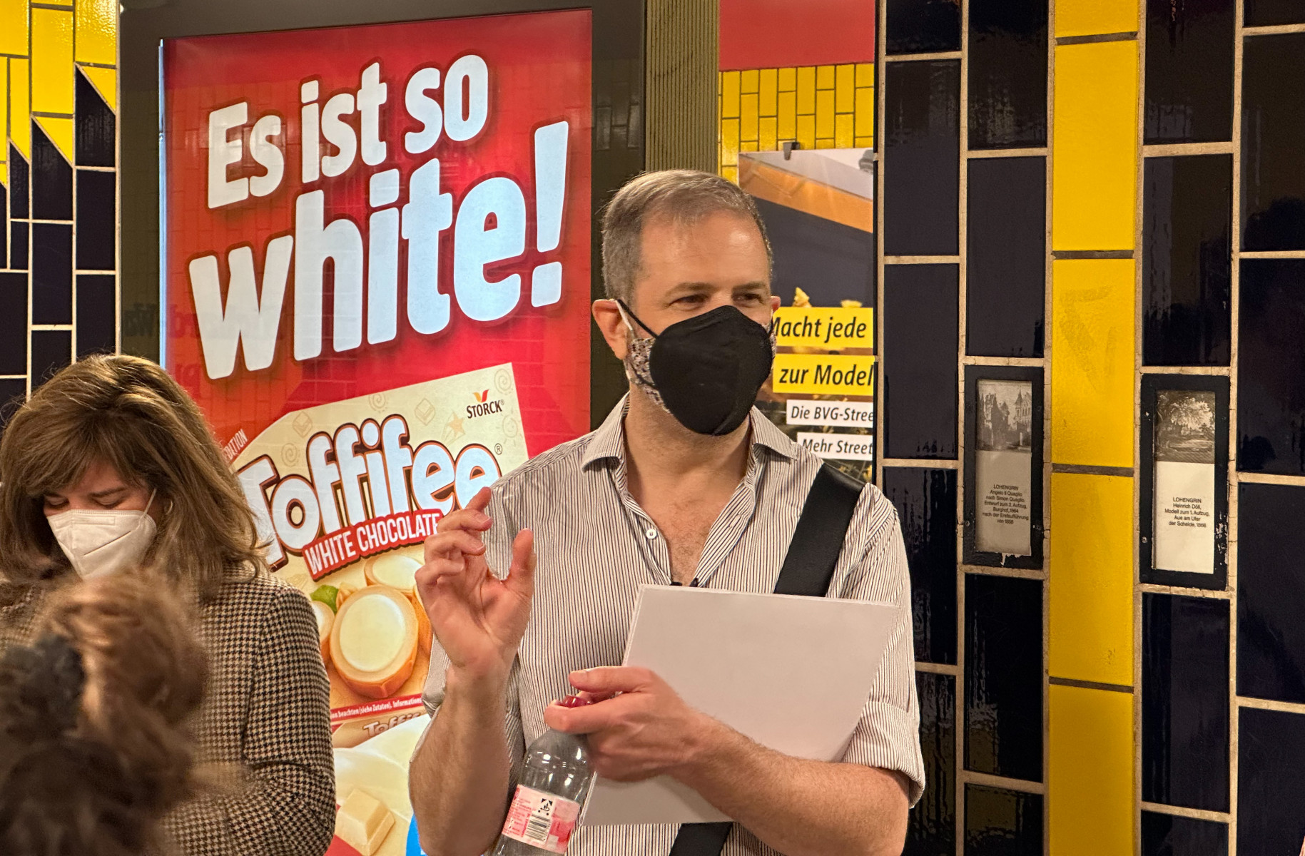
The most shocking example of historical misrepresentation, not to speak about falsification — in German we have the beautiful word Geschichtsklitterung — awaits us at Bismarckstraße. Beware. That glossy grass-green of the underground walls of the station might be considered “a fine colour” — but why is it here? Not to mention the typefaces.
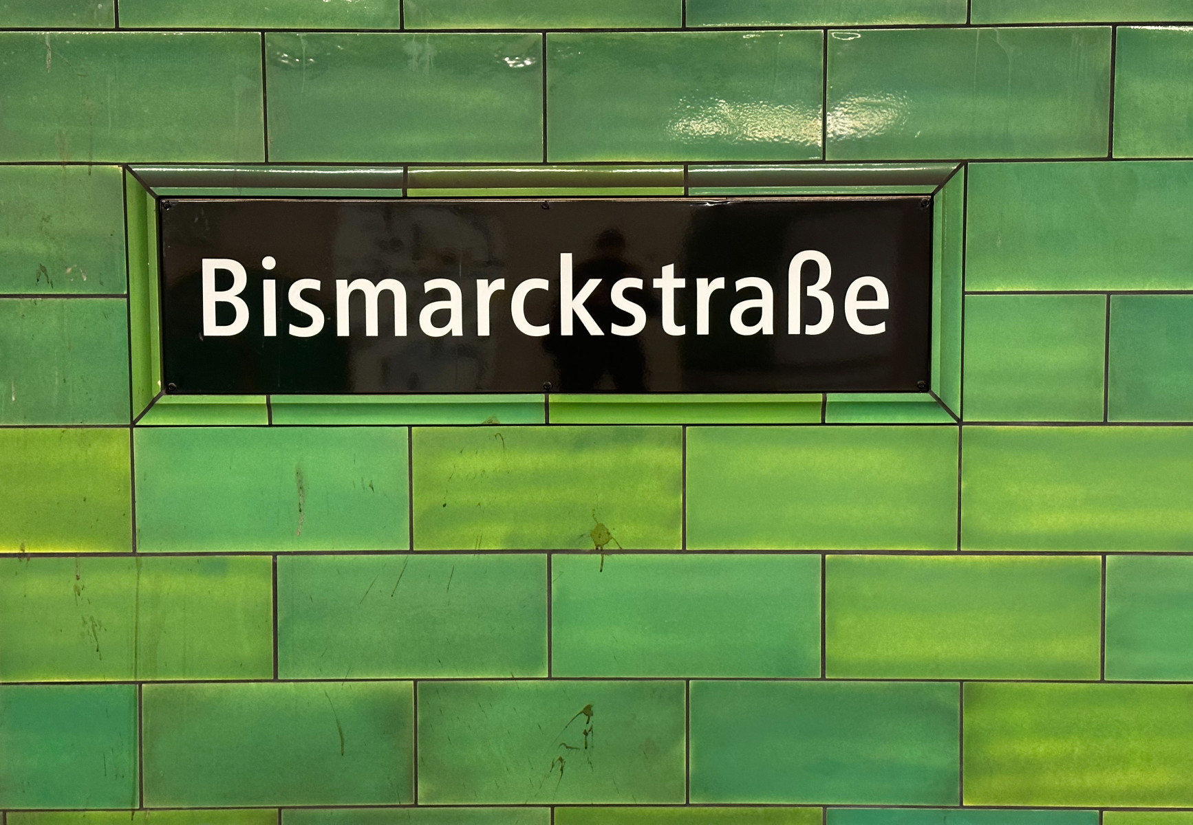
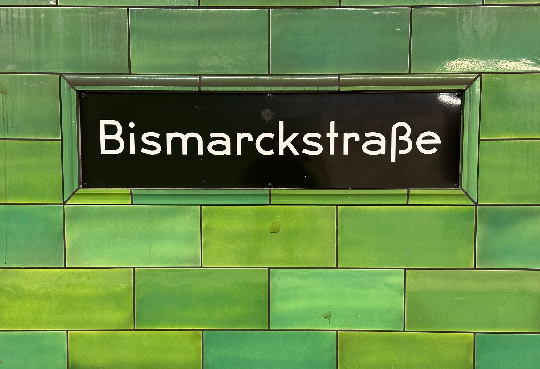
The walls at Bismarckstraße used to be in small yellow Sixties tiles. Now, why so huge? And what was the motivation behind the choice, or rather, the mix of type here? Why re-implement some kinds of wanna-be Twenties type in a station from a much later period? Nobody seems to take care. „There is no respect for the era of division”, Jesse says in a dark voice. As true and cruel as it is: tourism rules.
Sadly, there has not been something like a conscious “choice” whatsoever here, not color, not type. The whole renovation of Bismarckstraße U-Bahn station is, in the best way of interpreting it, “an attempted level of classicism that doesn’t belong here”. Even with a lot of goodwill this is not convincing or satisfying.
Luckily Jesse takes us further through Berlin’s diverse underground to experience some more of the gorgeous psychedelic settings along the U7.
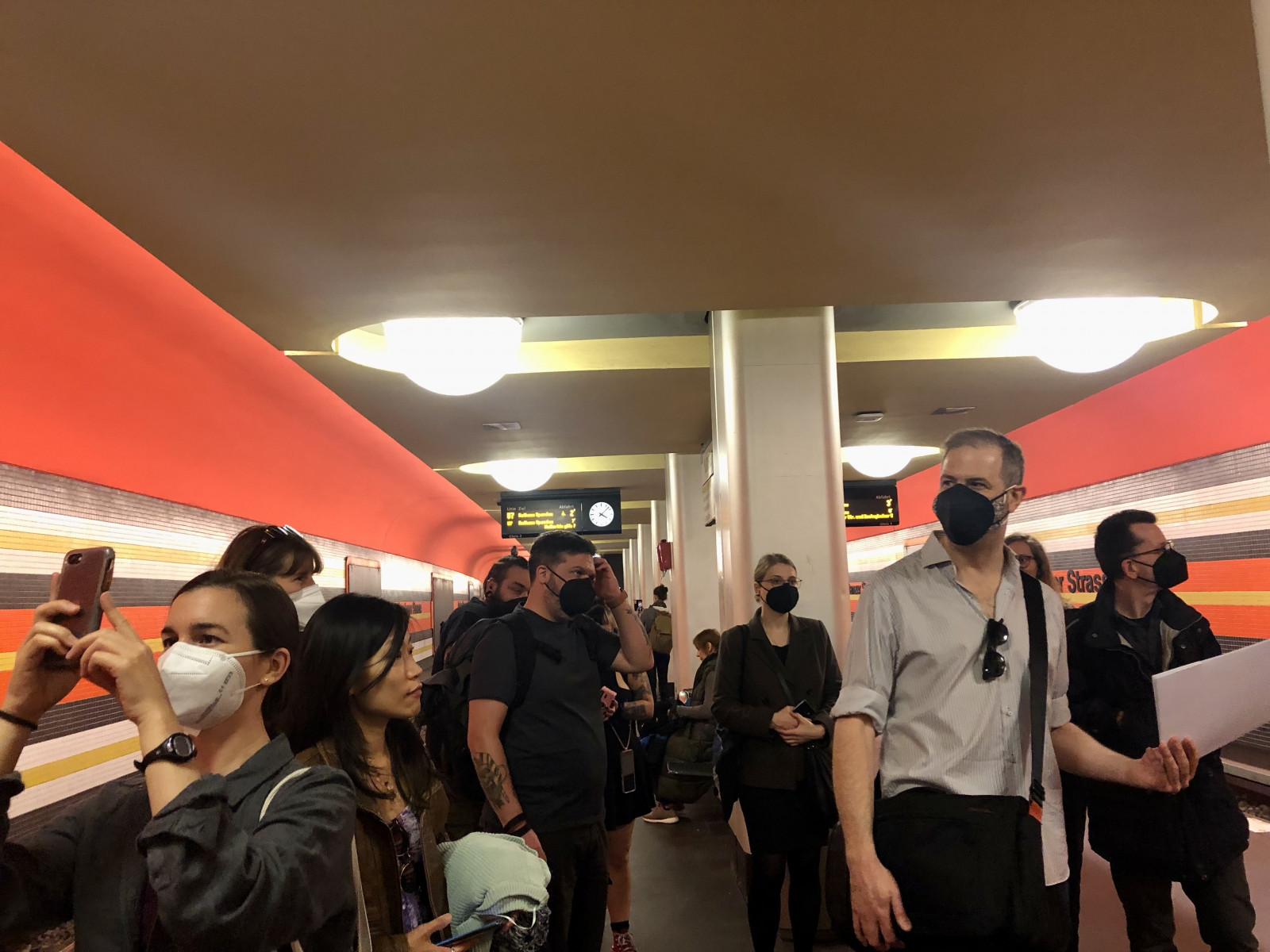
After all this variety of impressions and numerous stations, our group happily walked from Zoologischer Garten to Schleusenkrug beer garden, also a premiere. There we not only could supply our speaker with his well-deserved beer, but also enjoy a true Berlin Currywurst and very nice potatoes and stuff. Which lifted our spirits in regard to the city’s originals. So, the evening ended in a big group table with those visitors who came directly to Schleusenkrug, with heated conversations, and more beer. A true Typostammtisch-Stammtisch after all. Phew.
Thank you Jesse for this most wonderful Type Walk! Lovely meeting you! Let’s continue the ride.