Scroll down for English survey of Saturday’s presentations (skipping our German Überblick).
Die traditionelle Type Masters Ausstellung findet diesmal nicht wie sonst im Januar, sondern mitten im Frühlingserwachen statt. Außerdem präsentieren wir nicht einen Jahrgang – es gibt Arbeiten der Abschlussjahrgänge 2020 und 2021 aus Reading & Den Haag zu sehen, sowie Projekte aus Prag, die 2022 erst abgeschlossen sein werden (dazu später mehr). Die Vorbereitungen für diese Ausstellung starteten dementsprechend schon 2020, als Sol die ersten Alumni anfragte, wir uns dann aber coronabedingt gegen eine Ausstellung im Folgejahr entschieden. Umso mehr freuen wir uns, dass am Samstag Graduierte aus allen ausgestellten Schulen und Jahrgängen zugegen sind, um uns etwas über ihre Abschlussprojekte zu erzählen. Doch der Reihe nach:
Der Donnerstagnachmittag
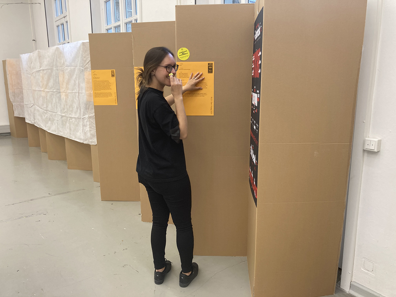
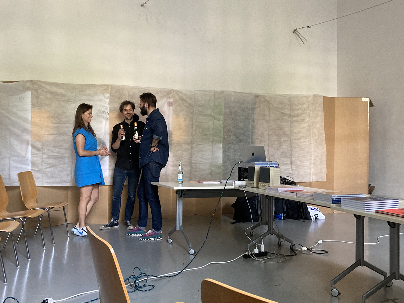
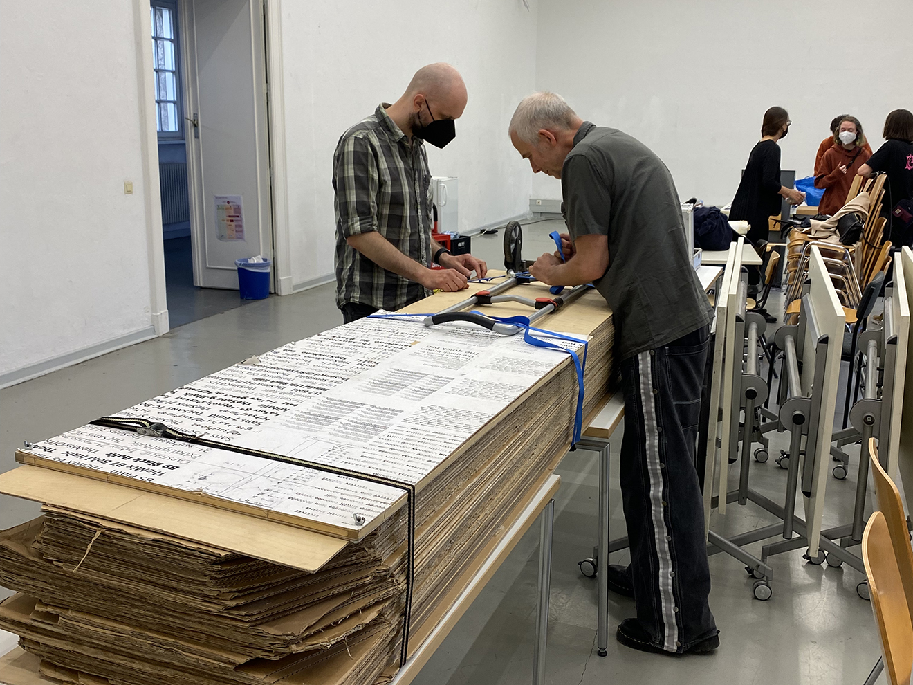
Der Aufbau im Schnelldurchlauf: Schlüssellisten, Stühle, Tische, Kühlschrank, Getränke, Pappwände, Plakate, huch, eins fehlt. Danke Sol Matas und Suki Su (UdK) für die schnelle Druckhilfe! Dank auch an Léna Le Pommelet, Oleksandr Parkhomovskyy, Kai Sinzinger und alle anderen mit helfenden Händen; noch mehr Plakate, Vorhänge, Zeit vorbei. Denn: Direkt vor der Ausstellungseröffnung startet im selben Raum ein absolut sehenswertes Rahmenprogramm, organisiert von Roman Wilhelm und der UdK. Es gastierten Petra Dočekalová und Radek Sidun, die sich und ihre Buchprojekte vorstellen. Dank an Petra, Radek, Roman, das gesamte Team der UdK sowie die ca. 30 Interessierten im Publikum. Die anschließende Umbaupause zwischen den beiden Veranstaltungen ist zugegebenermaßen knapp bemessen aber hey – für Menschen, die sich mit Schrift beschäftigen, ist Geduld kein Fremdwort.
Welcome back!
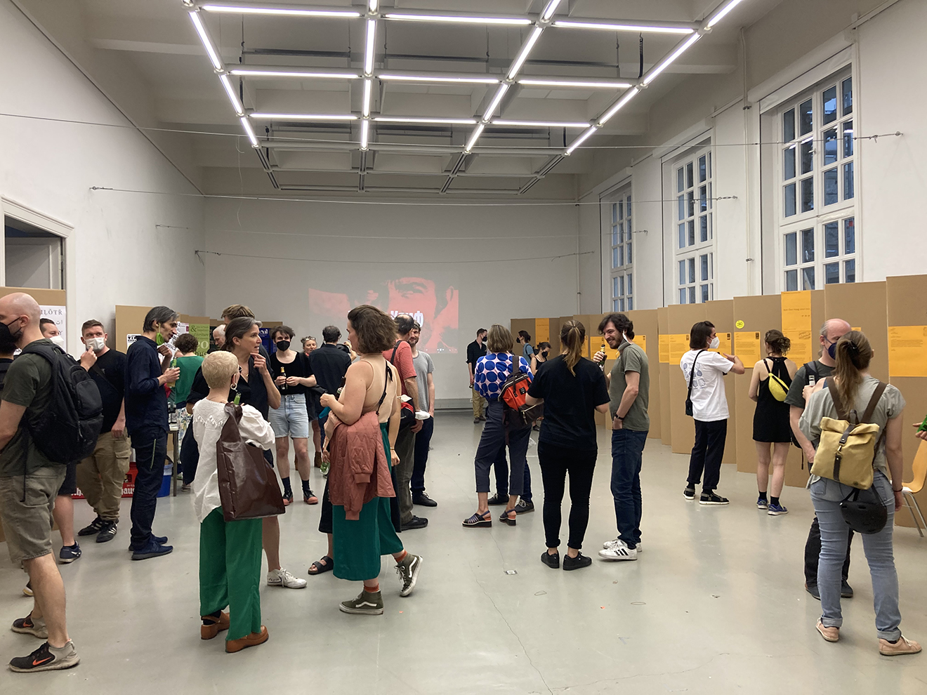
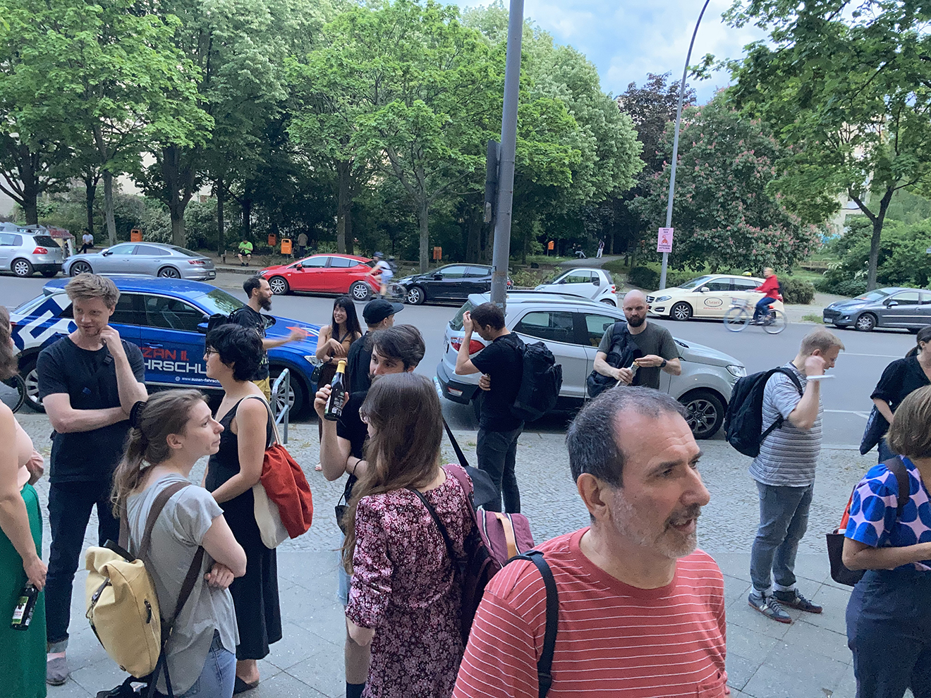
Die Türen öffnen sich also mit Verspätung und siehe da: alles wie immer! Euphorisiert davon, was einem während der letzten beiden Jahre schleichend abhanden gekommen ist (persönlicher Austausch, unverhoffte Wiedersehen, Klassenfahrtstimmung, sowas), ein Toast auf uns alle: Welcome back, Typostammtisch!
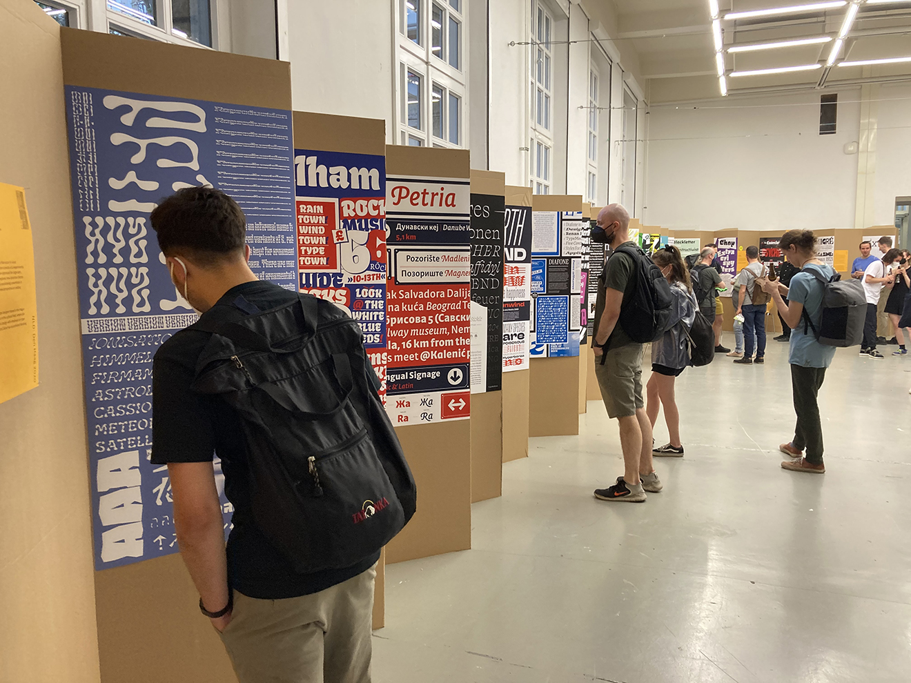
Der Freitagnachmittag und die Statistik
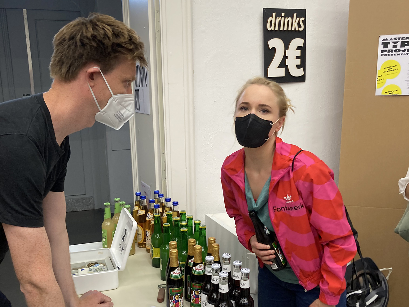
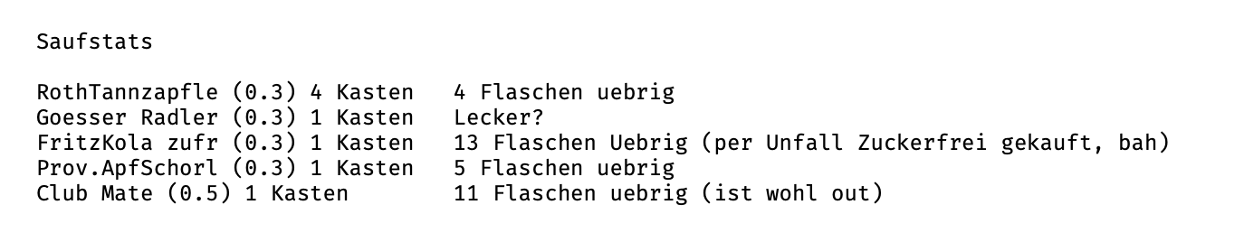
Nach dem Workshop der Kolleg·innen aus Prag am Freitag besuchen nur eine Handvoll Interessierte die Ausstellung. Ob wir das beim nächsten Mal genauso handhaben oder die Ausstellung lieber nur Donnerstag und Samstag öffnen …? Wo wir gerade dabei sind: Auch die offizielle Getränkestatistik von Luc(as) de Groot enthält wertvolle veranstaltungstechnische Erkenntnisse, die wir gern mit euch teilen. Spoiler: Mate ist out.
Der Samstagnachmittag / Saturday afternoon
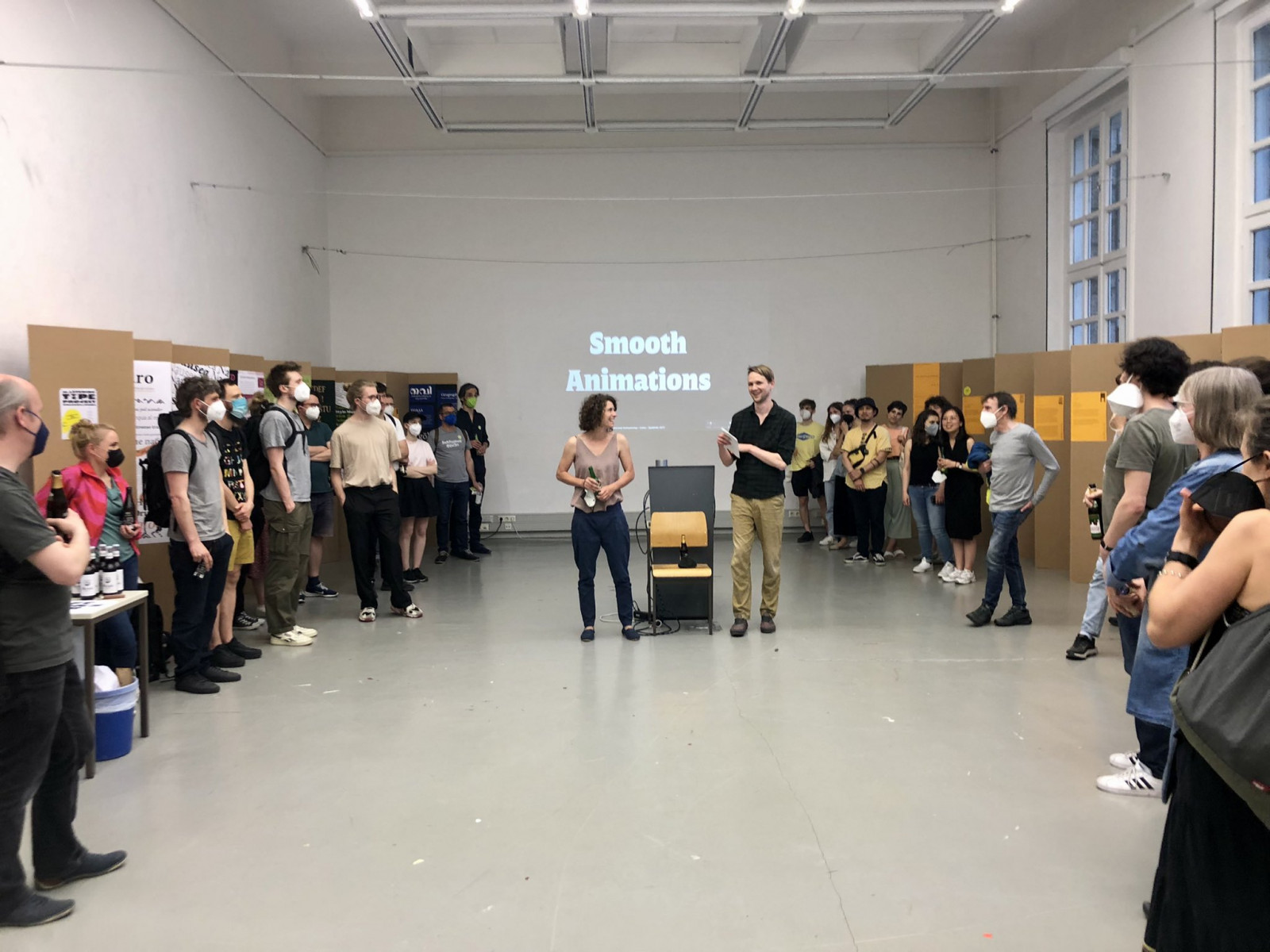
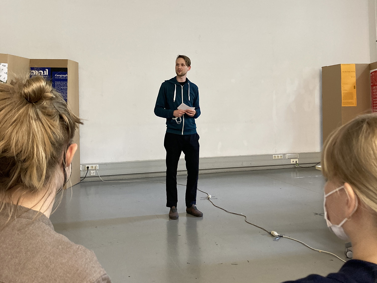
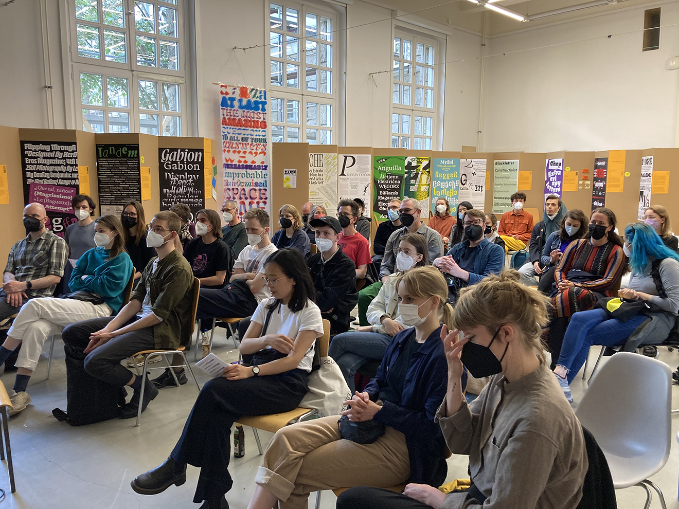
Am Samstag erleben die rund 40 Anwesenden im Publikum abwechslungsreiche Alumni-Vorträge mit unterschiedlichen Schwerpunkten, präsentiert von als Typostammtischneumitglied und KABK-21-Alumnus multi-involviertem Lukas Horn. Aber lest selbst …
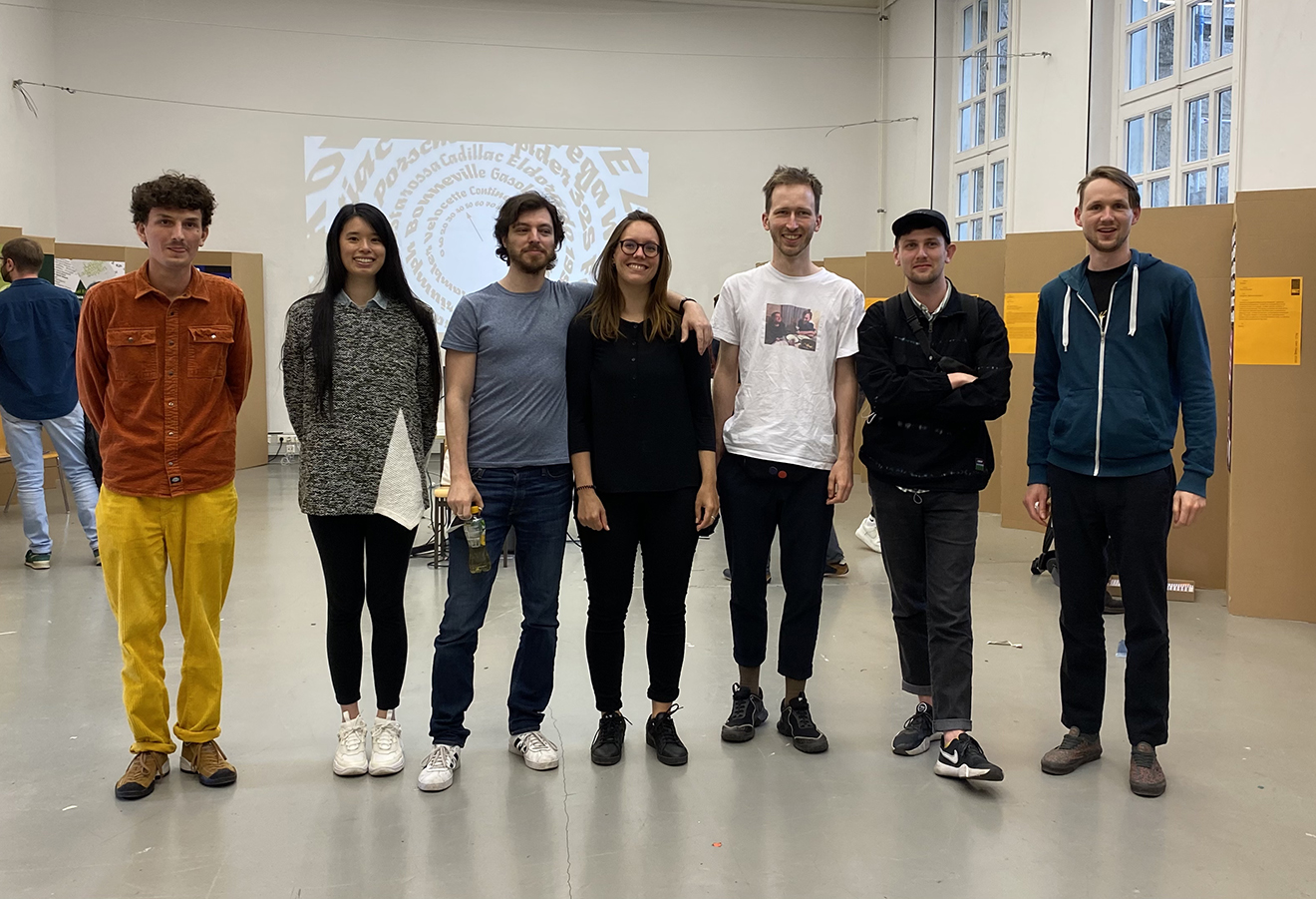
Alumni Line-Up:
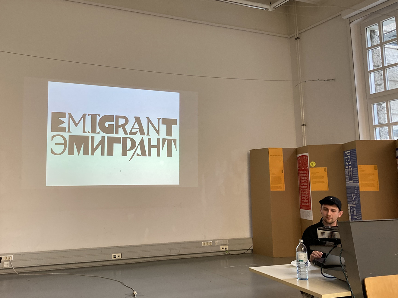
- Ilya Bazhanov (Prague 2022) Emigrant
- Jan Šindler (The Hague 2020) Gabion
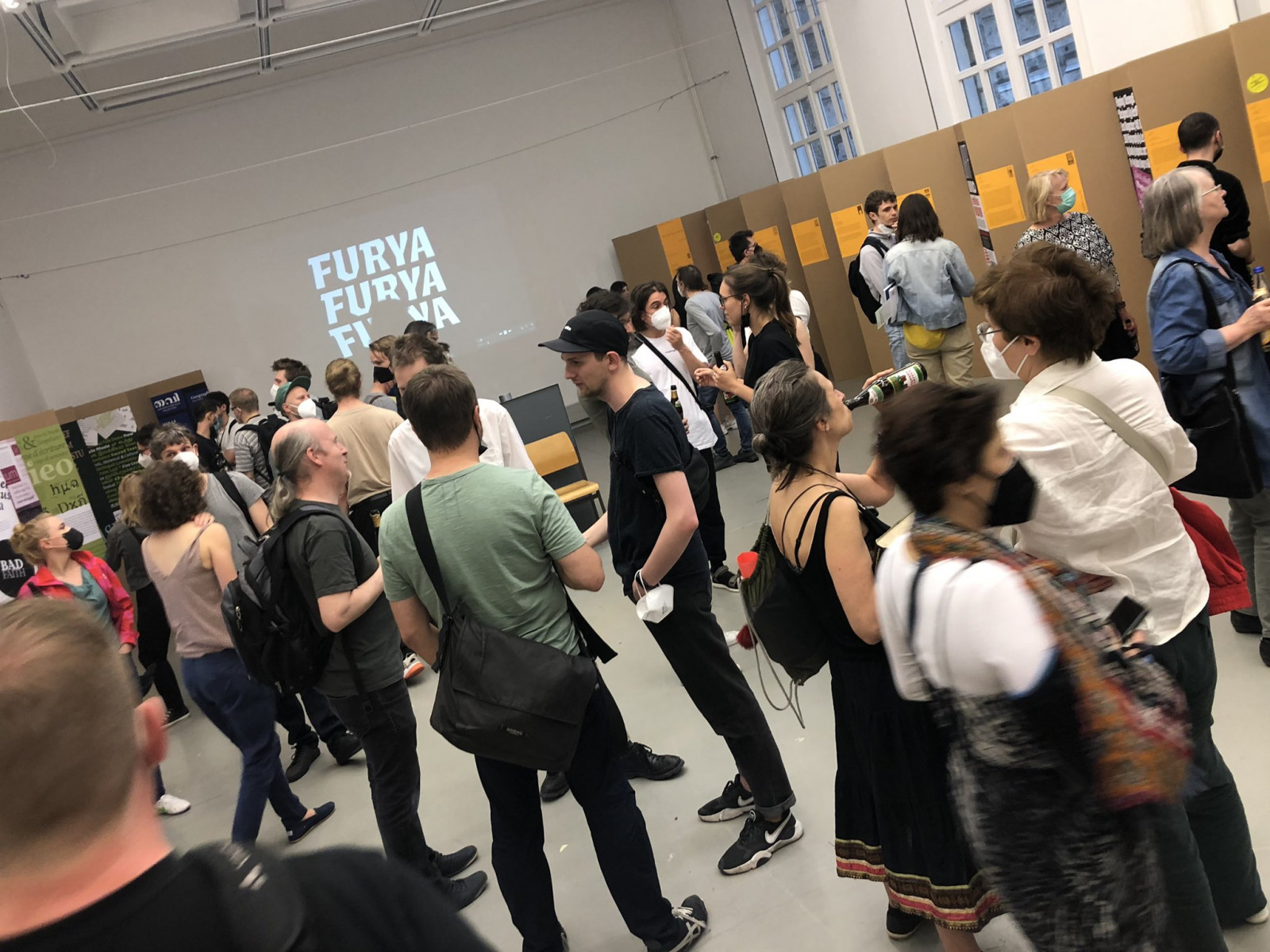
- Léna Le Pommelet (The Hague 2021) Furya
- Lukas Horn (The Hague 2021) Myzel
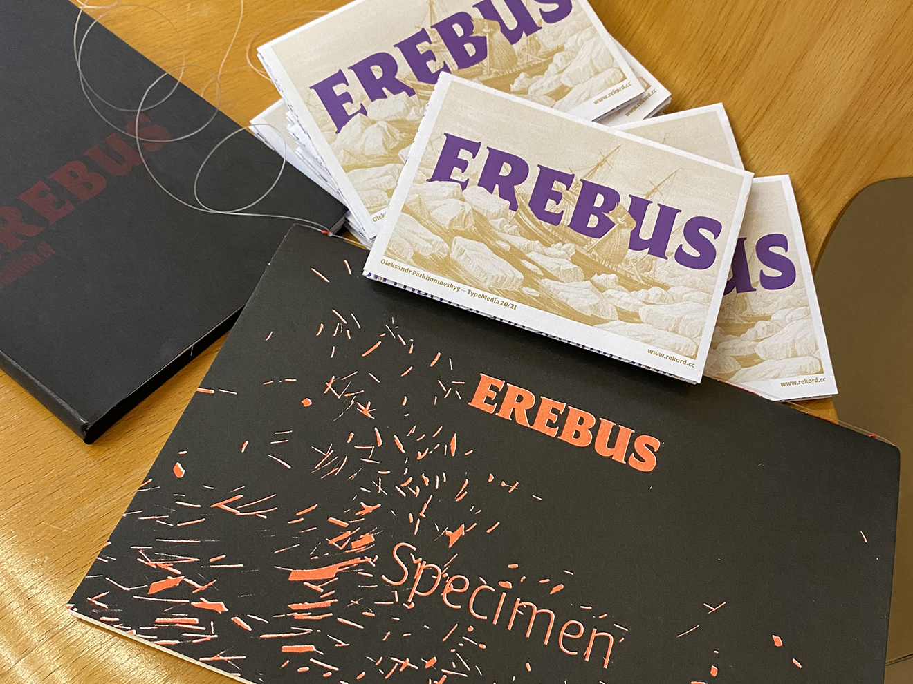
- Oleksandr Parkhomovskyy (The Hague 2021) Erebus
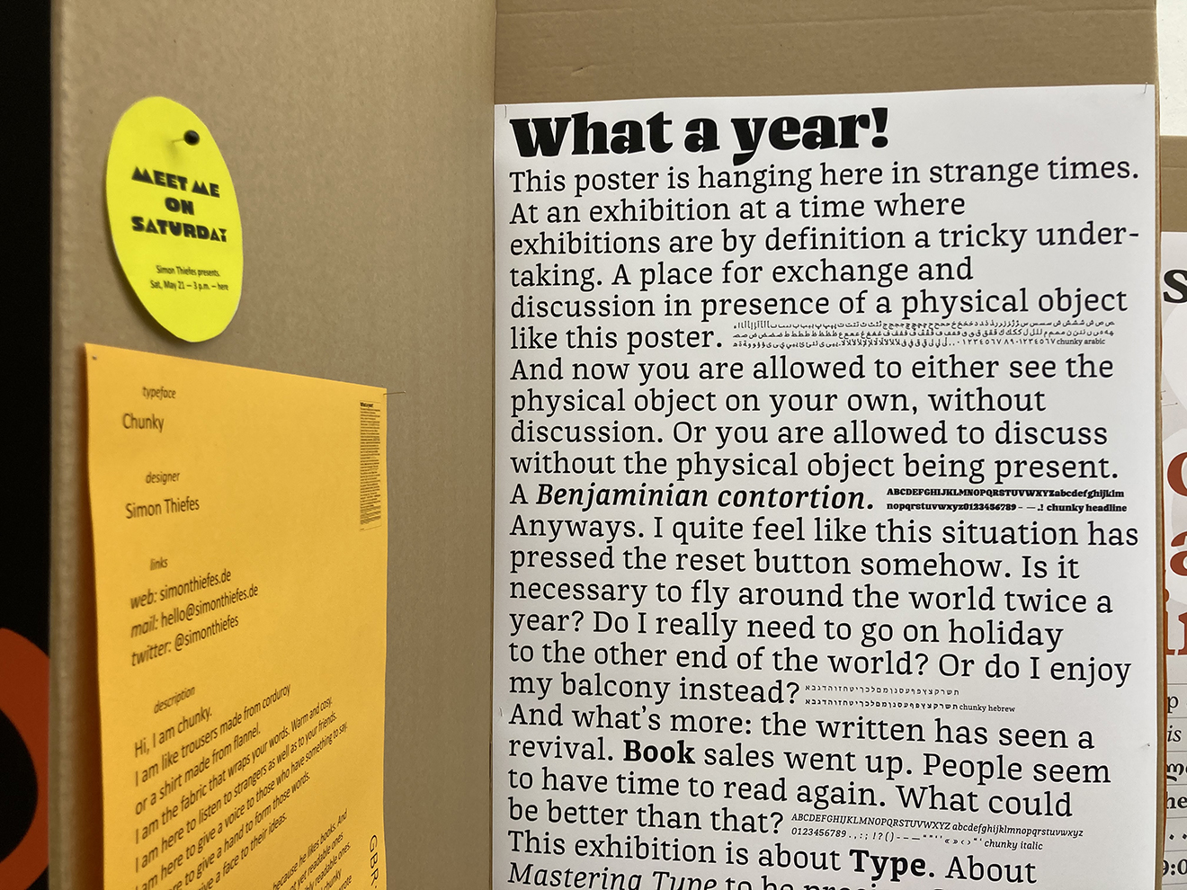
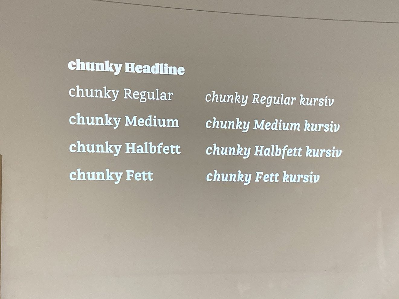
- Simon Thiefes (Reading 2020) Chunky
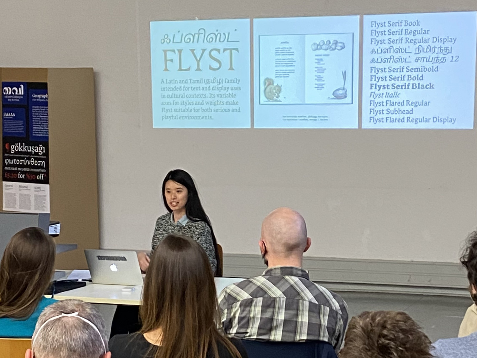
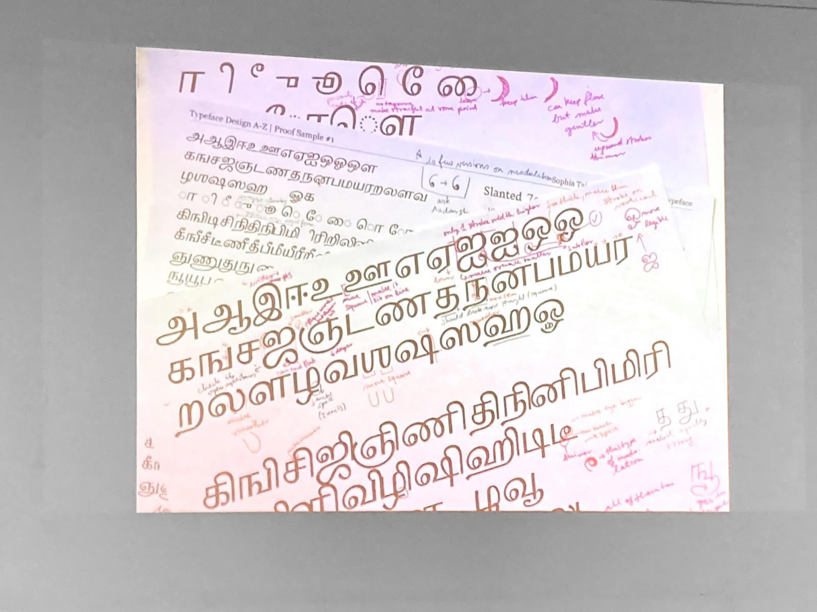
- Sophia Tai (Reading 2021) Flyst
- Céline Hurka (The Hague, 2020) unfortunately couldn’t come due to the storm.
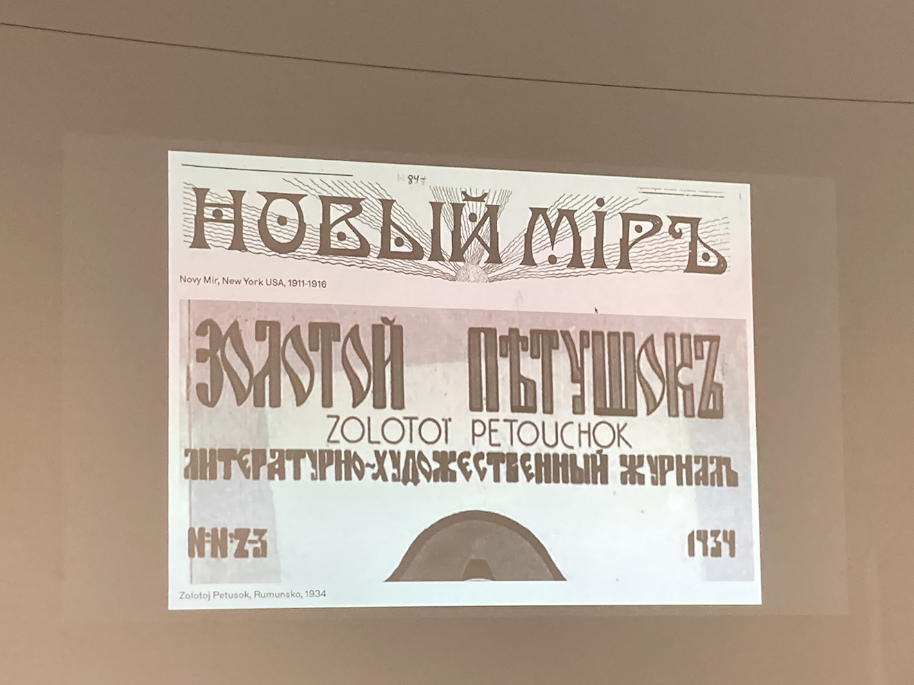
Ilya Bazhanov shows the result of his deep archive research on the history of Russian emigrants. He digitised interesting typographical findings and combined them in his typeface Emigrant, which comprises Cyrillic and Latin. According to Ilya, Emigrant is a “mix of shape, weights, structure and style”, mirroring diverse social backgrounds of Russian emigrants. Ilya will finish his project later this year at UMPRUM. All the best, Ilya!
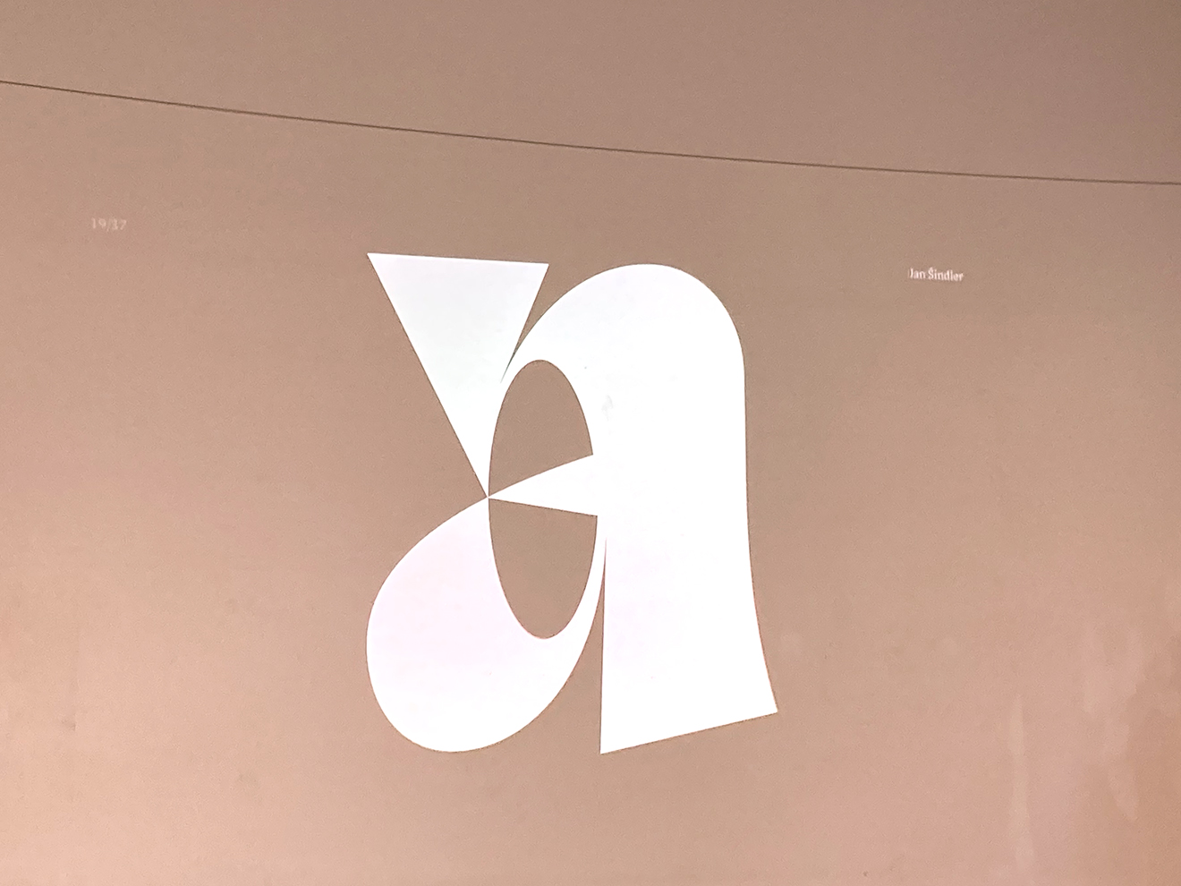
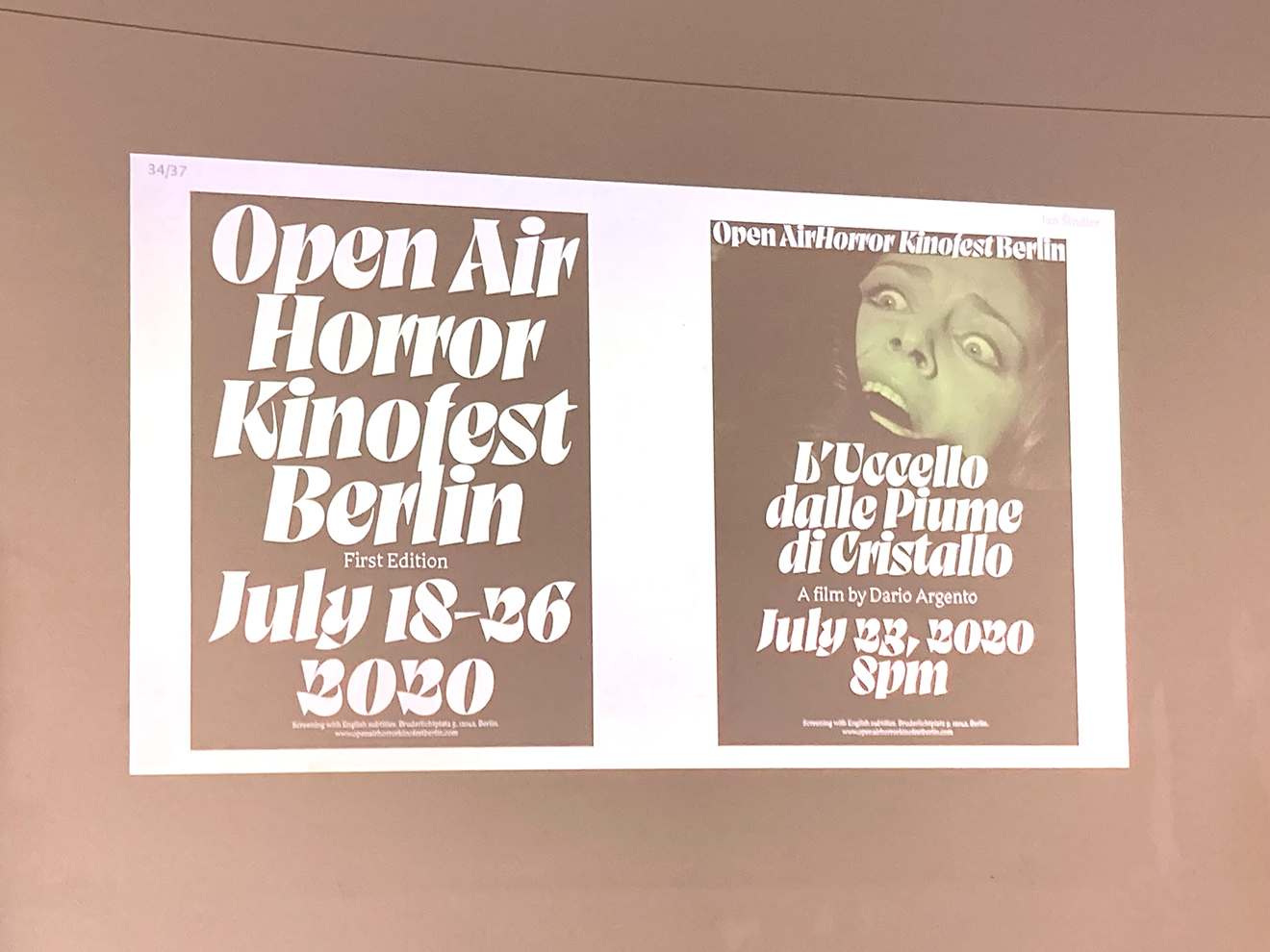
Presenting his project Gabion, Jan Šindler tells us that for him, studying was not primarily about the typeface (result), but about the process towards it. He put focus on experimenting, learning and is now suprised that “after all, I have a typeface that I would have never thought of drawing”. Being “kind of exhausted from the studies”, he “asked other people to use [the typeface]”. Let’s take this as an appeal: Go on people, use Gabion!
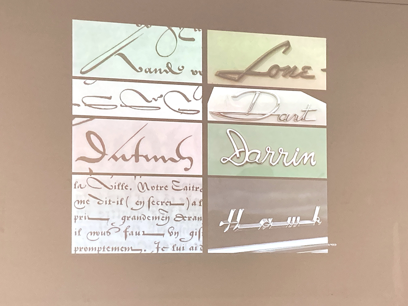
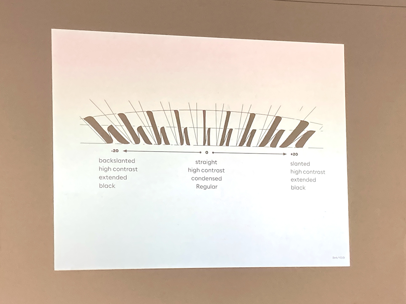
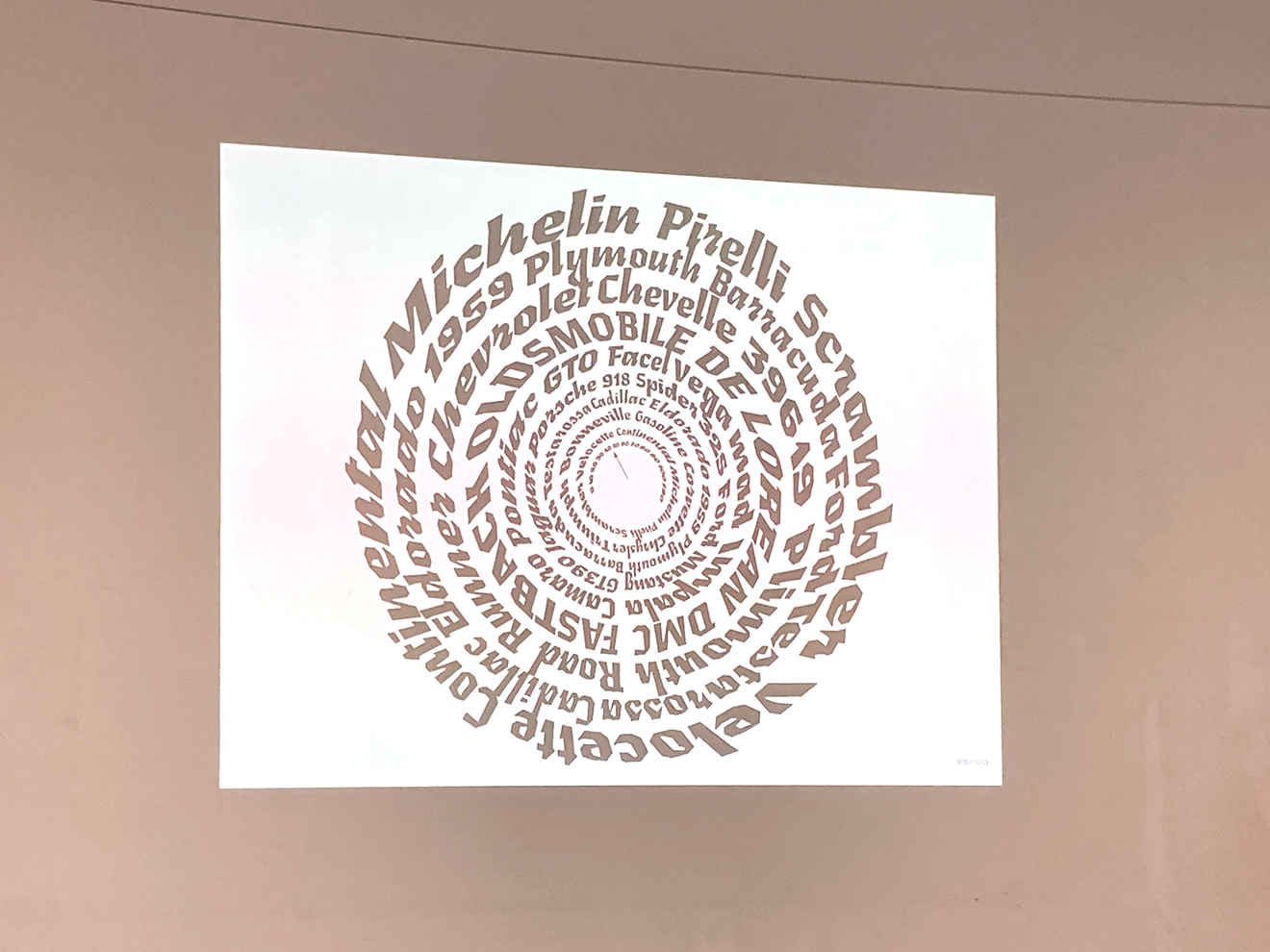
Léna Le Pommelet’s typeface Furya combines mechanical style car typography of the 50es to 70es with relaxed and dynamic script resources. Furya is provided with a combining “speedometer” axis that connects weight, width, contrast and slant from -45° to 45°. “I was entering the world of optical illusion”, she says explaining the optical effect of a passing car. To her, “the application of the typeface was really important. Put it on object!” So, amongst other use cases, she shows her typeface applied on a bike wheel to emphazise the neverending effect that her speedometer axis is creating.
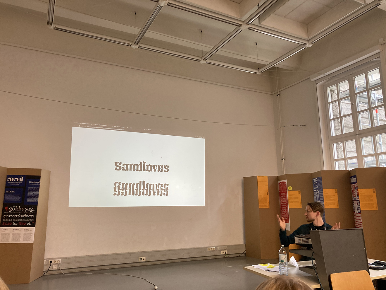
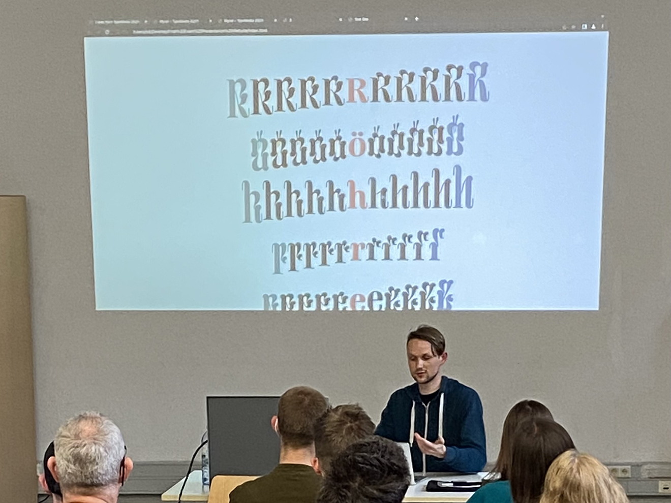
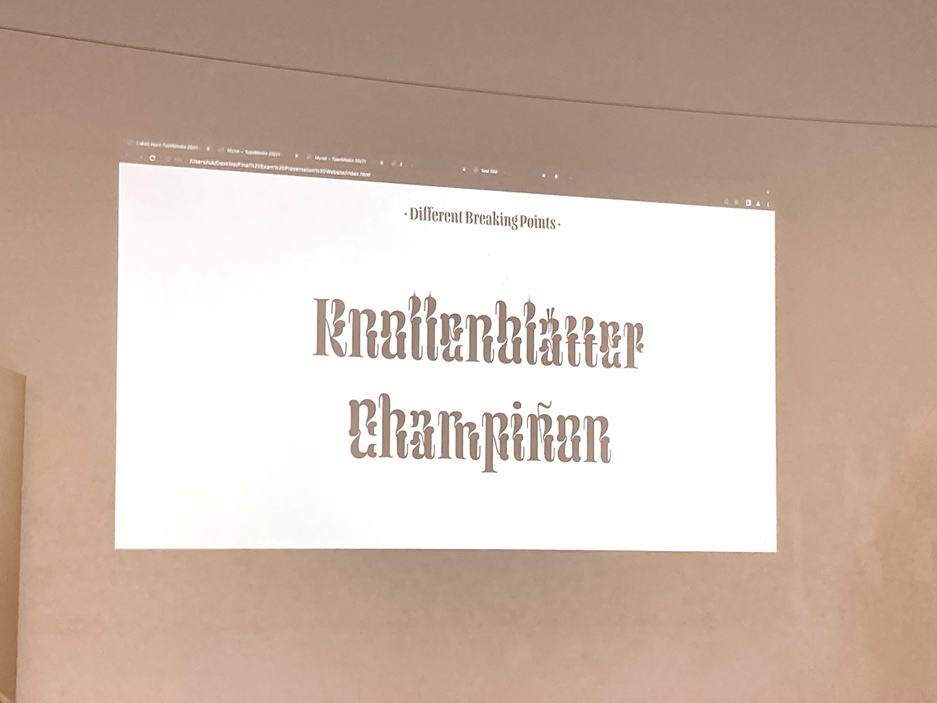
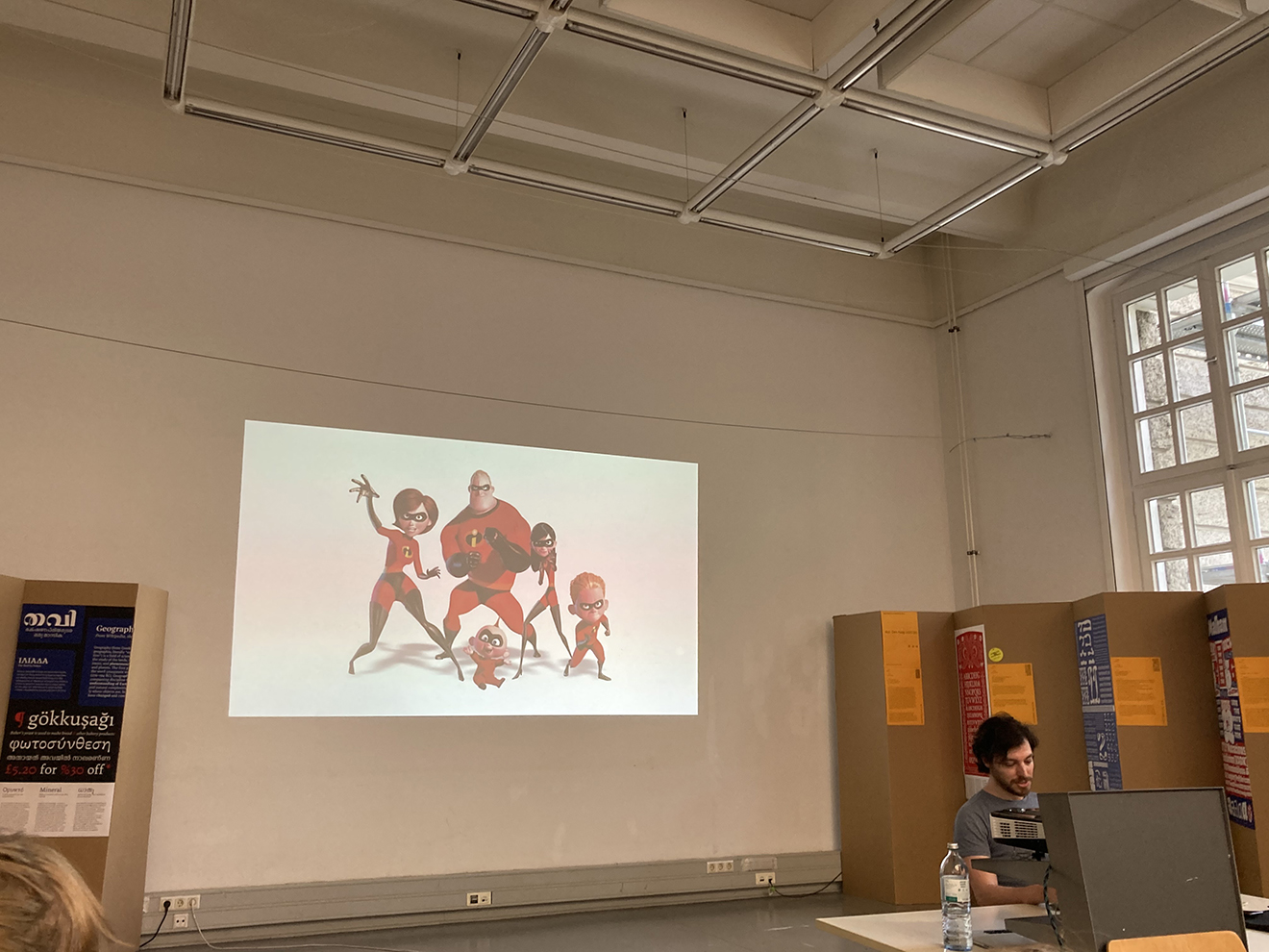
Lukas Horn lets us dive into the world of magic mushrooms. His playful and organic typeface Myzel grows up and down like mushrooms existing above and below the ground. Exploring possibilities of CSS-driven animations, Lukas states: “I learned a lot”. In fact, that’s what all the alumni are highlighting during their talks. The applause for Lukas lasts extra long – on the one hand due to the well-made project, on the other hand because he demonstrates that the public can influence the typeface’s behaviour on screen through making noise.
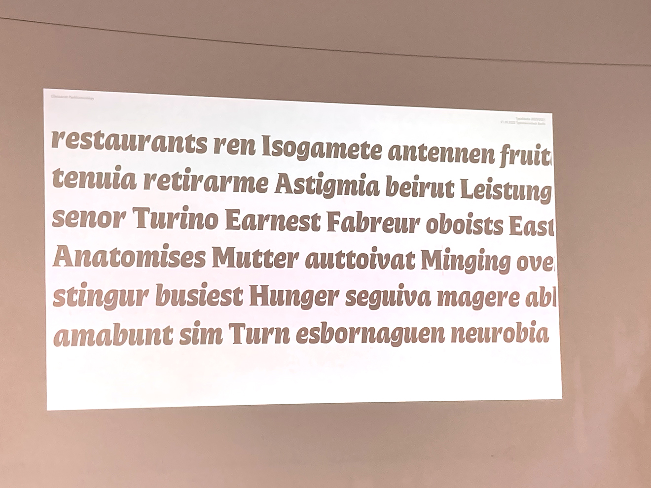
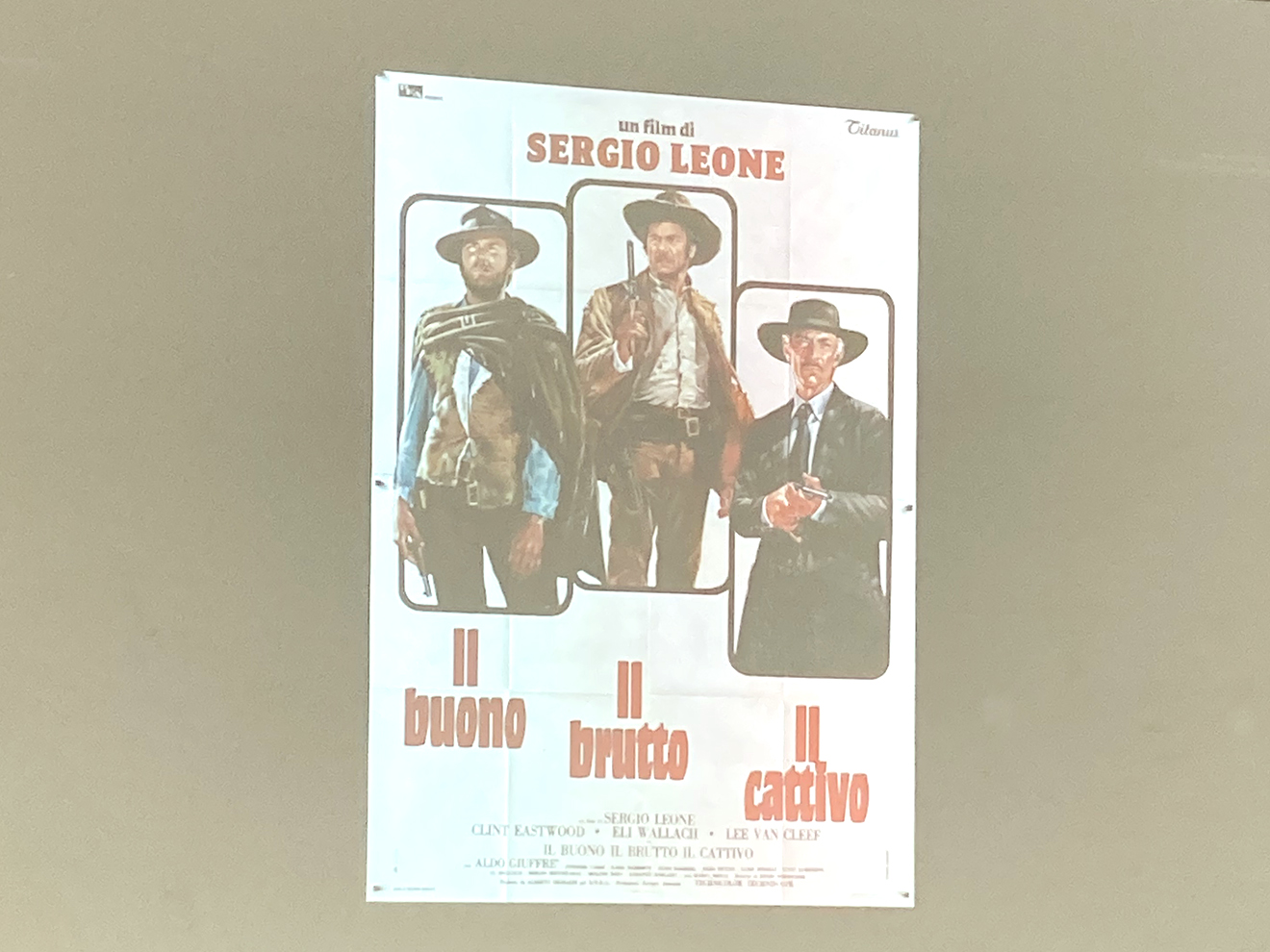
Oleksandr Parkhomovskyy describes the process behind his typeface Erebus with very honest and entertaining insights: “Automatically, it lead to nothing“, he states or: “At some point, I realized that I didn’t really enjoy it.” Thank you, Oleksandr (called Alex): Trials and tribulations are such an important part of studying and creating typefaces. The result of Alex’ work, however, is a wide design space of Sans/Serif/Slab/Display/Text/Italic/Shatter perfectly fitting into the applications he shows us: book covers, film posters, trailers – and whiskey brands.
“I am here to take you on a visual time journey with Chunky.” During Simon Thiefe’s dense and dynamic presentation, we meet Pablo Picasso at Fonts in Use, receive a letter by Kurt Schwitters containing design critique and we get to see a piece of art that actually is not art (signed as #1/∞). But of course, Simon also tells us about his typeface, comprising independent weight axes of Hebrew and Latin to optimize multilingual layouts with variable fonts. He also touches how Covid influenced the year of studying (find a diary at iso-type.com). “What would dadaists say about chunky?” – Well, we don’t know. “Anyways, back to the future”.
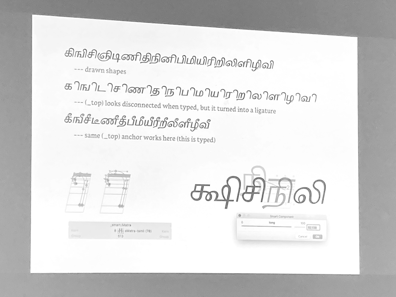
While speaking four languages herself (all written in Latin-based scripts), Sophia Tai was keen on also exploring a personally unknown script in her graduate project Flyst. After attending numerous script workshops at Reading (Arabic, Chinese, Devanagari), she decided to go for Tamil. In a short introduction, we learn that Tamil is a lively shaped unicase script. Since Sophia opens up a Serif/Flared design space, it was difficult for her to mimic stroke contrast in Tamil. Being thankful for feedback and help during a lot of zoom conferences with nice people, she’s proud: “I made my first text typeface”.
Explaining her user name “sophiatypelove” at the end of her presentation, she states: “I am Sophia and I love type” …
… In fact, that’s what all the attendees in the room and visitors during the last days share: Loving diversity in type, loving research and progress, loving Béziers and CSS, loving axes and contrasts. All the best for you! Thank you for sharing and joining us on all those wonderful journeys in type.
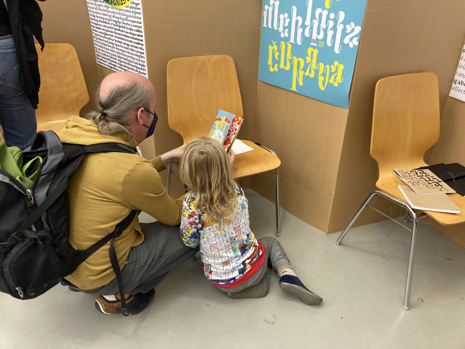
Traditionell beenden wir den Nachbericht mit der nächsten Generation; hier Nachwuchs von Jens Kutílek, das Pilz-Specimen von Lukas Horn begutachtend. Oder wie Simon Thiefes es formulieren würde: “Anyways, back to the future.”