Scroll down for English survey of Saturday’s presentations (skipping our German Überblick).
Unser klassischer Typostammtisch-Jahresauftakt am bewährten Standort bot zum fünften Mal in Folge ein großes Stelldichein von werdenden, frischgebackenen, langjährigen, international agierenden und dozierenden Schriftgestalterinnen und Schriftgestaltern: mittlerweile etabliert als Alumni-Treffen und Start ins typografische Jahr. Über Zickzackwände, Zelebrationen und zarte Verspätungen im UdK-Medienhaus am Kleistpark.
Der Freitagabend
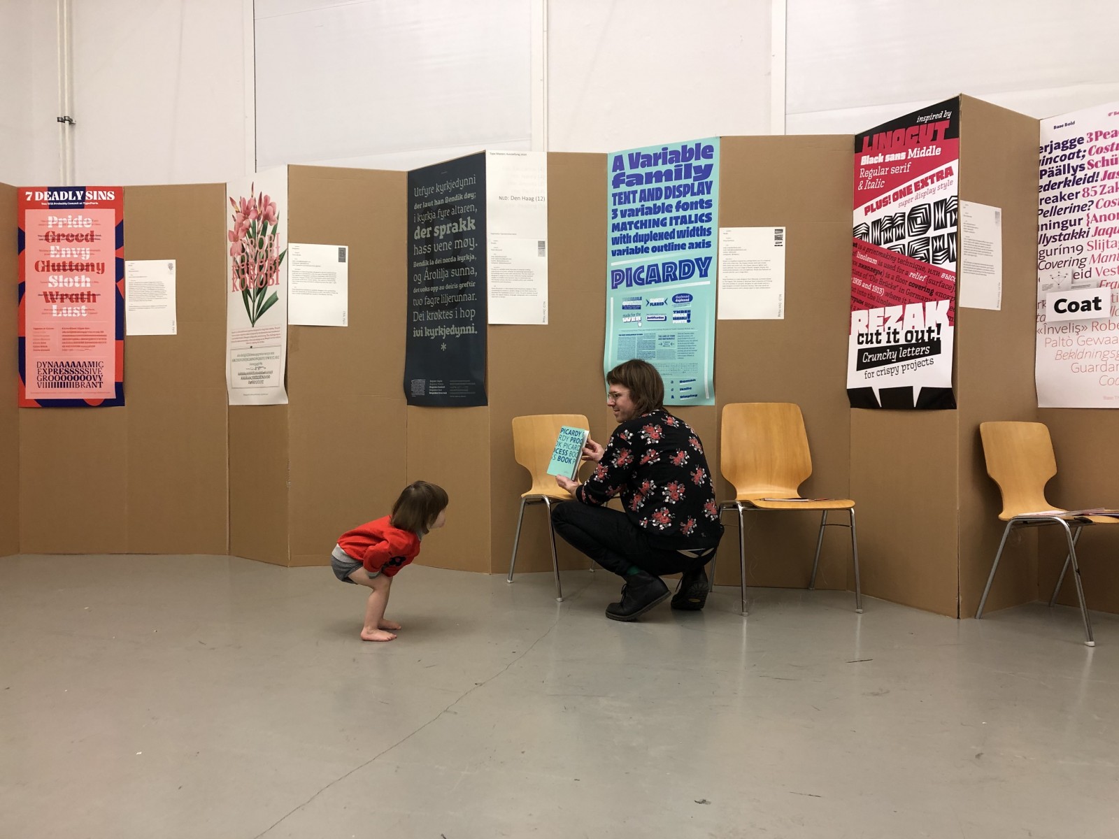
Das mit den zarten Verspätungen ist stark untertrieben und hat uns doch mal kurz Nerven gekostet. Zwar waren die großformatigen Plakate mit den auszustellenden Schriftentwürfen unserer internationalen Master schon Anfang der Woche fertig gedruckt – in unserer angestammten, leider aber 450 km von Berlin entfernten und jahrelang zuverlässigen Druckerei – aber bis Mitte der Woche noch nicht bei uns eingetroffen. Also hakten wir nach und erfuhren Schreckliches; sie lagen noch dort.

Die Plakate lagen also am Donnerstag noch in der Druckerei ganz weit weg, getrocknet und versandbereit. Schicken, holen, bringen hätte beim besten Willen nicht mehr geklappt. Wir mussten für Freitag neu drucken, in Berlin, und zwar allerhurtigst. Knappe Sache! Zehn Minuten vor Ausstellungseröffnung trafen die Plakate im UdK-Medienhaus ein, zwei Minuten vor 19 Uhr waren sie angepinnt – dank Luc(as)’ Hängeplan, unserer Routine und vieler helfender Hände. Uff.
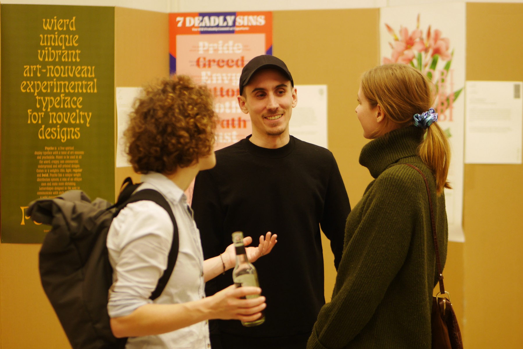
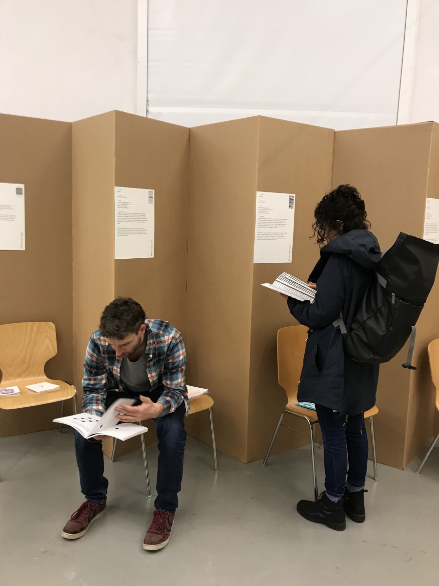
Zauberhaft war, dass die ersten Anwesenden die bereits hängenden Kurzprofile und Schriftbeschreibungen sorgfältig studierten und sich seelenruhig in die ausliegenden Process Books, die Gestaltungsprozessbeschreibungen der Studierenden der Den Haager Schule, vertieften. So eine schöne Bestätigung für den Aufwand, den wir Jahr für Jahr betreiben! Danke euch.

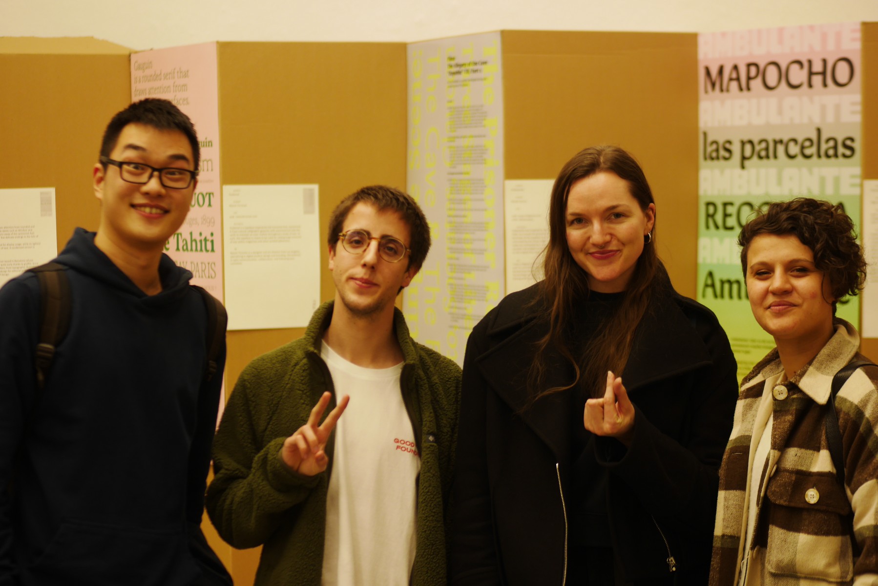
Überhaupt wurde der Eröffnungsabend wieder einmal bestens besucht und von vielen Berliner Freunden und Kolleginnen dazu genutzt, sich nach der Winterpause wiederzusehen und den nötigen Jahresanfangsansporn für die eigene Arbeit zu bekommen.
Für die, die nicht dabei waren und uns noch überhaupt nicht kennen: Mit der Ausstellungsreihe Mastering Type bieten wir (vom Typostammtisch Berlin) die unseres Wissens weltweit einmalige Gelegenheit, die neuesten Abschlussarbeiten aus internationalen Schriftgestaltungsmasterstudiengängen gebündelt an einem Ort zu sehen. Das finden wir selbst Jahr für Jahr enorm spannend, und bereichernd, weil wir auf diese Weise Trends und Neuerungen nicht nur im Design, sondern auch in der Schrifttechnologie und vor allem den unterschiedlichen Lehrkonzepten mitbekommen.
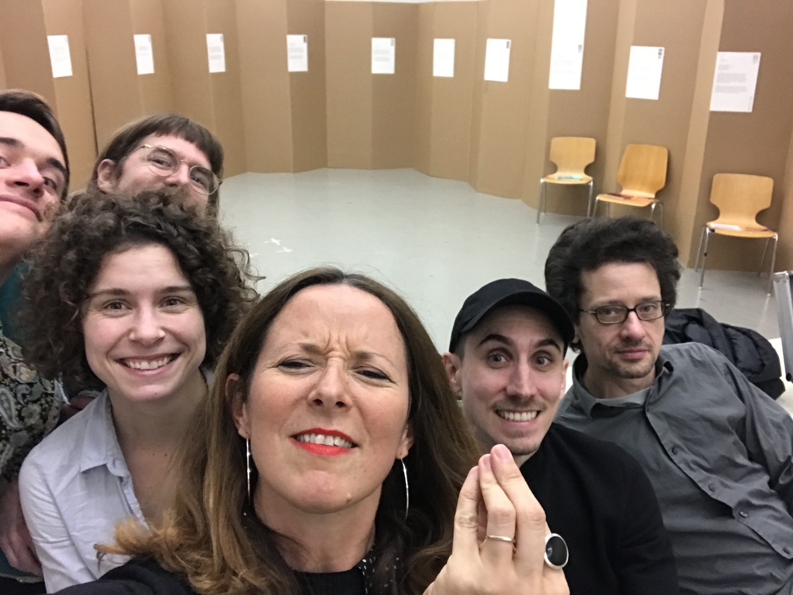
Der Samstagnachmittag
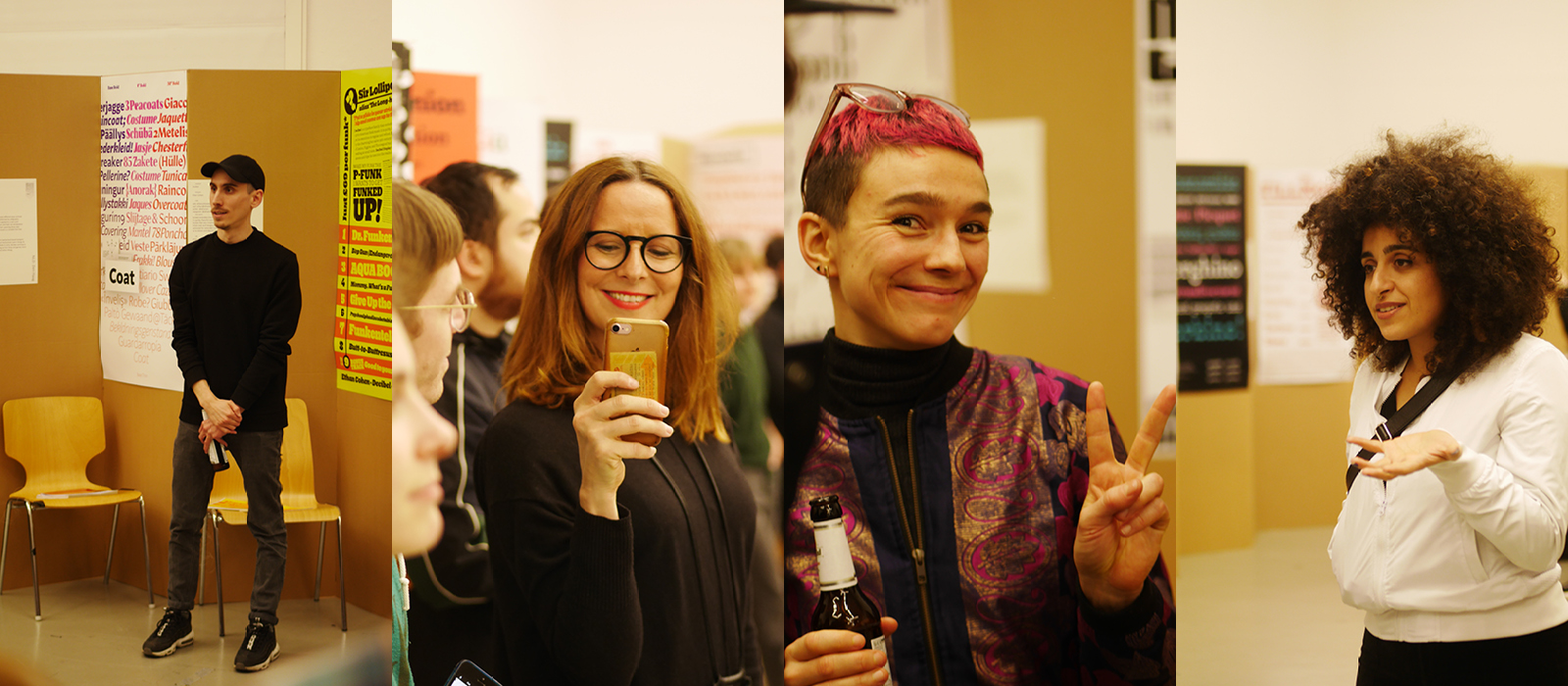
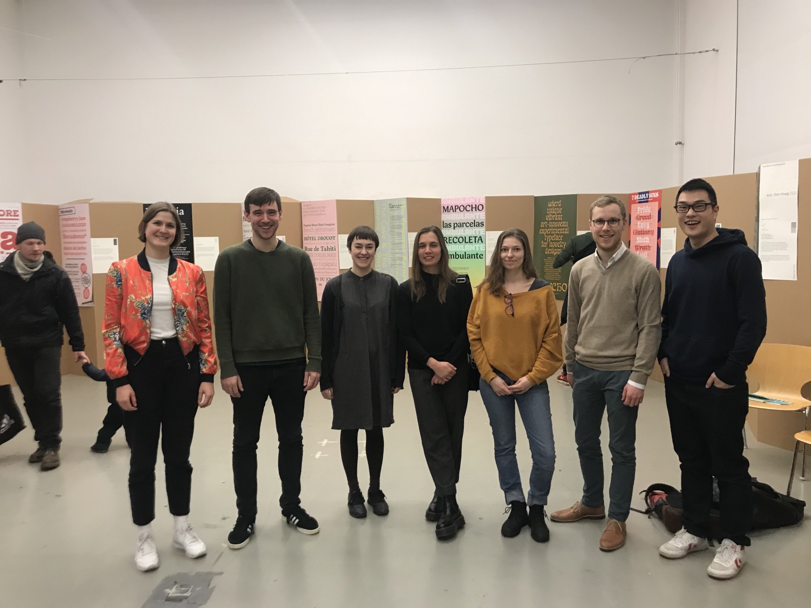
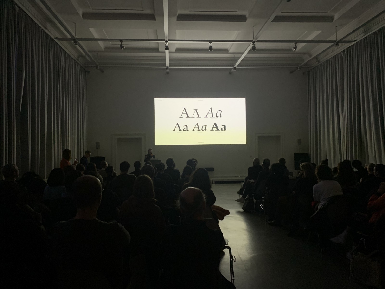
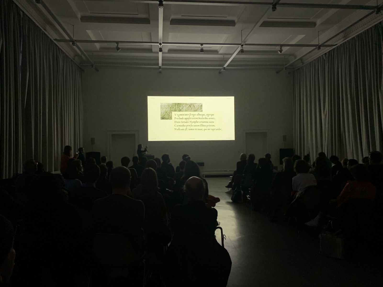
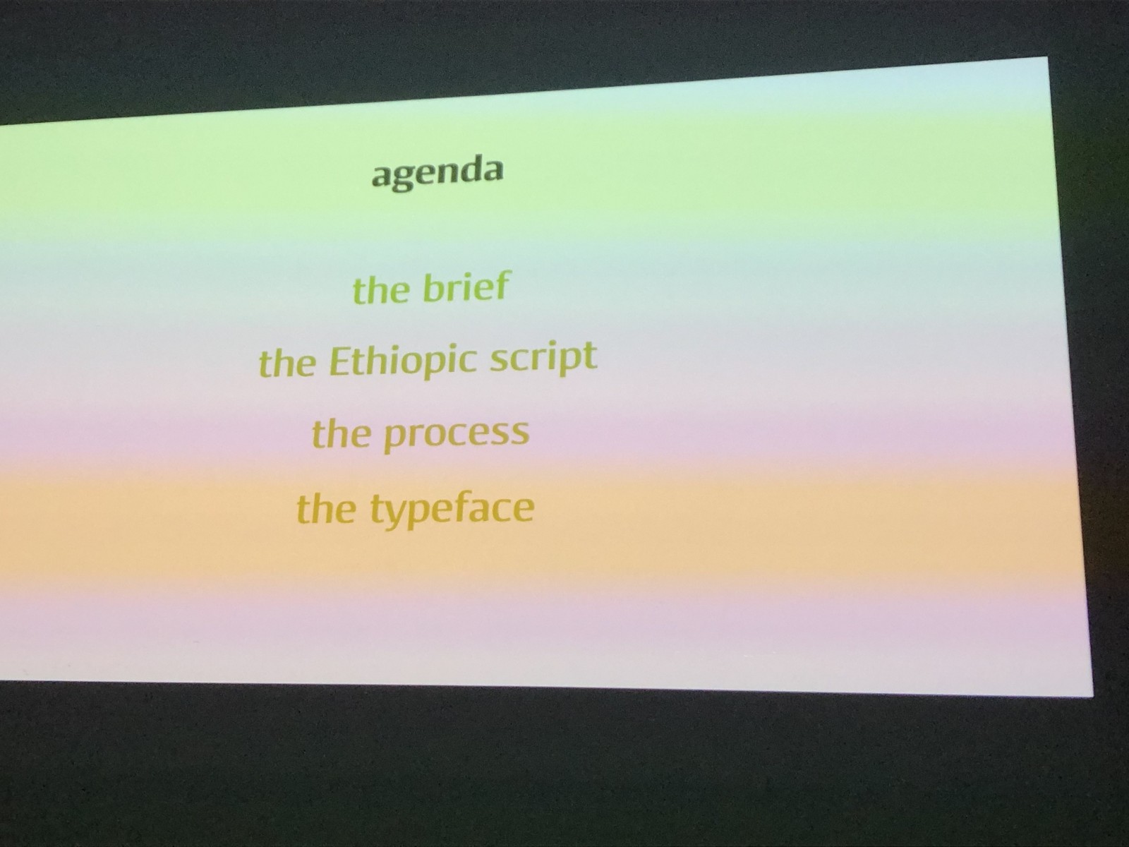
In diesem Jahr konnten wir die Abschlussprojekte von Studierenden aus Amiens (FR), Den Haag (NL), Lausanne (CH), Nancy (FR) und Reading (UK), sowie die Ergebnisse des fünfwöchigen Sommerkurses TypeParis (FR) präsentieren. Und präsentieren lassen: Erfreulicherweise gaben sieben der jungen Kolleginnen und Kollegen am Samstag in Form zusammenfassender Präsentationen auch persönlich Einblick in ihren Gestaltungsprozess. Sie teilten Überlegungen, Gegenüberlegungen, Briefings und Rebriefings, Konzepte, Arbeitsstufen und ihre Gedanken zum eigenen Ergebnis. – Many thanks to all of you!
Please find this year’s speakers here in alphabetical order, plus their typefaces and schools, and below some personal impressions of their presentations:
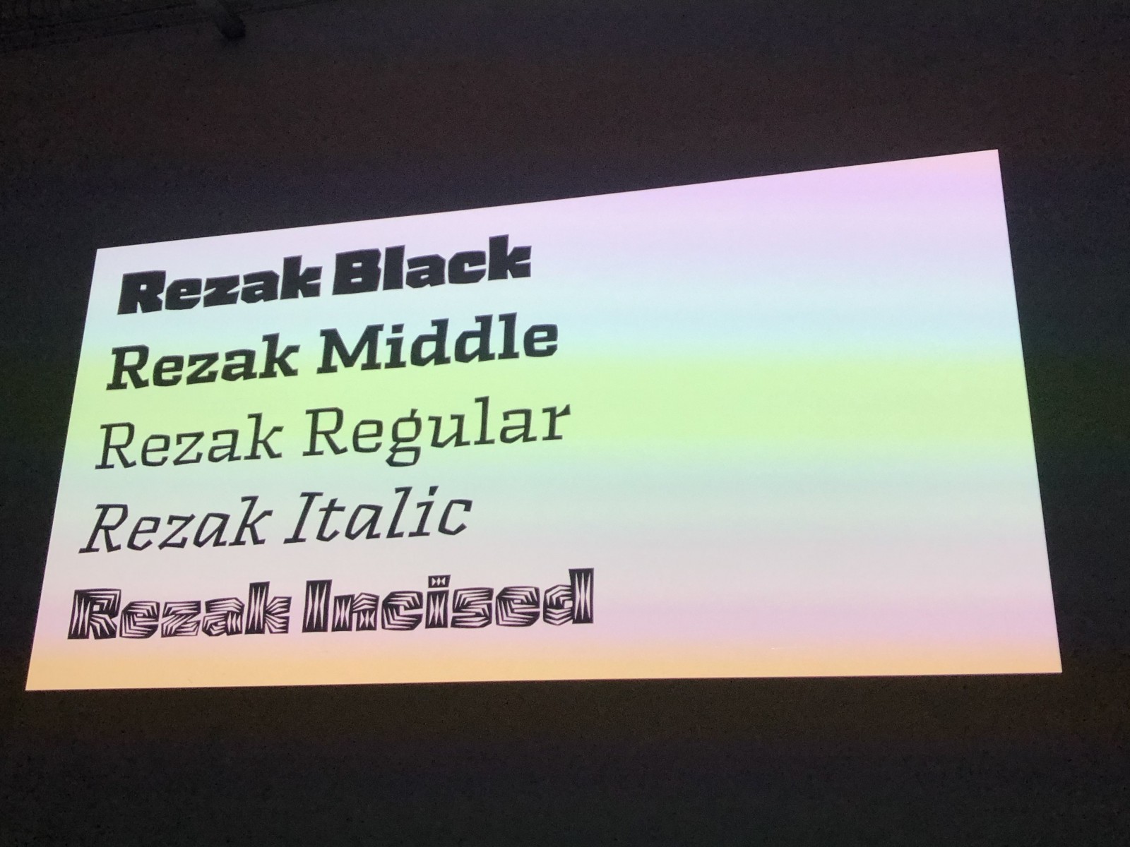
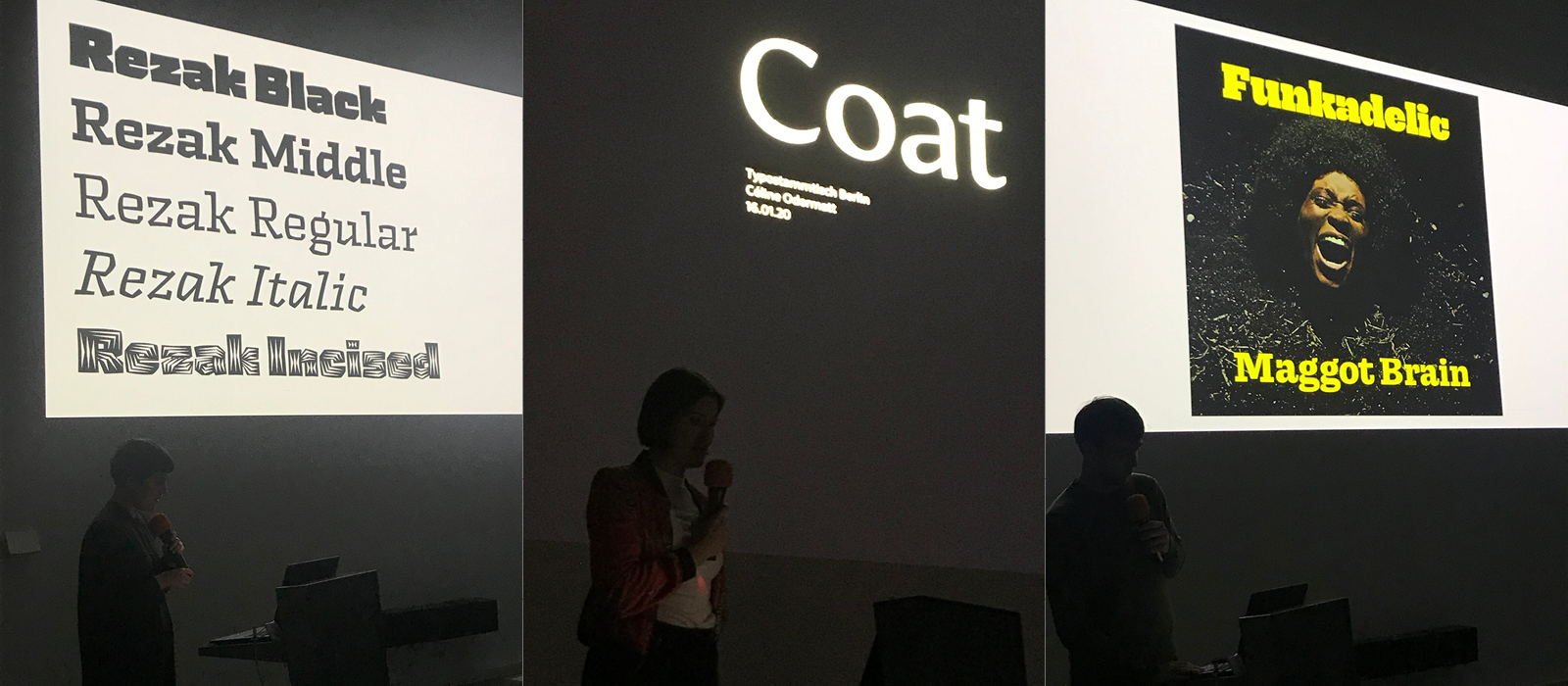
- Anya Danilova – Rezak (The Hague, Netherlands)
- Céline Odermatt – Coat (The Hague)
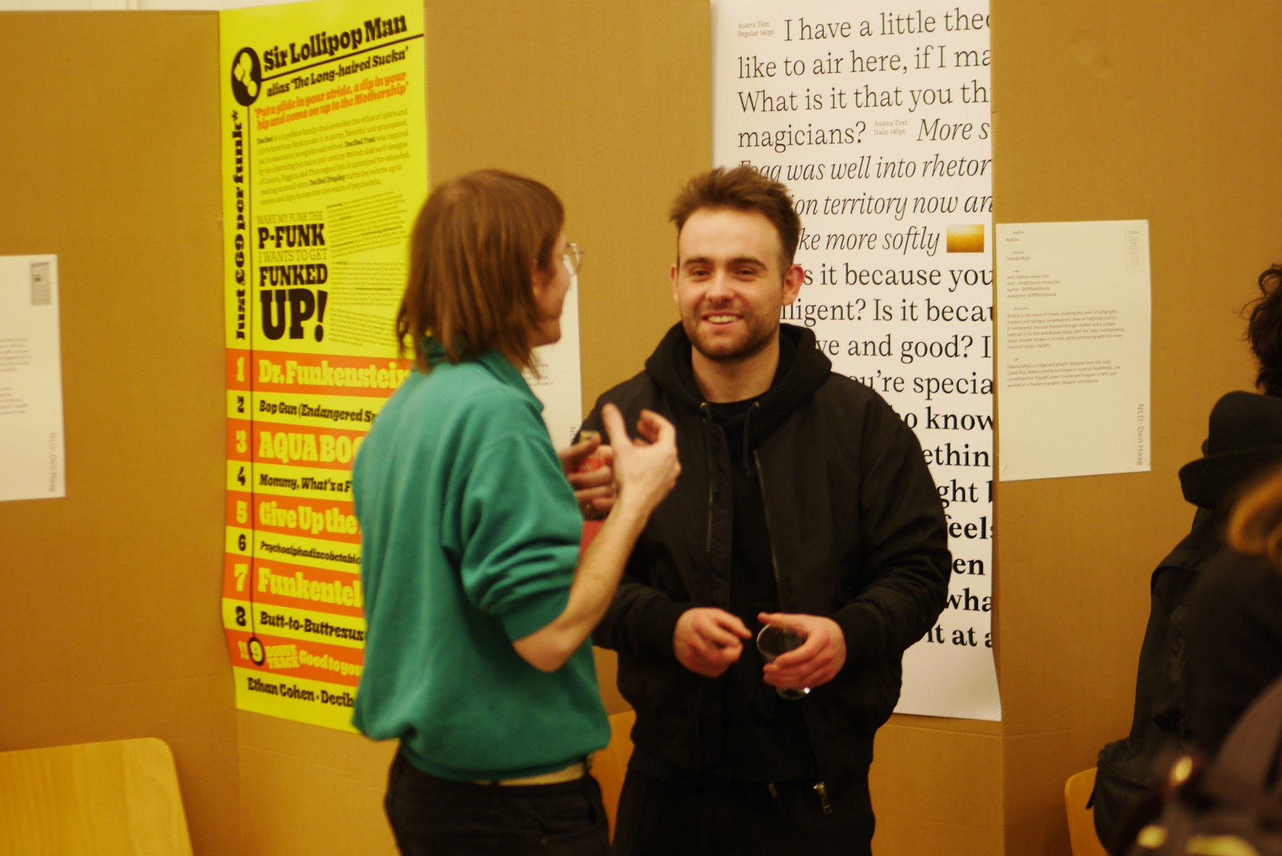
- Ethan Cohen – Decibel (The Hague)
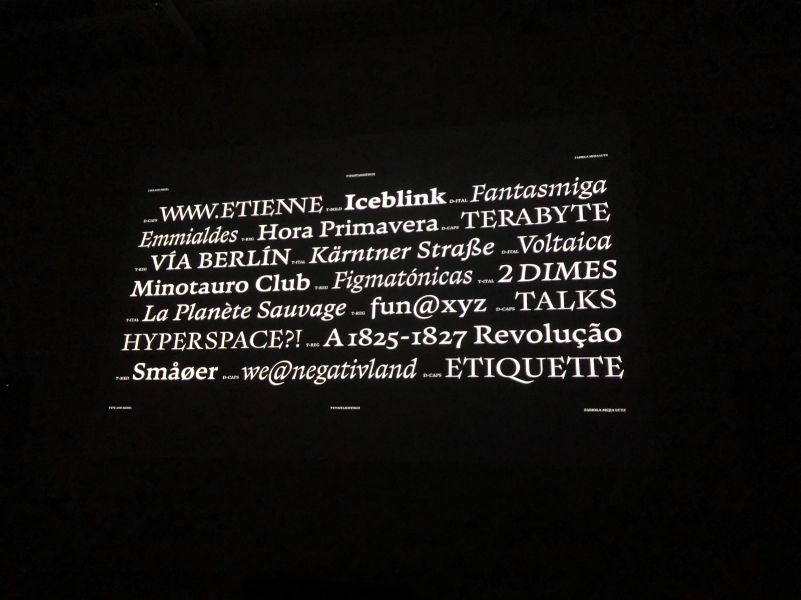
- Fabiola Mejía – Rodina (The Hague)
- Felix Kett – Memirati (Reading, United Kingdom)
- Mark Zhu – Vernicia (TypeParis, France)
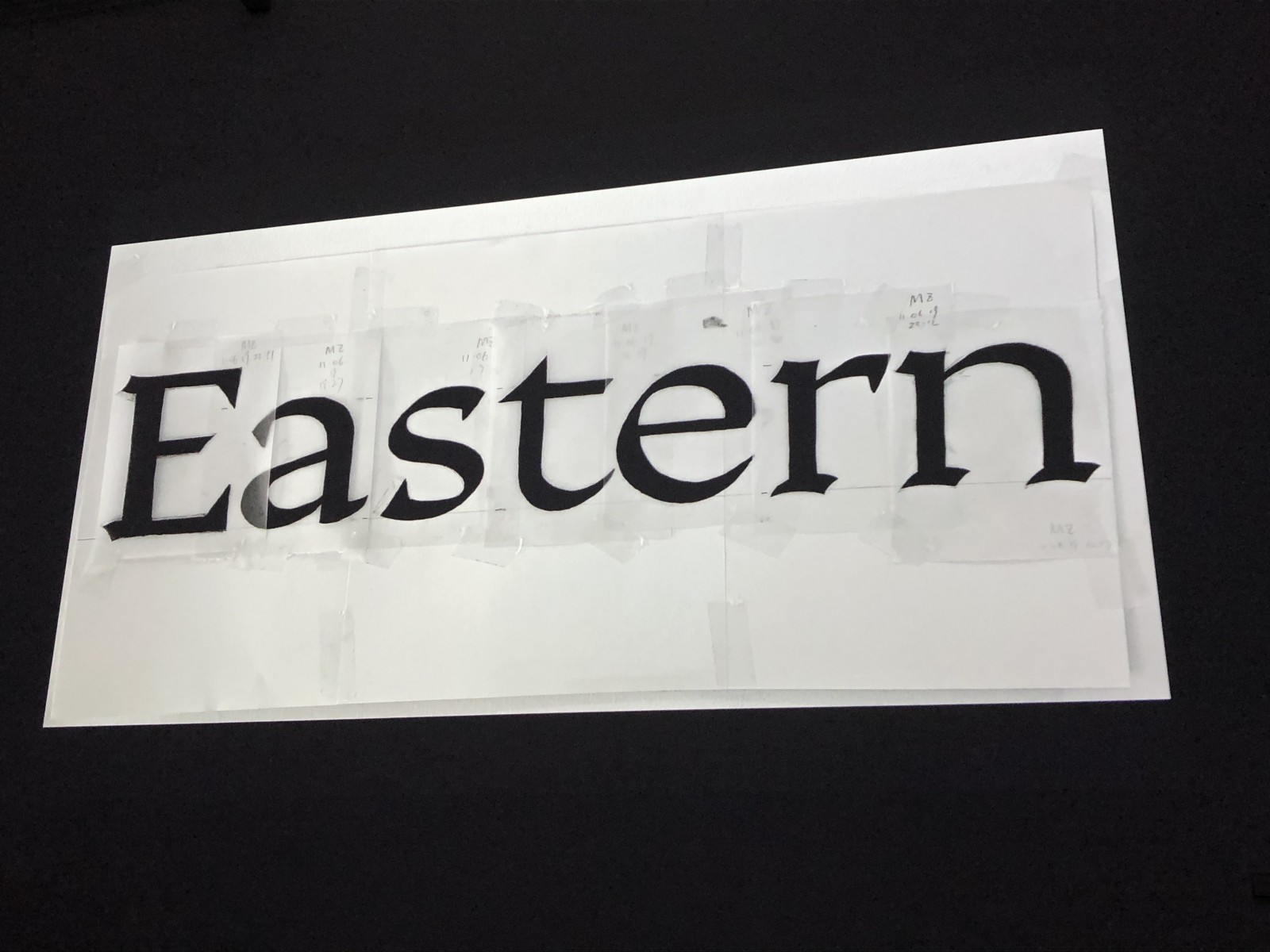
- Rosalie Wagner – Borel (Atelier National de Recherche Typographique, Nancy, France)
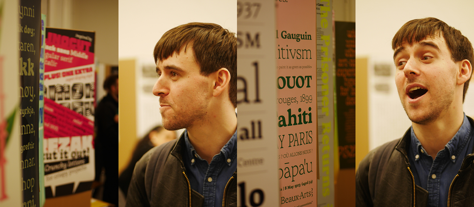
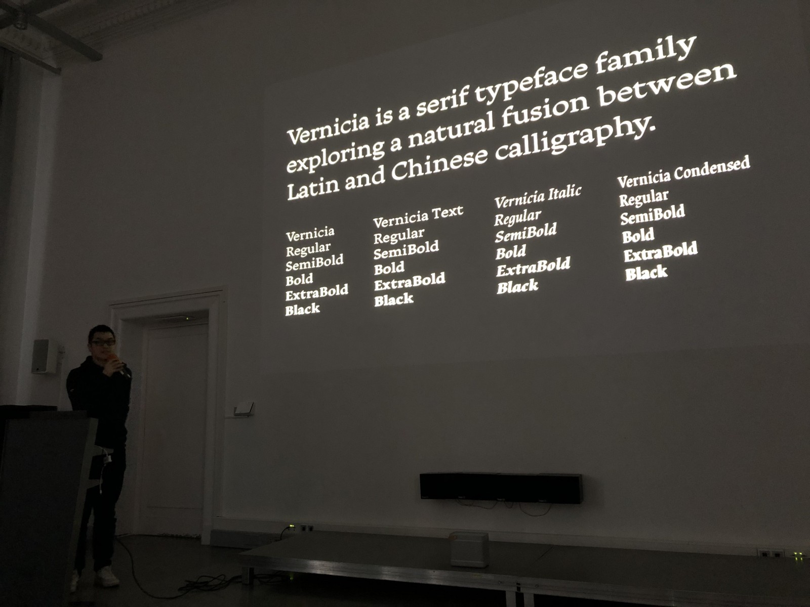
I was very impressed by the fact that all our presenters had clear concepts in mind. They spoke about briefs and sometimes several stages of rebriefs during their process, they reflected certain goals or tasks their typeface should fulfil. What does it incorporate? What could it be used for? Or: does my typeface maybe have too much contrast for a text; is it too wide for display? These last questions came from Mark Zhu, a designer and photographer from Hangzhou in China, graduating with a MA in typeface design at the University of Reading.
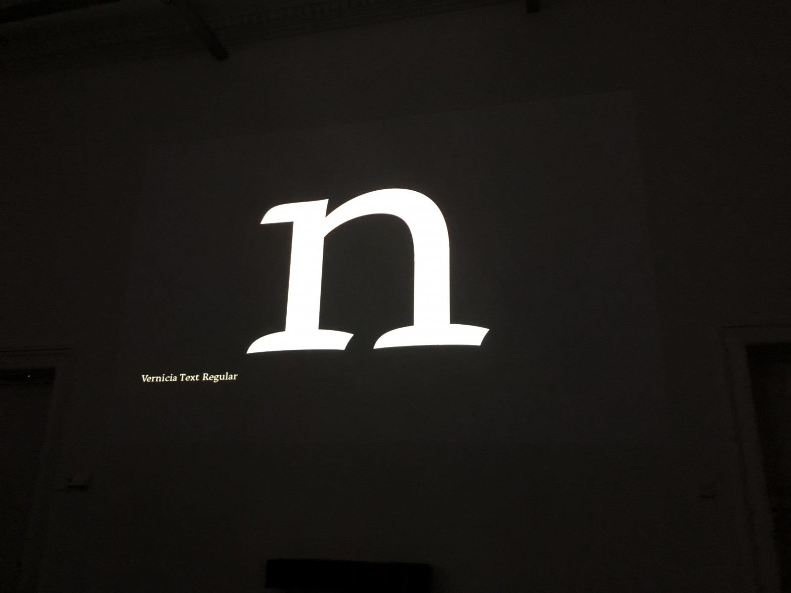
In addition to studying in Reading, Mark Zhu took the five-week summer course TypeParis to concentrate on his serif typeface family Vernicia. Already with his very first sketches for Vernicia, Mark noticed his cross-cultural background. Or rather, his co-students did, pointing out how “Chinese” his designs appeared to them. This had not occurred to Mark in the first place – nor had it been intended, actually. But Vernicia really comes across as “a natural fusion between Latin and Chinese calligraphy”, and Mark had to fine-tune and balance those two aesthetic influences. The name Vernicia, by the way, comes from a tree from the South of China.
Next on stage was Anya Danilova, originally from Moscow and a graduate from TypeMedia in The Hague. Anya “wanted to explore how shapes behave“ and presented Rezak as her result. She pointed out that her design is based on cutting parts of the letter shapes off, like in wood cut, not adding to them. Her italics she designed after making sketches again, not from the cuts, in order “to save the rhythm and regularity”. She summarises Rezak’s characteristics as follows: “old fashioned, not variable, not interpolated“ – her concern was, as she convincingly demonstrated, about the forms and shapes. And how to work with them.
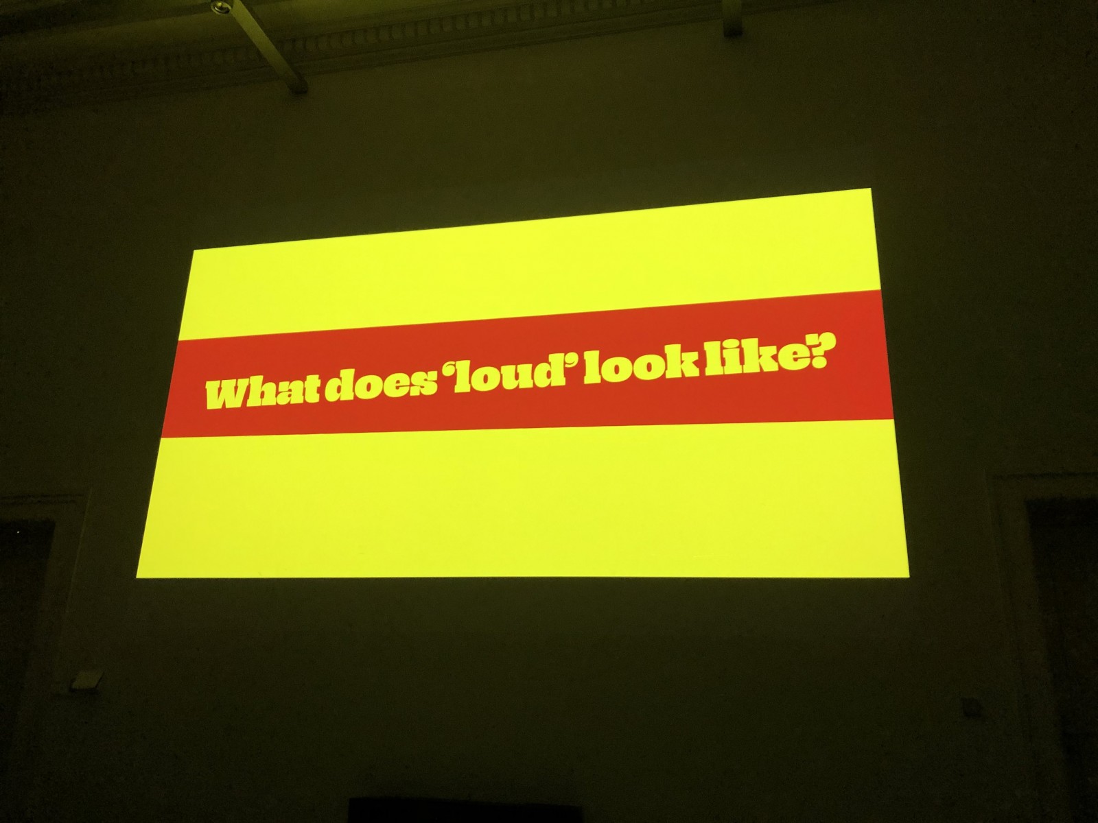
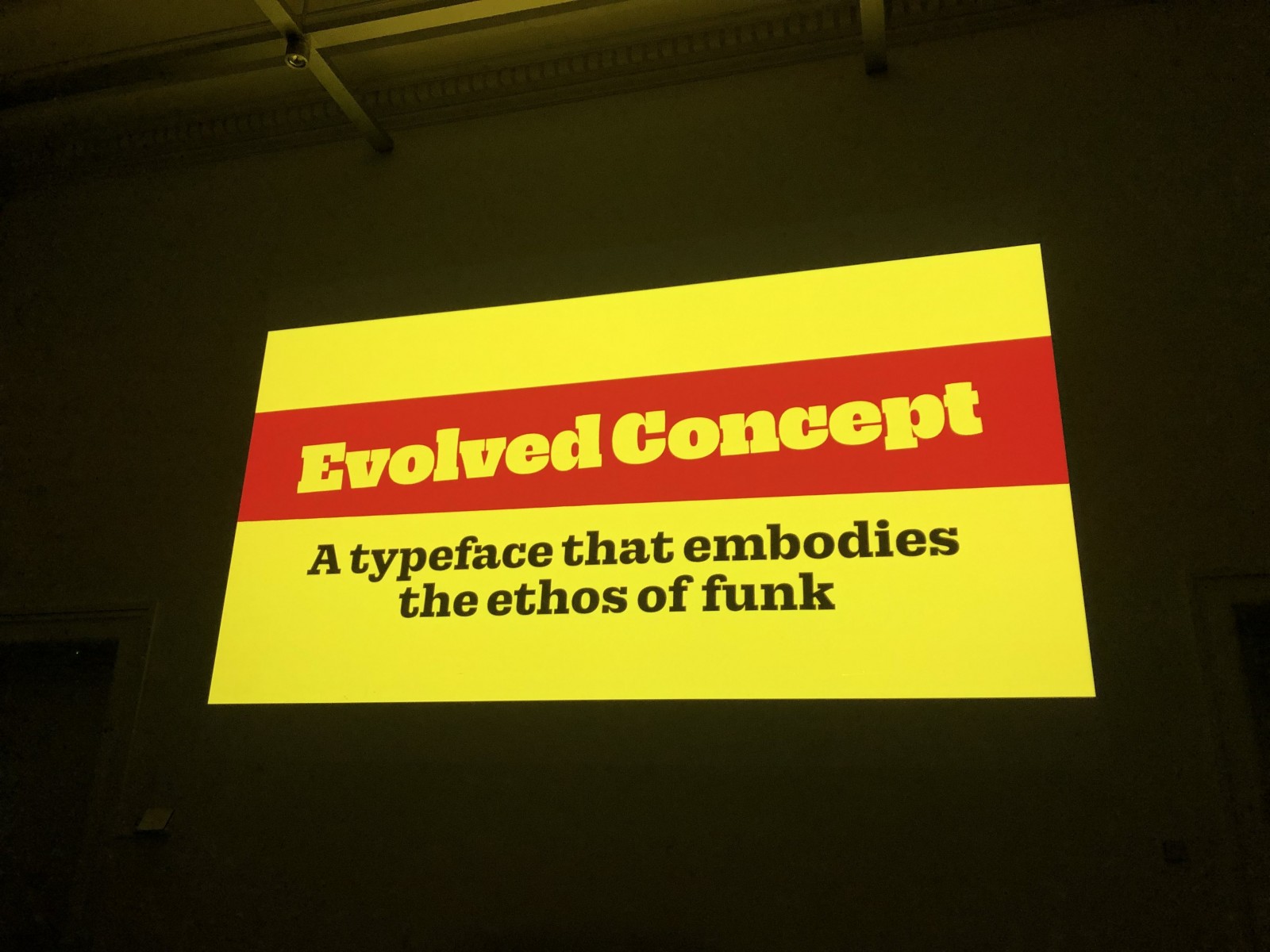
Anya’s classmate Ethan Cohen from New York City, a broad nib calligrapher, designer, musician and expert in intellectual property law currently working at LucasFonts in Berlin, added to such explorations by focusing on his design concept – and how it evolved during the process. “Connecting an adjective to type design: loud”, Ethan realised that loudness with type is actually hard to express other than by just making your fonts extremely bold. So he got really interested: how to add loudness to all your weights? How make a hairline strong and funky? Music helped him, or rather, a specific music. Seventies and Eighties funk. Ethan took us along with the sound, demonstrating how his design got funkier by the day. The refined briefing and outcome was: “a typeface that embodies the ethos of funk”. Both weird and smooth: Decibel.
With Coat, Céline Odermatt designed “a typeface for editorial use”, building it up from the skeleton. A The Hague classmate of Anya and Ethan as well, Swiss graphic and type designer Céline shared their explorations in shape, systematically undergoing the design steps from sketching to analysing the step-by-step outcome to going further to fine-tuning.
Fabiola Mejía said, that she struggled a lot with the capitals for Rodina – “I wanted sharpness, and I wanted them classic“, adding to our impression that the most important thing in type design seems to be that you have an aim, a certain idea at least when starting off, an aim or a point of interest to go to, a question to focus on, a direction for your explorations, in order to make your explorations work and to add sense to what you do.
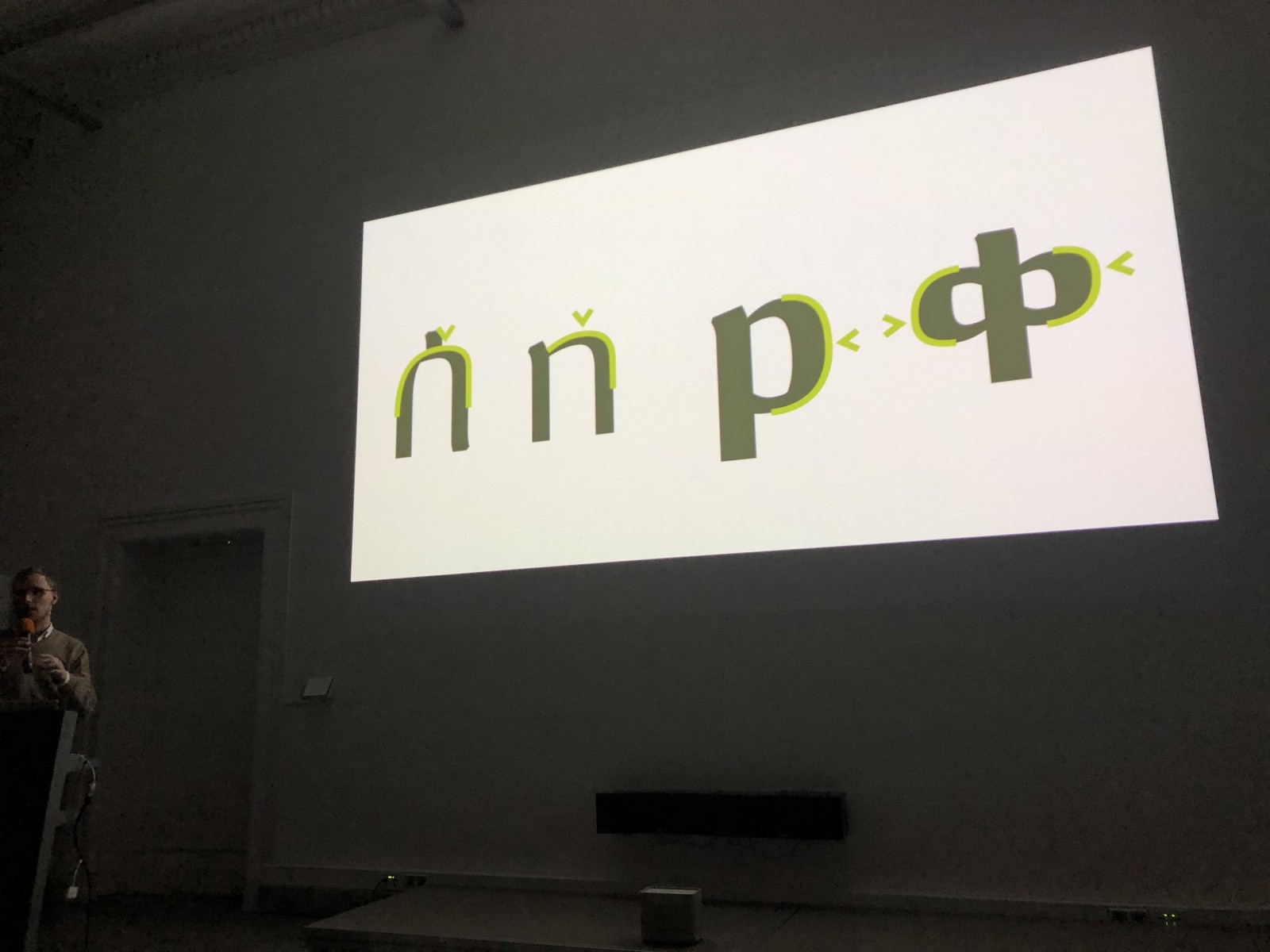
Felix Kett from Hamburg in Germany, and a graduate from Reading in the UK, added clearly to this conceptional approach with his very structured talk. He shared how he explored Ethiopian scripts step by step, and how he made his findings work in his graduate typeface design Memirati.
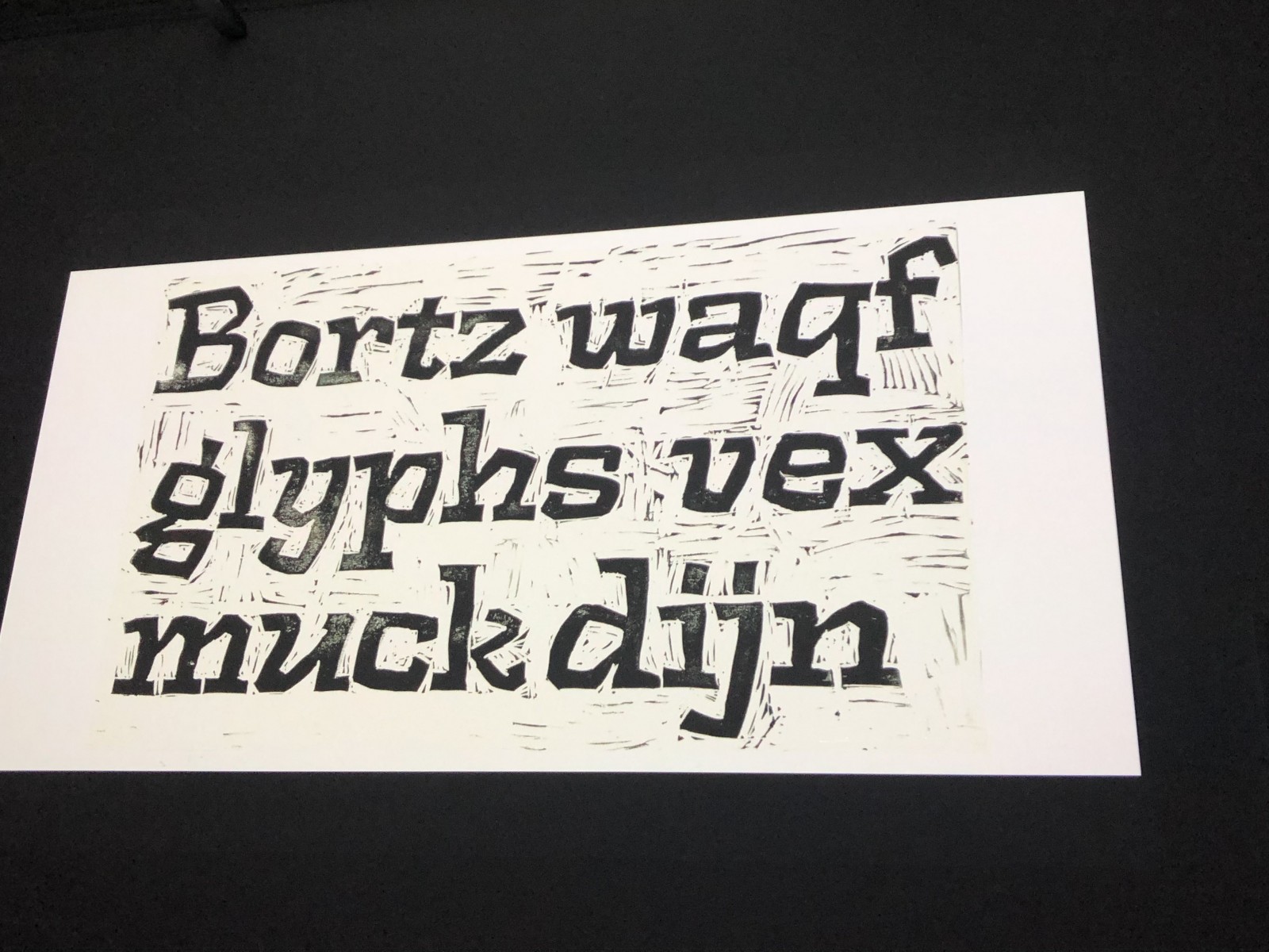
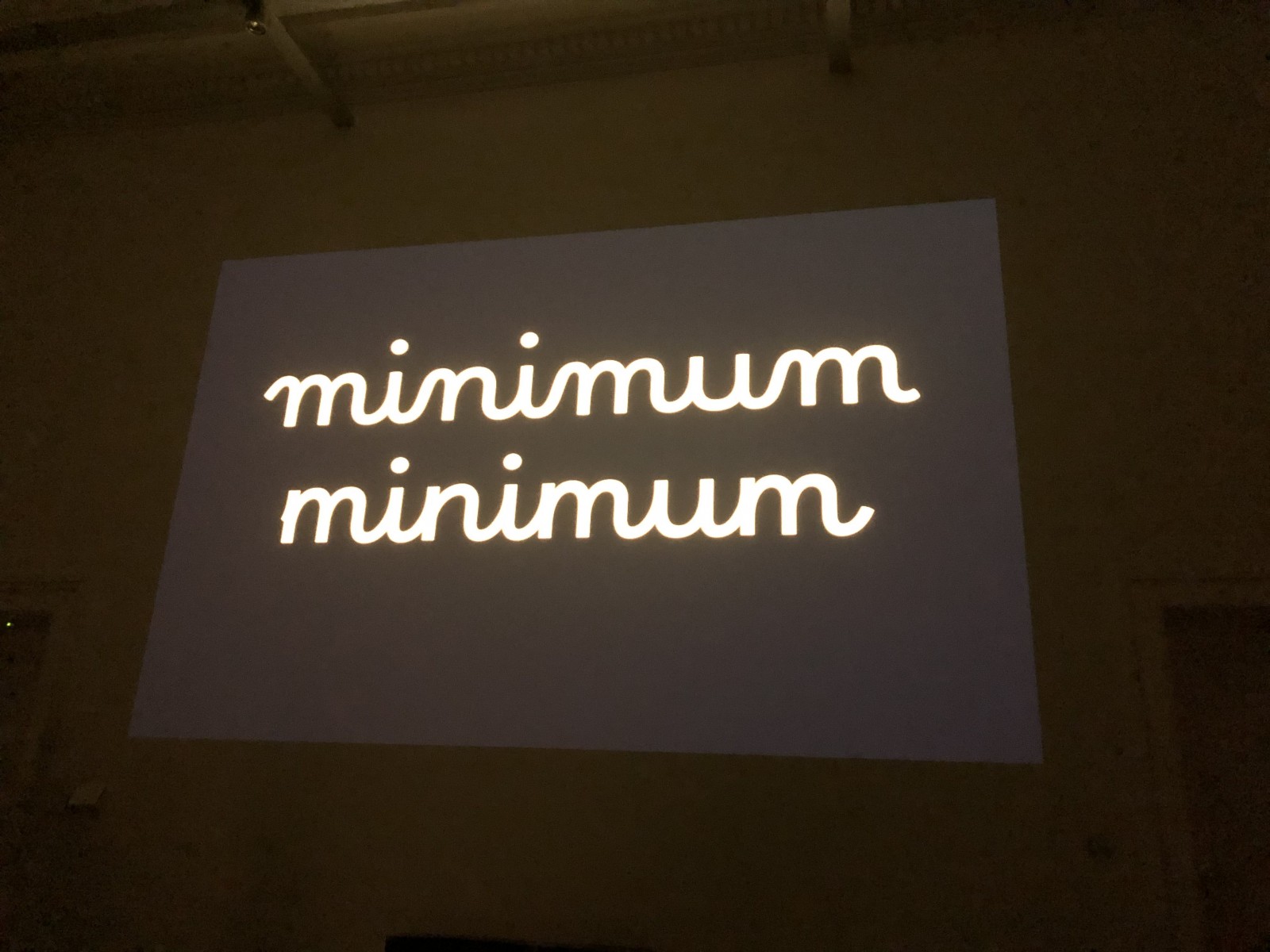
Rosalie Wagner acquainted us with Borel, a school script she developed alongside her research on how school scripts work, and how they differ. She demonstrated how to proceed with such findings, how to choose and to decide which of them you would ideally use and combine in your design. Rosalie graduated from the Atelier National de Recherche Typographique (ANRT) in Nancy, France.

The presentations left the audience impressed, and a lively exchange started as soon as the lights were turned back on. Everyone moved back to the exhibition and us, the Typostammtisch team, were really happy about how crowded the main auditorium of the Medienhaus building of Berlin University of the Arts was on that Saturday afternoon. Thanks to their typography teacher Dr. Thomas Maier, who opened the doors and helped us to organise this, and many many thanks to all our visitors for your appreciation. Thanks for your great presentations, dear graduate students, and congratulations to all new type masters 2019! Amazing work.
Looking forward to future generations…
Photos team Typostammtisch, if not mentioned otherwise; many thanks to Georg Seifert for those great portraits! If we didn’t get someone’s name please let us know, also if someone did not want to be depicted in this report. We love the fact that you attended in any case.